

Website design and frontend development for 4vps.su hosting
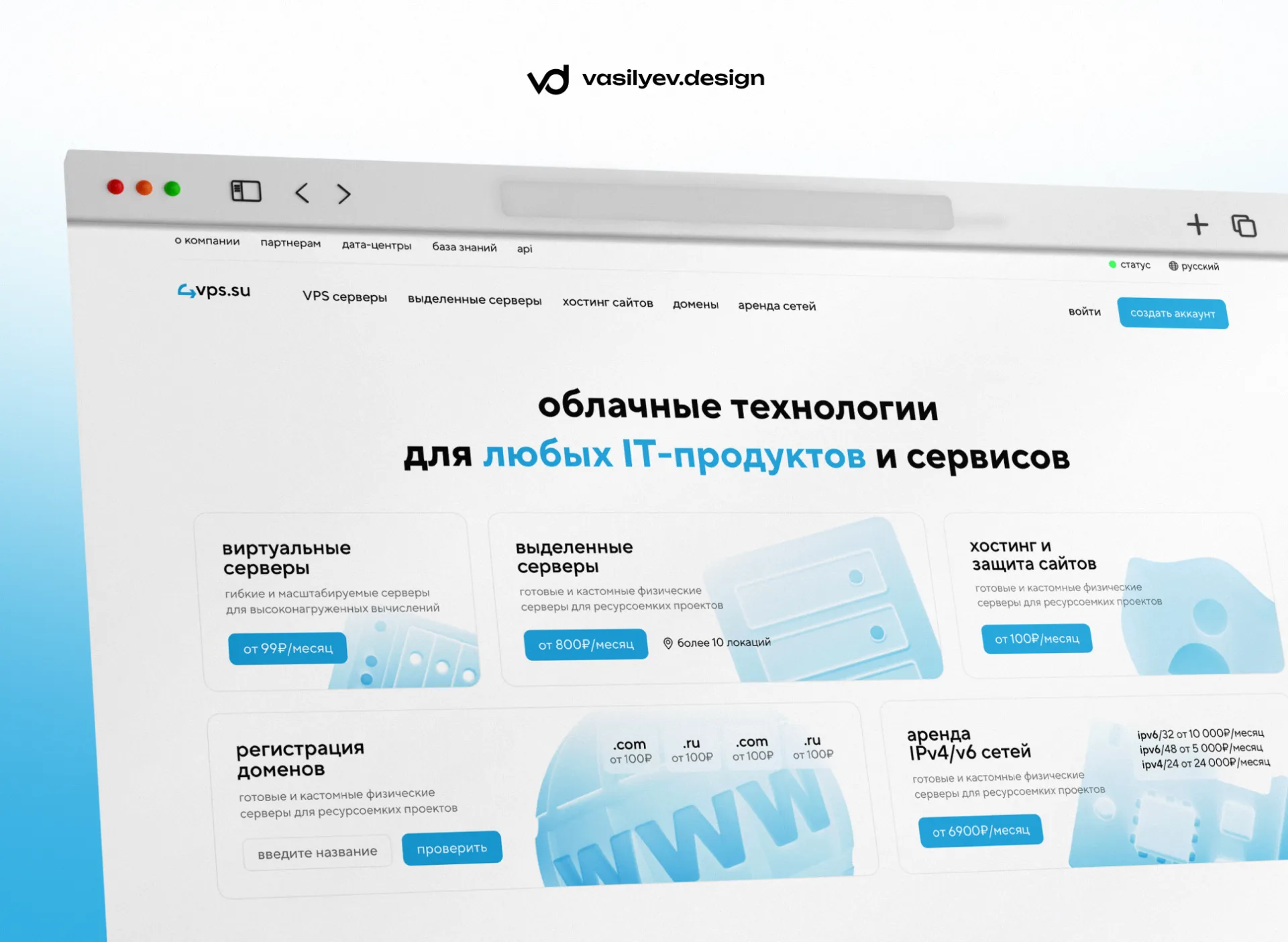
We developed the design and frontend of the website for the hosting provider 4vps.su: home page, VPS, dedicated servers, website hosting, domains, data centers, service status, API, news, authorization, and registration
Website design and frontend development for hosting 4vps.su
For hosting provider4vps.suWe developed the website design and performed frontend development of the project’s key pages.
The task was not just to update the visual part, but to create a full-fledged modern website for an IT company: clear, fast, structured and convenient for users who choose VPS servers, dedicated servers, website hosting, domains, network rental and other infrastructure services.
The project turned out to be large-scale: we worked on the main page, product pages, sections of data centers, service status, API documentation, news, contacts, referral system, authorization, registration and access restoration.
About the project 4vps.su
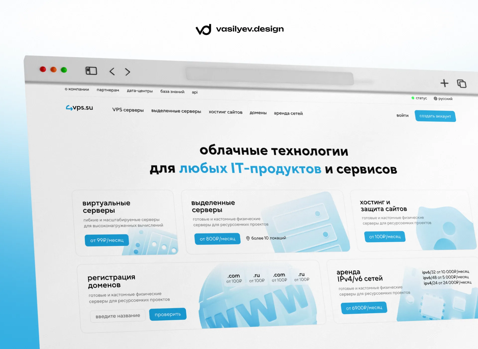
4vps.suis a hosting provider that provides cloud infrastructure, VPS servers, dedicated servers, website hosting, domain registration, IPv4/IPv6 network rental and equipment placement.
For such a project, the website is not just a business card.
This is the main tool for sales, navigation through services and communication with clients.
The user must quickly understand:
— what services are available;
— in which locations you can rent a server;
— what tariffs are there;
— what operating systems and ready-made scripts are supported;
— how to check the status of services;
— where to find documentation;
— how to register and proceed to order.
Therefore, when developing the design, it was important to combine a clean visual style, a clear structure and a practical user experience.
Project goal
Our task was to develop a modern website for a hosting provider that would look technologically advanced, neat, and instill trust.
Main goals:
— update the visual style of the site;
— make the interface clearer and easier;
— structure a large number of services;
— think over the user path from the first screen to the order;
— create a single UI for all pages;
— prepare a design in a light and dark theme;
— perform frontend page development;
— make the site convenient for further scaling.
In the hosting industry, logic is especially important.
A user often comes to a website with a specific task: rent a VPS, select a dedicated server, check a domain, study data centers, or view the status of services. Therefore, the interface should lead him to the desired action without unnecessary steps.
What has been done
As part of the project, we developed the design and frontend part for a large set of website pages.
Were prepared:
— home page;
— VPS server pages;
— VPS page for a specific location;
— dedicated servers page;
— website hosting page;
— domain registration page;
— network rental page;
— colocation / server placement page;
— data centers page;
— service status page;
— detailed status page for a specific service;
— API documentation;
— referral system;
- news;
— open news page;
— “About the company” page;
— contacts;
— authorization;
- registration;
— password recovery.
All pages are collected in a single visual system: the same grid, card logic, buttons, forms, tabs, filters, FAQ blocks, footer, navigation and service components.
Home page
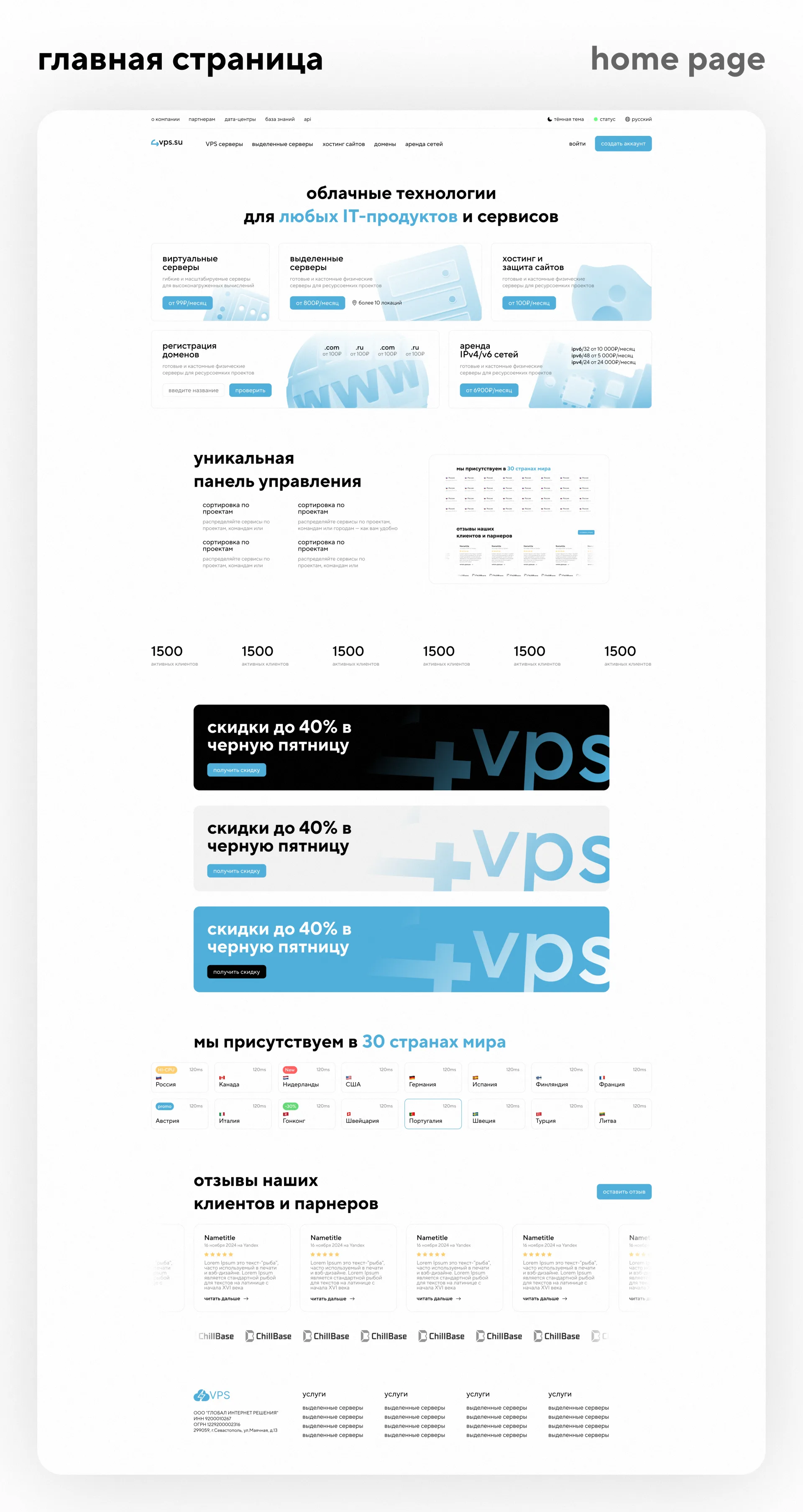
The main page of the site has become a showcase of all key areas of 4VPS.
On the first screen, the user sees the main positioning: cloud technologies for IT products and services. Below are cards of the main services: virtual servers, dedicated servers, website hosting and protection, domain registration, IPv4/IPv6 network rental.
We made the structure so that the user could immediately go to the desired section without studying the entire long page.
The main page also provides:
— a block with the advantages of a control panel;
— statistical indicators;
— promotional banners;
— a block with locations in different countries;
— reviews from clients and partners;
— footer with legal information and navigation.
The main page turned out to be light, clean and informative. It does not overload the user, but at the same time immediately shows the scale of the service.
VPS server pages
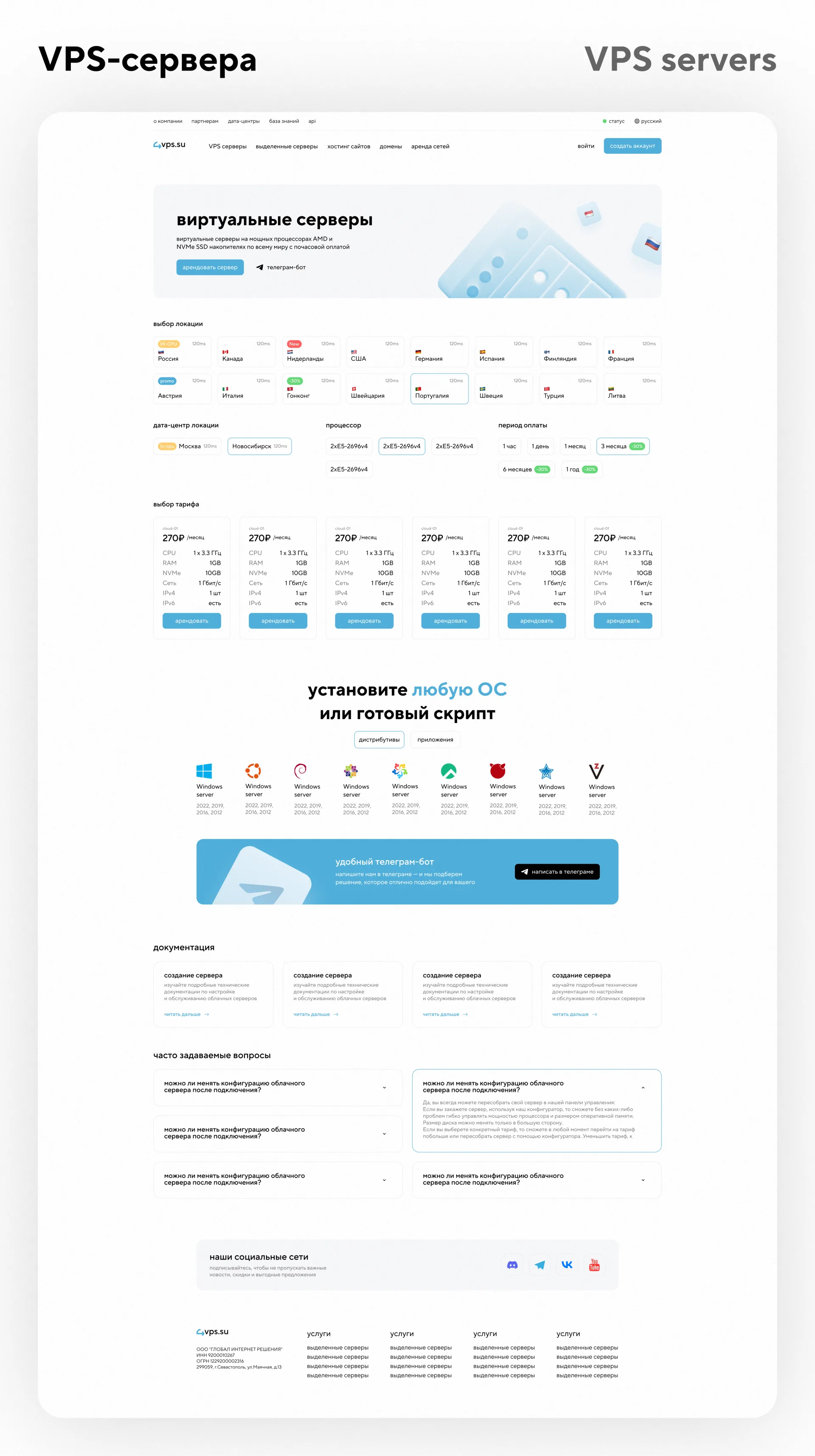
For the VPS section, we have developed pages with a choice of location, data center, processor, payment period and tariff.
The goal was to make server selection clear and convenient.
The user can quickly filter the desired configuration, select the country, server parameters and proceed to rental.
The page provides:
— choice of location;
— cards of countries with flags and ping;
— choosing a data center;
— processor selection;
— choice of payment period;
— tariff cards;
— CPU, RAM, NVMe, network, IPv4 and IPv6 parameters;
— rent buttons;
— a block of operating systems and ready-made scripts;
— Telegram banner;
— documentation;
— FAQ;
- social media.
The VPS page in a specific location was separately developed - for example, virtual servers in the Netherlands. This helps to create landing pages for different directions and improve the SEO structure of the site.
Dedicated Servers
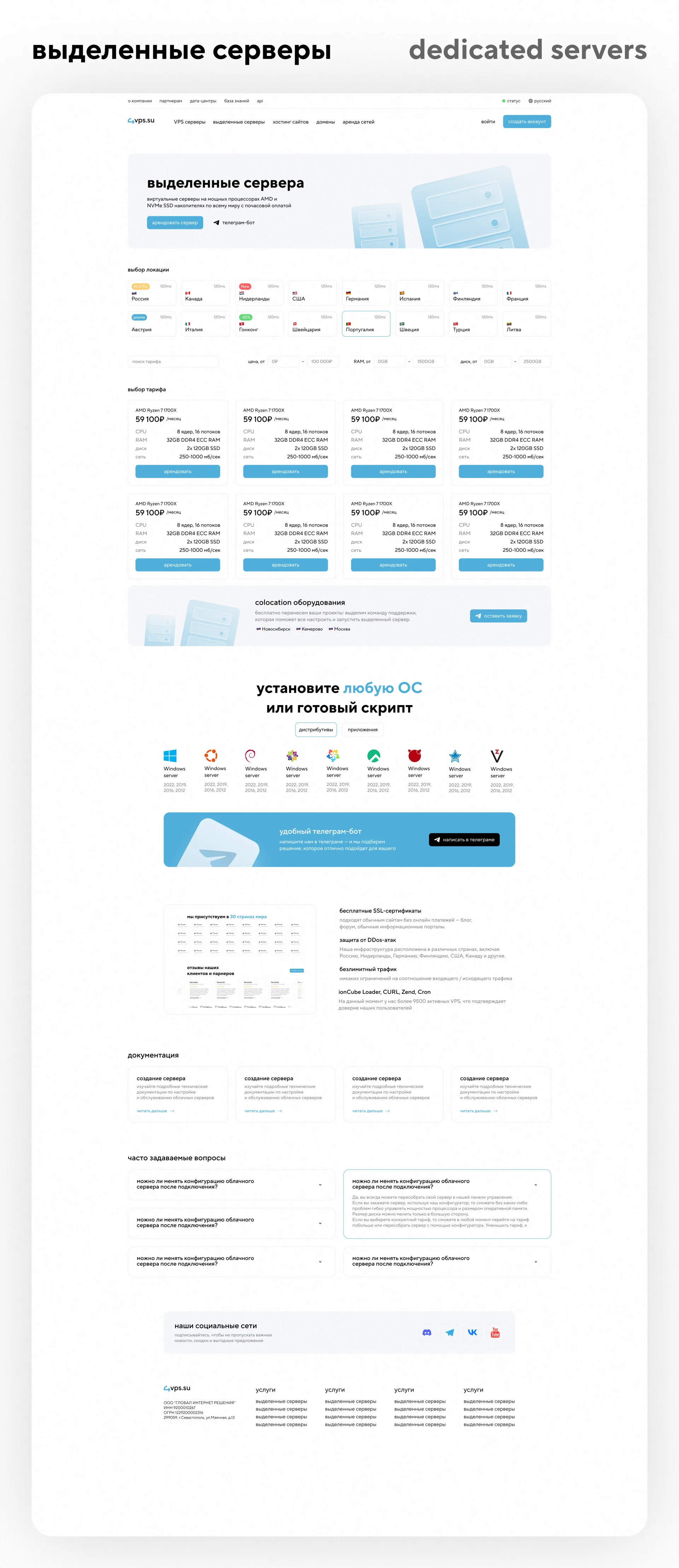
For dedicated servers, we have developed a separate product page with filters, location selection and configuration cards.
In the interface, it was important to carefully show the technical parameters, but not to overload the page.
The user must quickly compare tariffs and understand which server is right for him.
The page has:
— selection of locations;
— tariff filter;
— CPU, RAM, disk and network parameters;
— server cards;
— colocation block;
— support for popular OS;
— documentation;
— FAQ;
— block of social networks.
The design is structured so that technical information is readable and does not turn into a complex table.
Website hosting
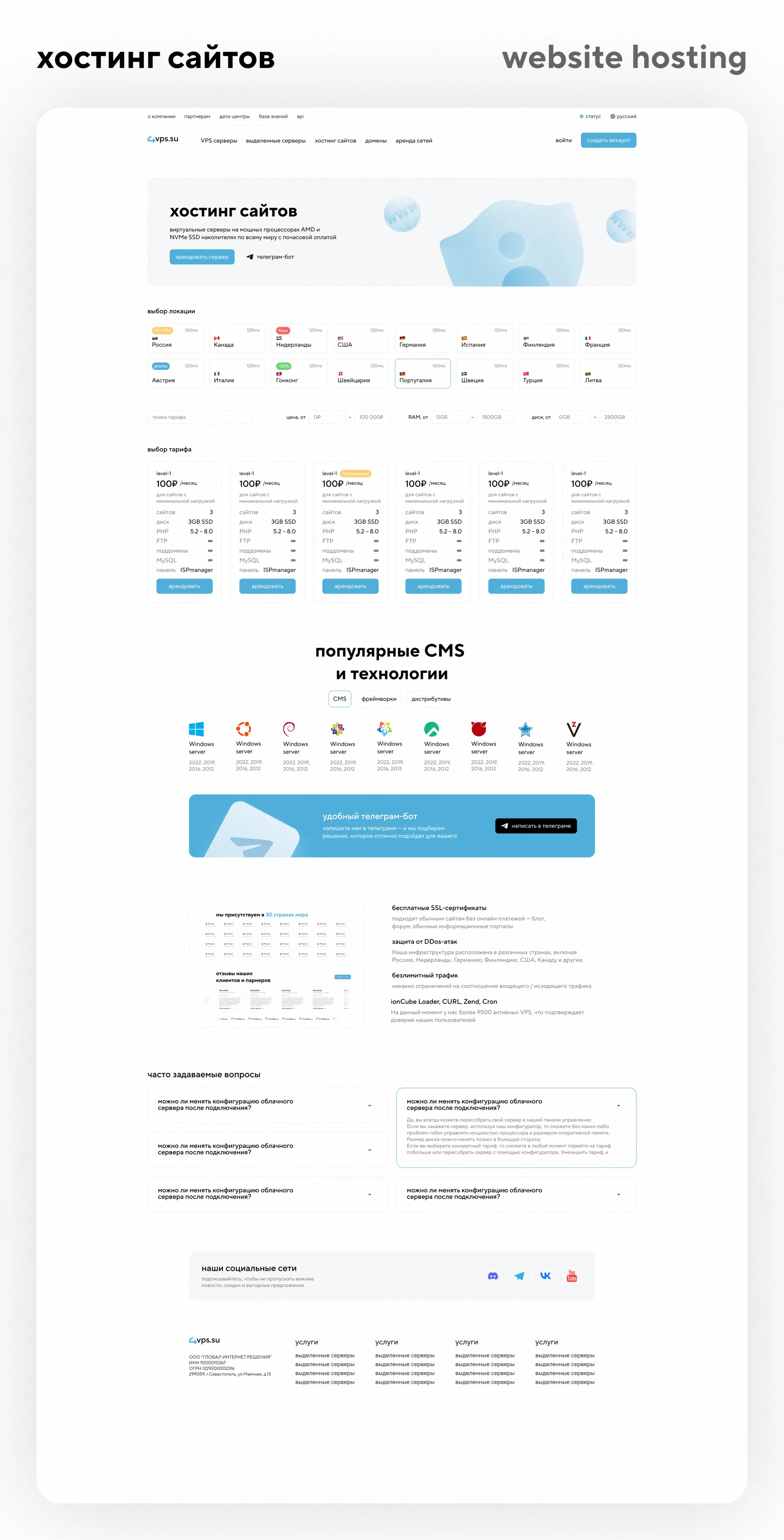
For the website hosting section, a page was prepared with tariffs, popular CMS and technologies.
The user can select the appropriate tariff, see the main parameters and quickly proceed to rent.
Additionally, the page has a block with CMS and technologies to show the compatibility of the service with popular solutions.
The page structure includes:
— choice of location;
— tariff cards;
- price;
— parameters of sites, disk, PHP, FTP, subdomains and MySQL;
— block of popular CMS and technologies;
— Telegram banner;
- advantages;
— documentation;
— FAQ;
- social media.
The result is a convenient landing page for the service, which simultaneously works as a product page and as a landing page for advertising or SEO.
Domain registration
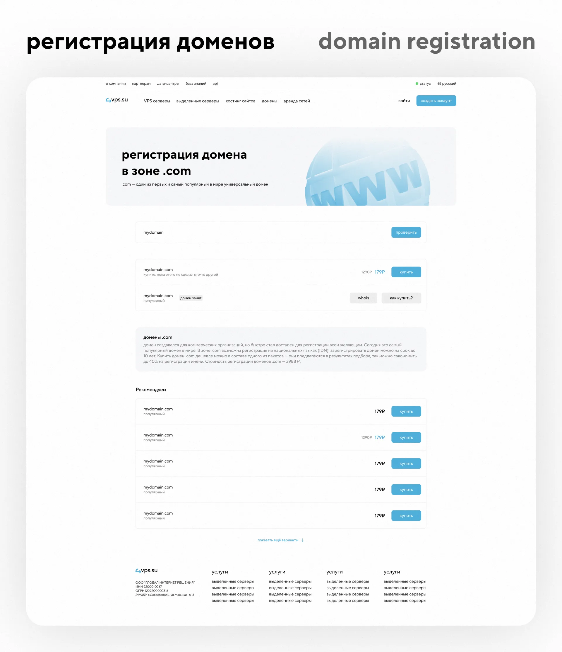
To direct domains, we have developed a page with a large domain search, zone categories and a grid of domain zones.
The user can enter a domain or keyword, check availability, and explore available zones.
There are separate categories: all zones, popular, discounted, premium.
The page turned out to be simple and clear: the main emphasis is on the search, and the remaining elements help the user quickly select the desired option.
Network rental and LIR direction
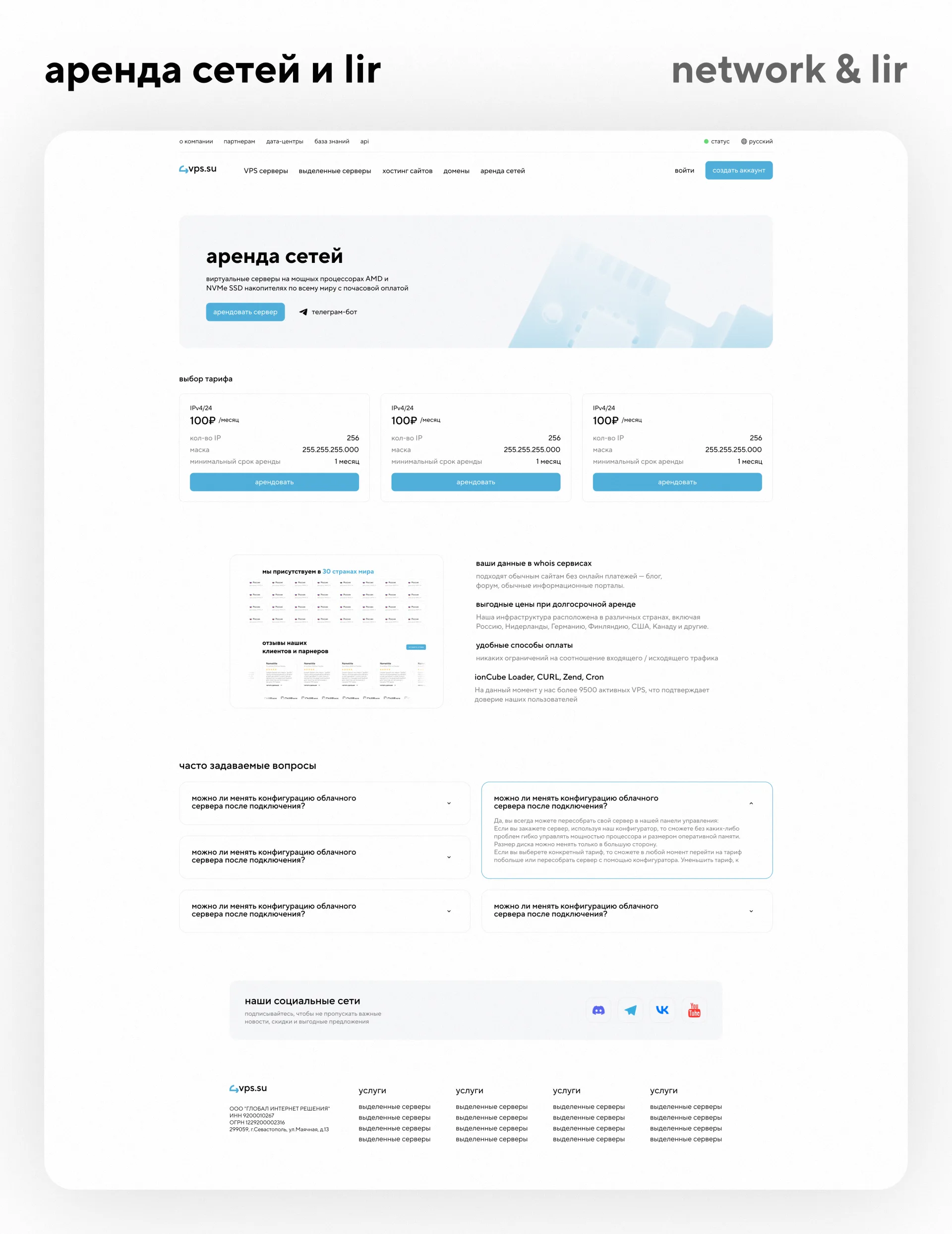
A structure with IPv4/IPv6 tariffs and benefit blocks was developed for the network rental page.
The goal is to explain the service in an understandable manner and give the user a quick path to ordering.
The interface includes tariff cards, descriptions of parameters, information blocks and FAQ.
This section is important for a more technical audience, so we made it as clean as possible: without unnecessary decorative elements, with an emphasis on numbers, parameters and actions.
Colocation and server placement
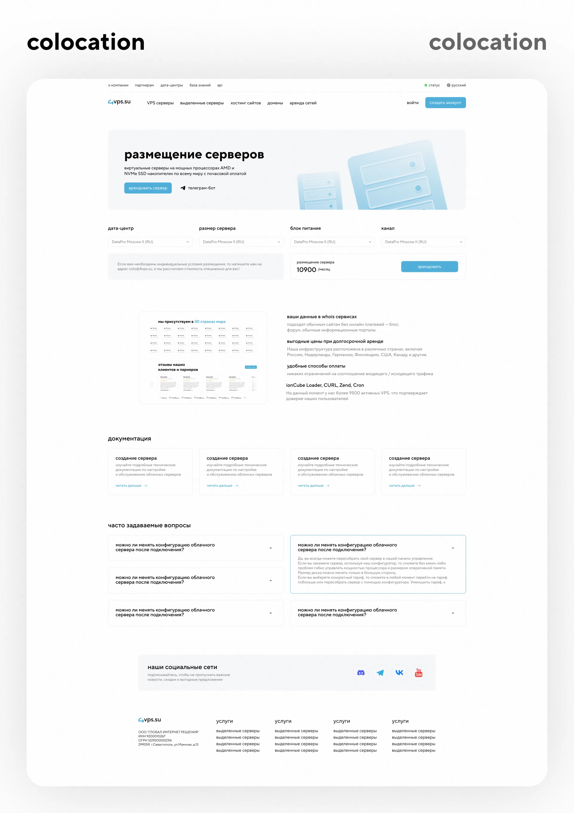
For the server placement page, we prepared a separate landing page with the choice of data center, server size, power supply and channel.
The page has a calculation form, a price block and a rental button.
There are also additional information blocks, documentation and FAQ.
The main task is to make a complex service visually simple.
The user sees a consistent structure: select parameters → see the cost → submit a request or proceed to rent.
Data centers
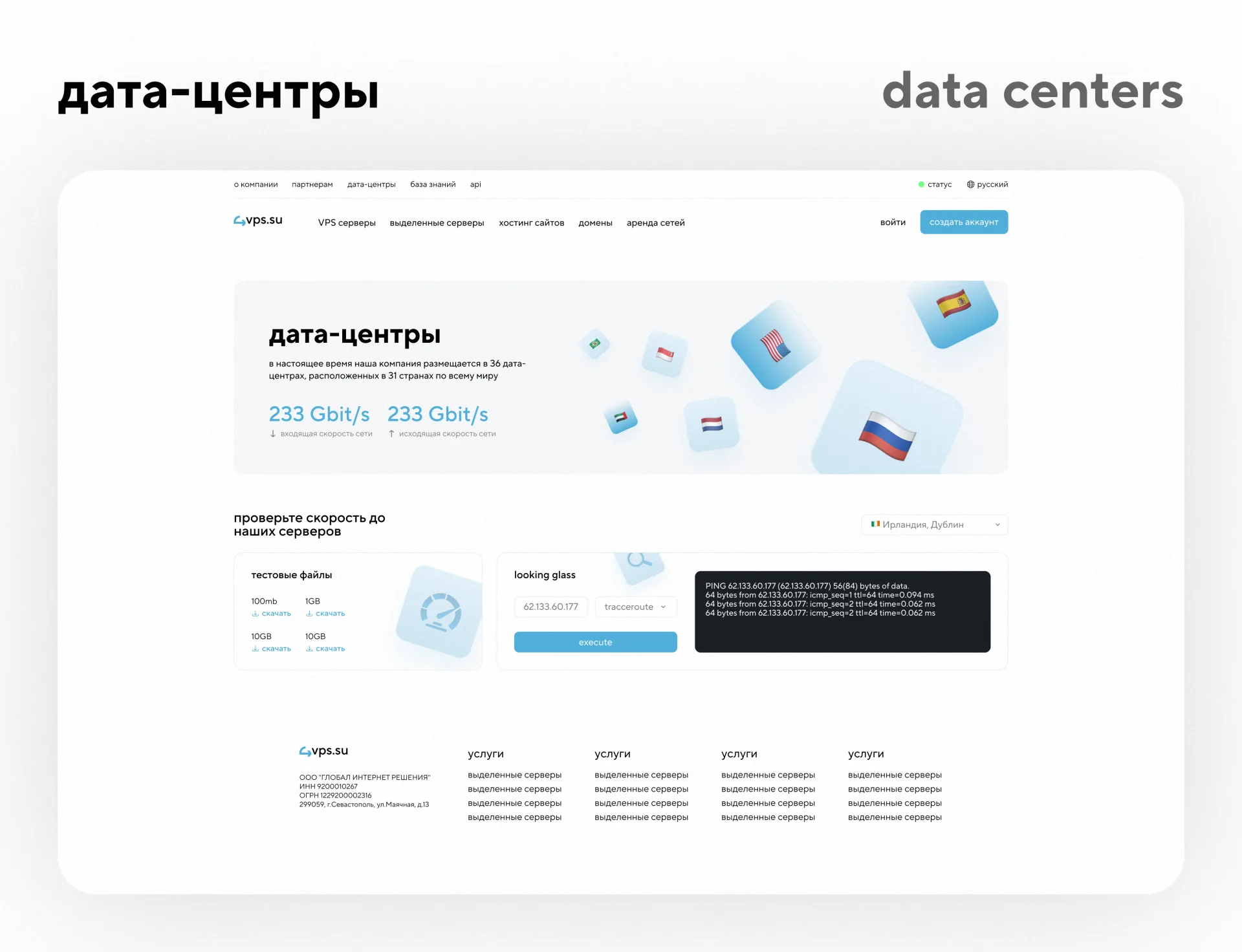
The data centers page shows the geography of the infrastructure and technical capabilities of the company.
The design uses a large promotional block with country flags, speed indicators and neat 3D graphics.
Below is a block for checking speed to servers: test files, looking glass, choosing a location and displaying the result.
This interface helps the user not just read about data centers, but check technical parameters and make decisions based on data.
Services status
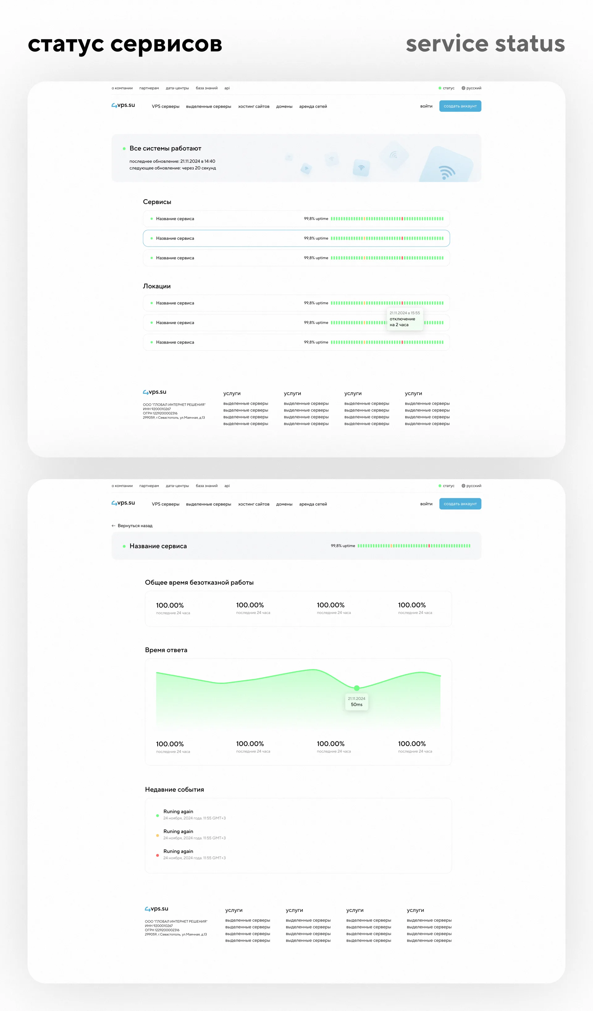
A service status page was developed separately.
For a hosting provider, this is an important section because it shows the transparency of the infrastructure.
The user can see whether the systems are working, when the last update was, and whether there are problems for individual services or locations.
We have worked:
— general status screen;
— list of services;
— list of locations;
— uptime indicators;
— hints on events;
— page of a specific service;
— response time schedule;
- recent events.
The interface turned out to be calm, understandable and technically neat. Green indicators help you quickly read the system status, and detailed blocks provide more information when needed.
API documentation
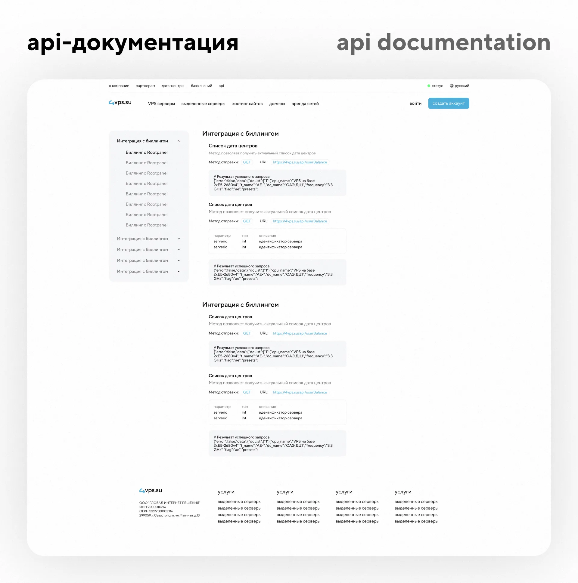
An API page has been developed for technical users.
It provides a side menu with documentation sections, method descriptions, GET tags, URLs, example responses, parameter tables, and code blocks.
It was important to make the API documentation readable and convenient for developers.
The information is structured so that you can quickly find the desired method and understand the request format.
This section strengthens the product: the hosting provider looks not only as a server rental service, but also as a technological platform with the ability to integrate.
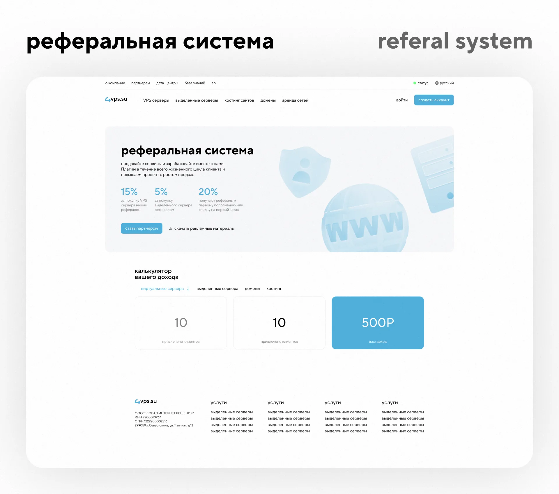
Referral system
A referral system page has been developed for partners.
It shows the terms of the program, percentages, the “Become a partner” button, the ability to download promotional materials and an income calculator.
The page solves two problems:
— explains the benefits of the affiliate program;
— helps the user quickly assess potential income.
We made the interface simple and clear so that the conditions are quickly understood and the affiliate section does not look overloaded.
News and blog
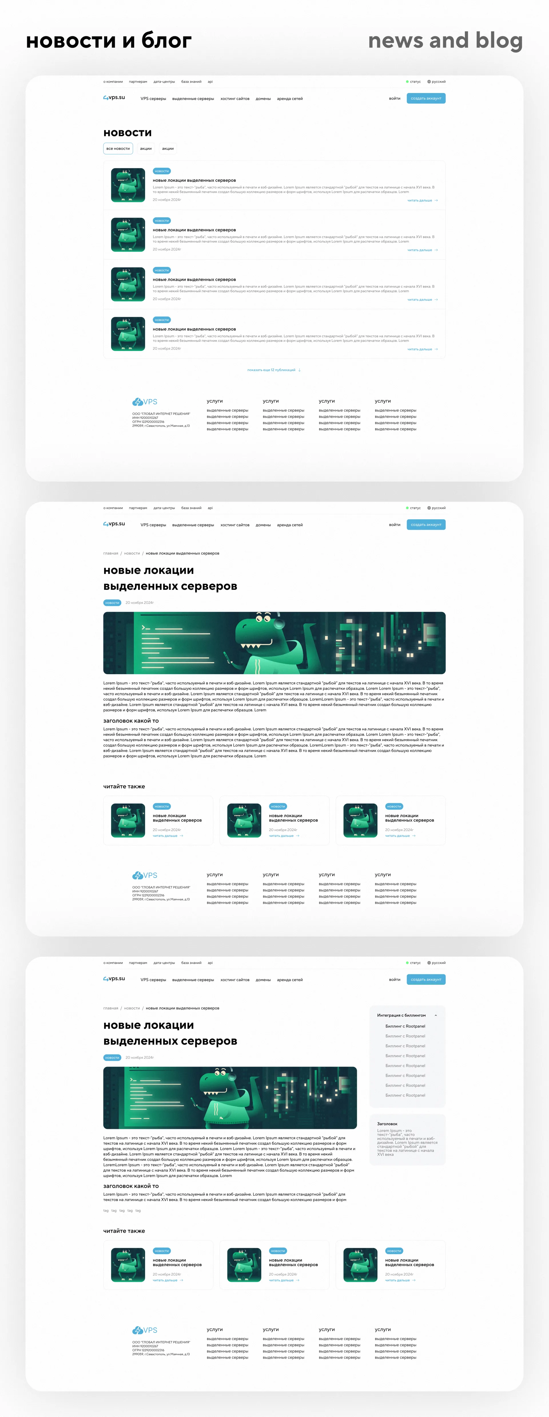
For the content section of the site, a news page and an open news page were developed.
The list of news is made in the form of neat horizontal cards: image, category, title, description, date and “read more” link.
Open news has a full article structure: breadcrumbs, title, category, date, image, text blocks, tags, “Read also” block and side navigation.
This structure helps the site develop SEO direction, publish news, updates, instructions and useful materials for clients.
Authorization, registration and access restoration
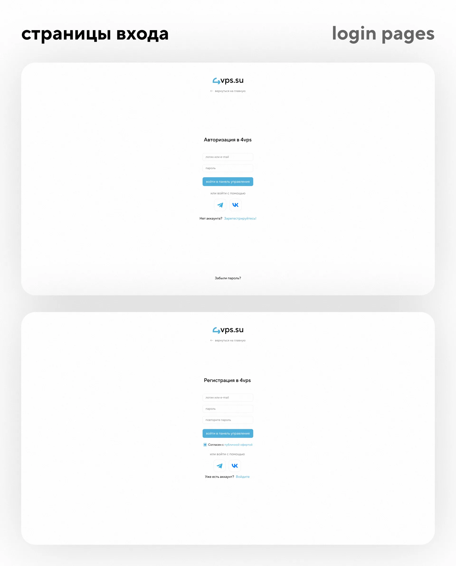
Service pages for login, registration and password recovery were also developed.
They are made in a minimalist style: logo, form, input fields, button, links and login options via Telegram and VK.
On such pages, it is important not to overload the interface.
The user must quickly perform an action: log in, register, or restore access.
We made these screens as clean and clear as possible so that they do not distract from the main scenario.
"About" page and contacts
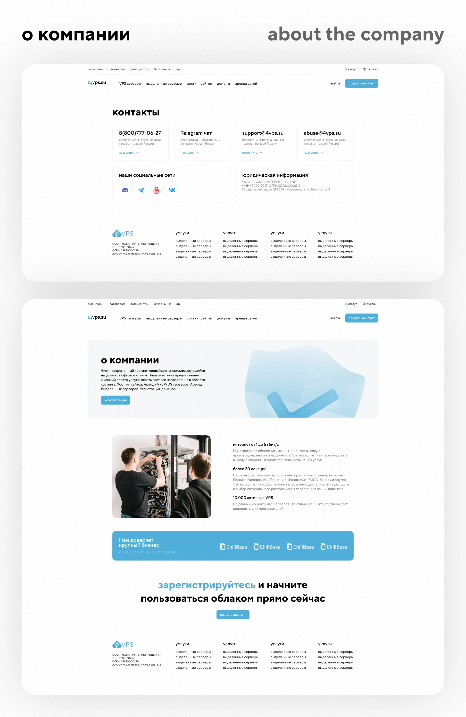
For the “About the Company” section, a page was prepared with a description of the provider, infrastructure, advantages, photos and trust blocks.
The page helps show that there is a real company, infrastructure, clients and experience behind the service.
For contacts, we have developed a separate screen with cards:
- telephone;
— Telegram chat;
— support mail;
- abuse-mail;
- social media;
— legal information.
This approach makes communication transparent: the user quickly finds the desired communication channel and the company’s legal data.
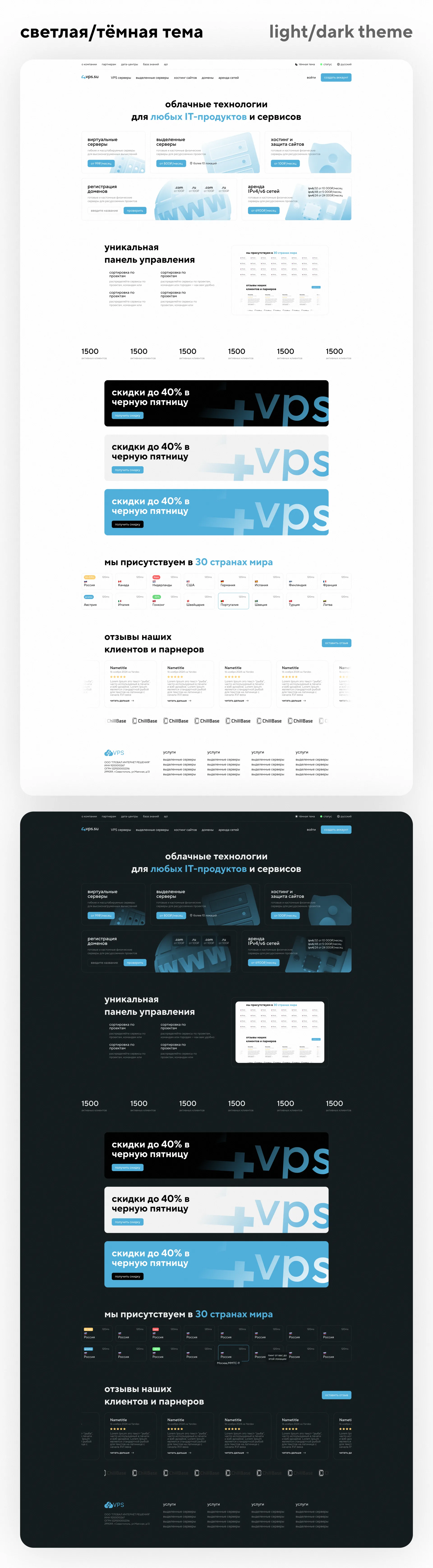
Light and dark theme
A separate important area was working with light and dark themes.
The light theme turned out to be clean, airy and well suited for a public site: lots of space, blue accents, soft cards and light 3D illustrations.
The dark theme helps expand the visual system and make the interface more flexible for further use in your personal account, billing or internal services.
We thought through the visual language so that both themes were perceived as part of one brand, and not two different sites.
UI/UX approach
In the project, it was important not just to draw individual beautiful pages, but to assemble a system.
We have worked:
— a single grid;
— tariff cards;
— filters;
- tabs;
- forms;
— buttons;
— FAQ;
— promotional banners;
- statuses;
- tables;
— code blocks;
- footer;
— navigation;
- repeating components.
Thanks to this, the site can be scaled: add new services, new locations, new articles, new product sections and not break the overall style.
This is especially important for a hosting provider, because the product is constantly evolving: new servers, tariffs, data centers, integrations and technical capabilities appear.
Frontend development
After the design was completed, frontend development of the pages was completed.
We transferred the visual system to the working interface, maintaining the structure, indents, components, adaptability and interaction logic.
The frontend part of the project included the implementation of:
— main pages of the site;
— product sections;
— tariff cards;
- forms;
— filters;
- tabs;
— FAQ;
— news pages;
— statuses;
— service pages for authorization and registration;
— an adaptive structure for further integration.
The goal of frontend development is to ensure that the design does not remain just a layout, but becomes a full-fledged basis for a working website.
Result
As a result for4vps.sua modern hosting provider website was developed with a large number of pages, a well-thought-out structure and a unified visual language.
The project received:
- clean modern design;
- light and dark theme;
— clear navigation through services;
— convenient product pages;
— pages for VPS, dedicated servers, hosting, domains and network rental;
— data centers section;
— service status pages;
— API documentation;
— news and blog;
— authorization, registration and access recovery pages;
— frontend implementation for further integration.
The site has become not just an updated showcase, but a full-fledged digital platform for promoting and selling the services of a hosting provider.
What was done on the project
As part of the case, we completed:
— UI/UX website design;
— design in a light theme;
— dark theme design;
— page structure design;
— home page design;
— design of product pages;
— design of VPS pages and dedicated servers;
— website hosting page design;
— domain page design;
— network rental page design;
— colocation page design;
— design of data centers;
— design of status pages;
— design of API documentation;
— news and blog design;
— design of authorization, registration and password recovery;
— frontend website development.
Bottom line
The 4vps.su case shows what a modern website should look like for a hosting provider: clean, fast, understandable, technically accurate and ready to scale.
We have created a website that helps the user quickly understand the services, select the appropriate server, explore the infrastructure, check the status of services and proceed to order.
For an IT company, a website should not just be beautiful.
It must inspire trust, explain complex services in simple language, and work as a full-fledged sales tool.
This is exactly the problem we solved in this project.