

Aeza Internet Security mobile application design
Aeza Internet Security mobile application design
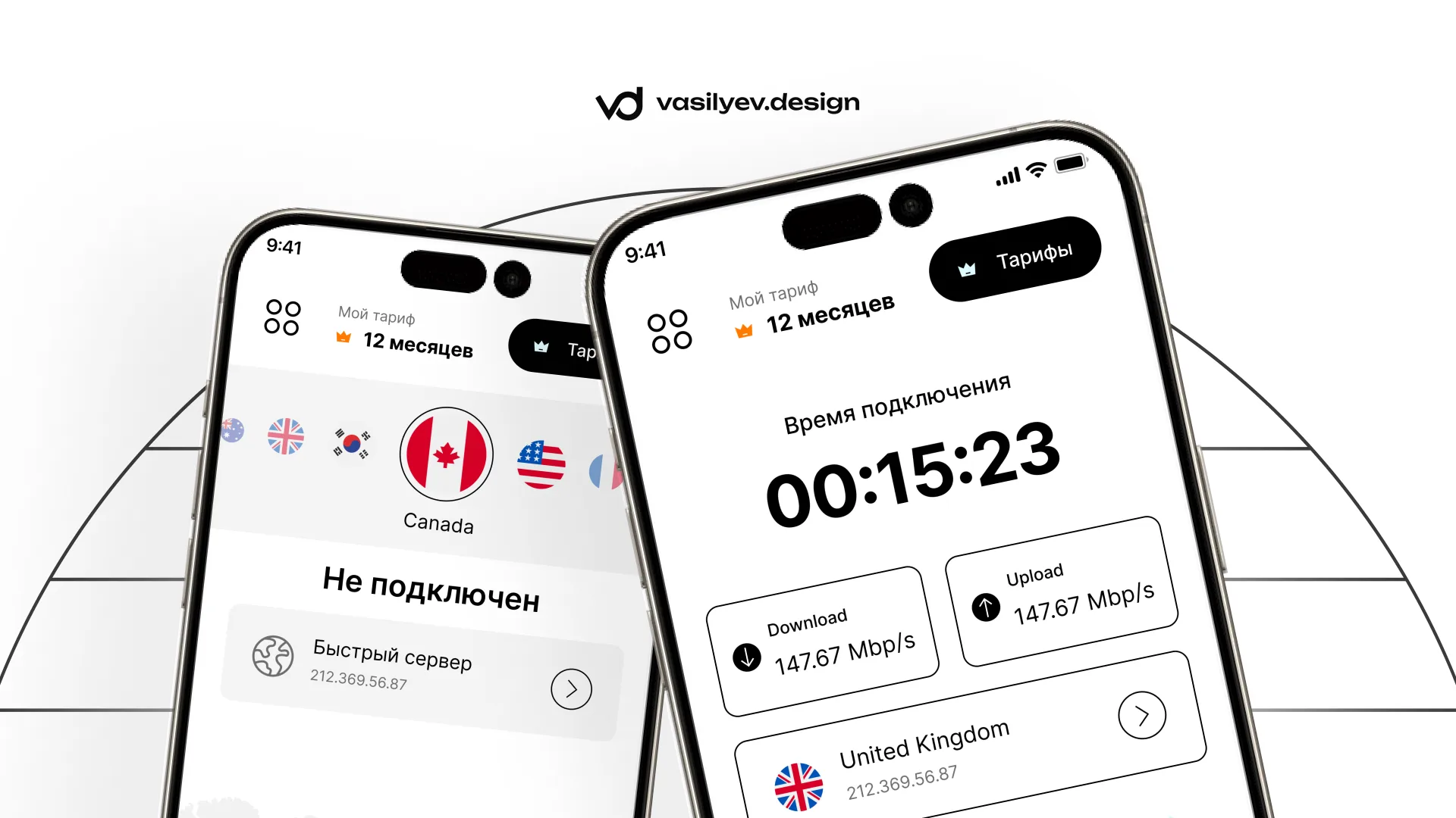
For the projectAeza Internet SecurityWe have developed a mobile application design in a minimalistic and technological style. The main task is to create a clear, clean and modern interface that will be convenient to use every day: to connect, select a location, manage the tariff and account settings.
The app needed to look lightweight, fast, and reliable—without visual noise, cluttered screens, or complicated navigation.
Project objective
Our task was to developUI/UX design of a mobile applicationfor Internet security service.
It was necessary to think through not only the appearance of the screens, but also the user path: from the first launch and registration to the main connection screen, server selection, tariff viewing and profile management.
It was important to create an interface that:
— quickly explains to the user how to use the application;
- looks modern and neat;
— does not overload the screen with unnecessary elements;
— works conveniently on mobile devices;
— visually conveys a feeling of safety, speed and technology.
What has been done
As part of the project, we prepared a complete mobile application design, including basic user scenarios and additional interface states.
Screens have been developed:
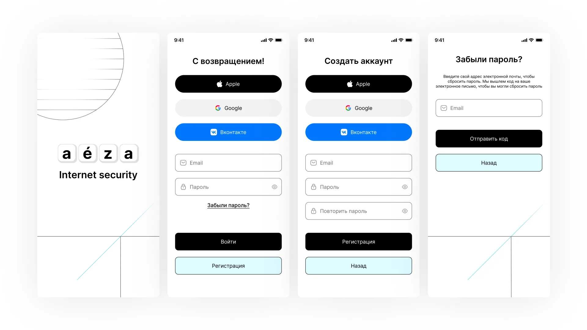
— welcome screen;
— login to your account;
- registration;
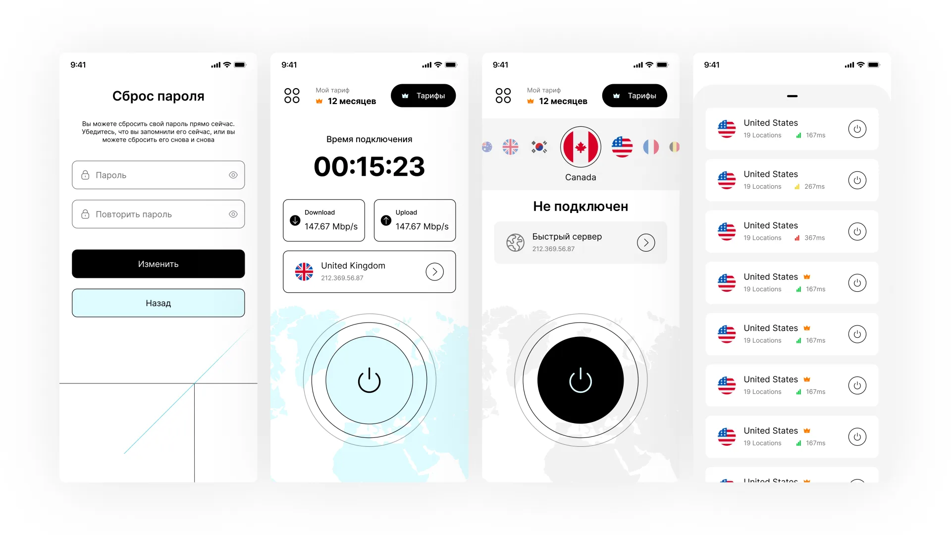
— password recovery and reset;
— user confirmation;
— main connection screen;
— selection of country and server;
— tariff screen;
— application menu;
— user profile;
- settings;
— terms and conditions;
- 404/error status screen.
The visual presentation for the presentation of the case was also separately thought out: smartphone mockups, a general overview of the screens and an emphasis on the key screen of the application.
UI/UX approach
The main screen of the application is built around the main action - connection. The user immediately sees the status, selected country, connection time, download and upload speed.
We emphasized a clear hierarchy: first the main action, then secondary information. Thanks to this, the interface does not look overloaded, and the user quickly understands what is happening.
The application also provides simple navigation: access to tariffs, menus, profiles, settings and server selection is placed in clear interface areas.
This approach helps reduce the number of unnecessary actions and make using the application more comfortable.
Visual style
The design is made in a light minimalist style. The basis is a lot of air, large typography, a black and white palette and light blue accents.
This visual language helps create a sense of purity, simplicity and technology. The interface does not conflict with the content and does not distract the user from the main actions.
Visual elements - buttons, cards, input fields, switches and server lists - are made in the same style so that the entire application is perceived as a cohesive product.
Working with tariffs and account
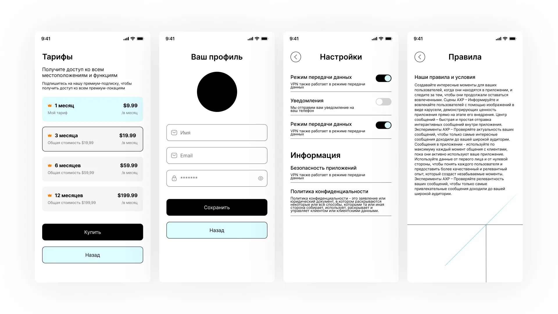
A tariff screen has been developed separately, where the user can select the appropriate subscription period. The structure is made as simple as possible: term, price and buy button.
The profile and settings screens have also been improved. The user can manage their data, view information, change application settings and read the rules of use.
Such sections are no less important than the main screen, because they form the feeling of a completed and thoughtful product.
Adaptation for the application
All screens were designed with mobile use in mind: convenient click zones, readable text sizes, clear indents and a logical block structure.
We sought to make the interface not just beautiful, but practical - one that can be transferred to development and used as a full-fledged basis for a future application.
Result
The result is a clean, modern and user-friendly mobile app design forAeza Internet Security.
The project combines minimalism, clear navigation and a neat visual system. The interface helps the user quickly understand the application, connect, select a server, manage the tariff and settings.
This design is well suited for digital products where speed of perception, trust and ease of use are important.