

ISILYAEV: logo of the surname under the trademark
Logo development for the ISILYAEV brand - how to turn a surname into a graphic sign that can be registered as a trademark
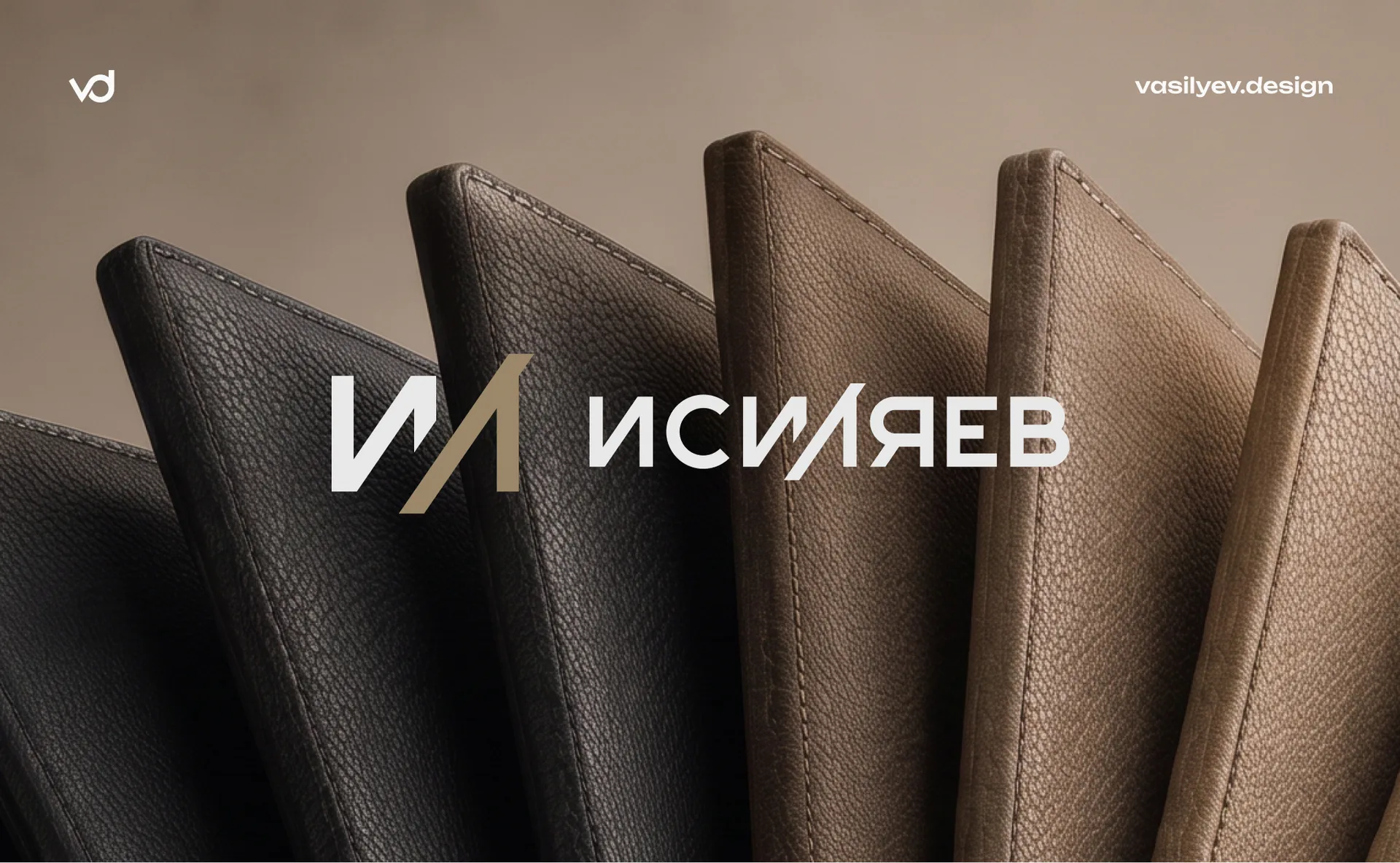
Usually, a logo for a brand is primarily a matter of taste: how to convey the character of the company, stand out among competitors, and please the audience. But sometimes design solves a problem that goes beyond aesthetics. The ISILYAEV case is exactly this: here the logo needed to be not just “beautiful”, but legally protectable.
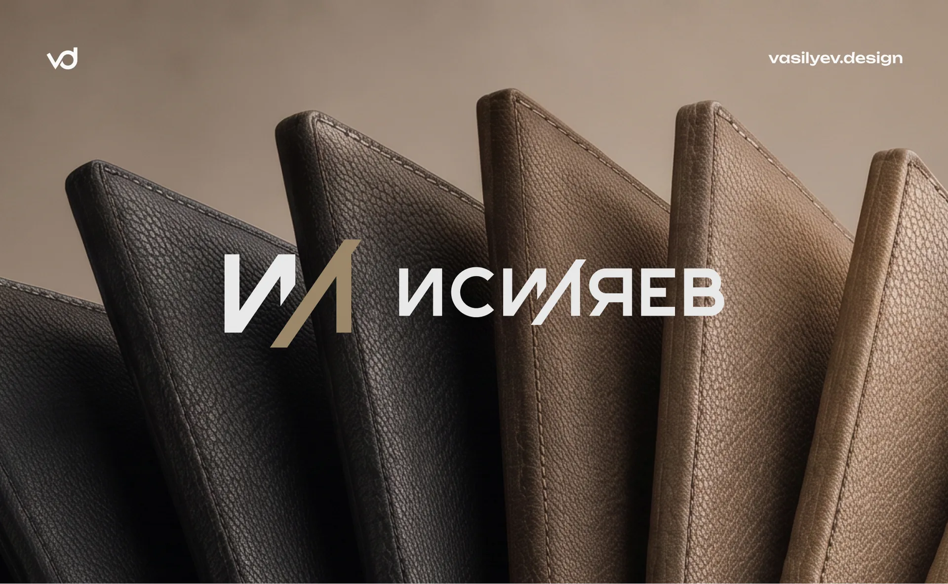
Task: a surname that cannot be patented by itself
The client is launching a brand of leather accessories under his own surname - ISILYAEV. The first product line is covers for documents; in the future, bags and backpacks will be added to it. The name had already been chosen, all that remained was to turn it into a brand.
Here a limitation arose that determined the entire project: a surname as such cannot be registered as a trademark. Rospatent refuses to register designations that are perceived solely as a personal name or surname, if they do not have their own, recognizable graphic form. The legal logic is simple: the surname itself does not have a distinctive ability - there can be many such surnames, and one person cannot have a monopoly right to them.
The solution is to make not a text typed in font, but a full-fledged graphic sign, in which the name is a visual composition. Not “text + logo”, but a logo that consists of text.
Starting point: without a ready-made concept of color and style
The brief at the start was deliberately open. The client had no color preferences - neither corporate blue nor fashionable black. There was no requirement for the mood: I didn’t want either excessive creativity with abstract forms, or a strict, cold corporate style. The studio’s task is to offer a solution that the studio itself would consider correct, based on the product and its future development.
This is a rare situation for branding: more often the client comes with references and strict frameworks. Here the frame was only a legal necessity - unique graphics instead of the usual font.
Solution: monogram I/L and author's style
The logo is based on two components that work as one.
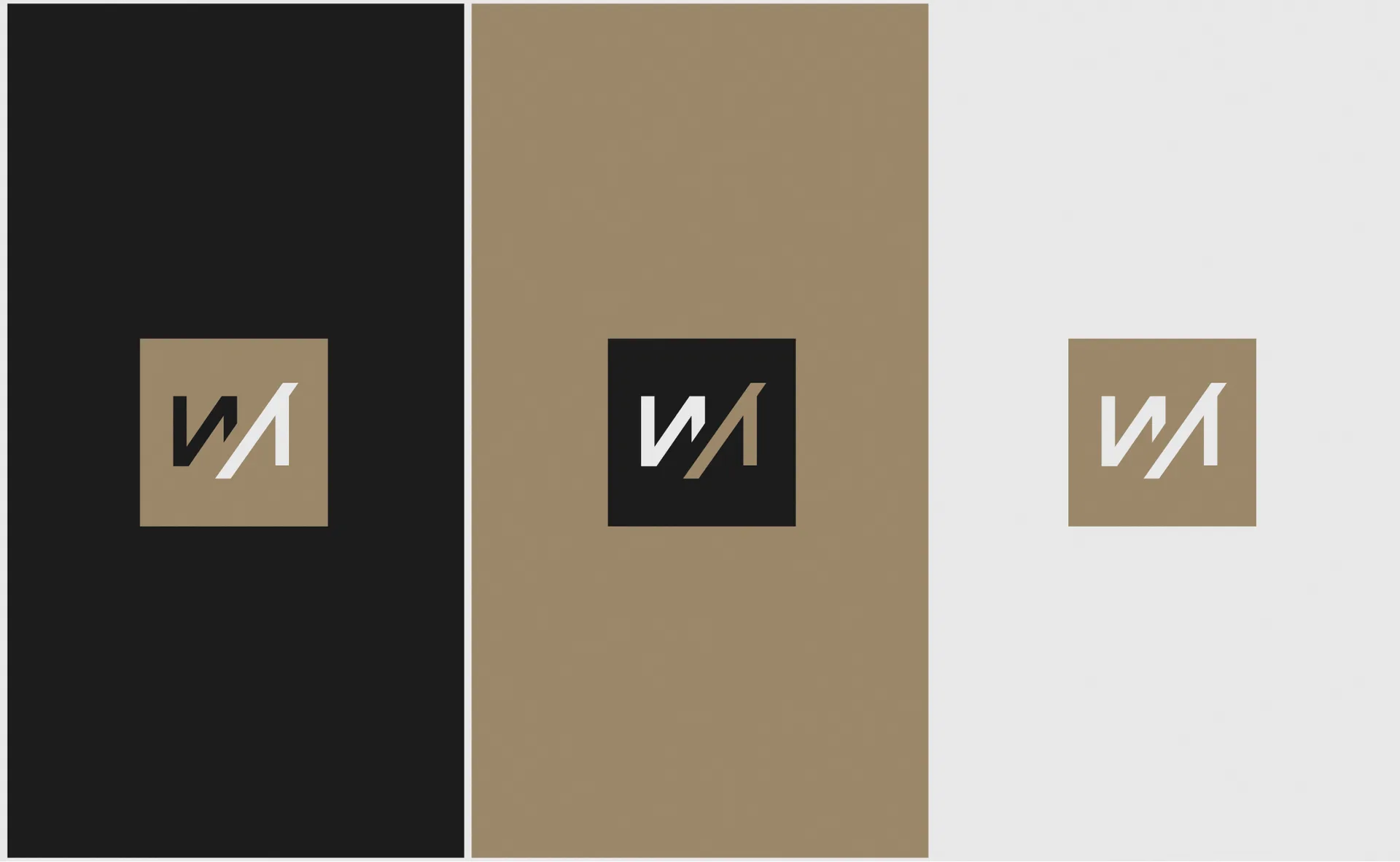
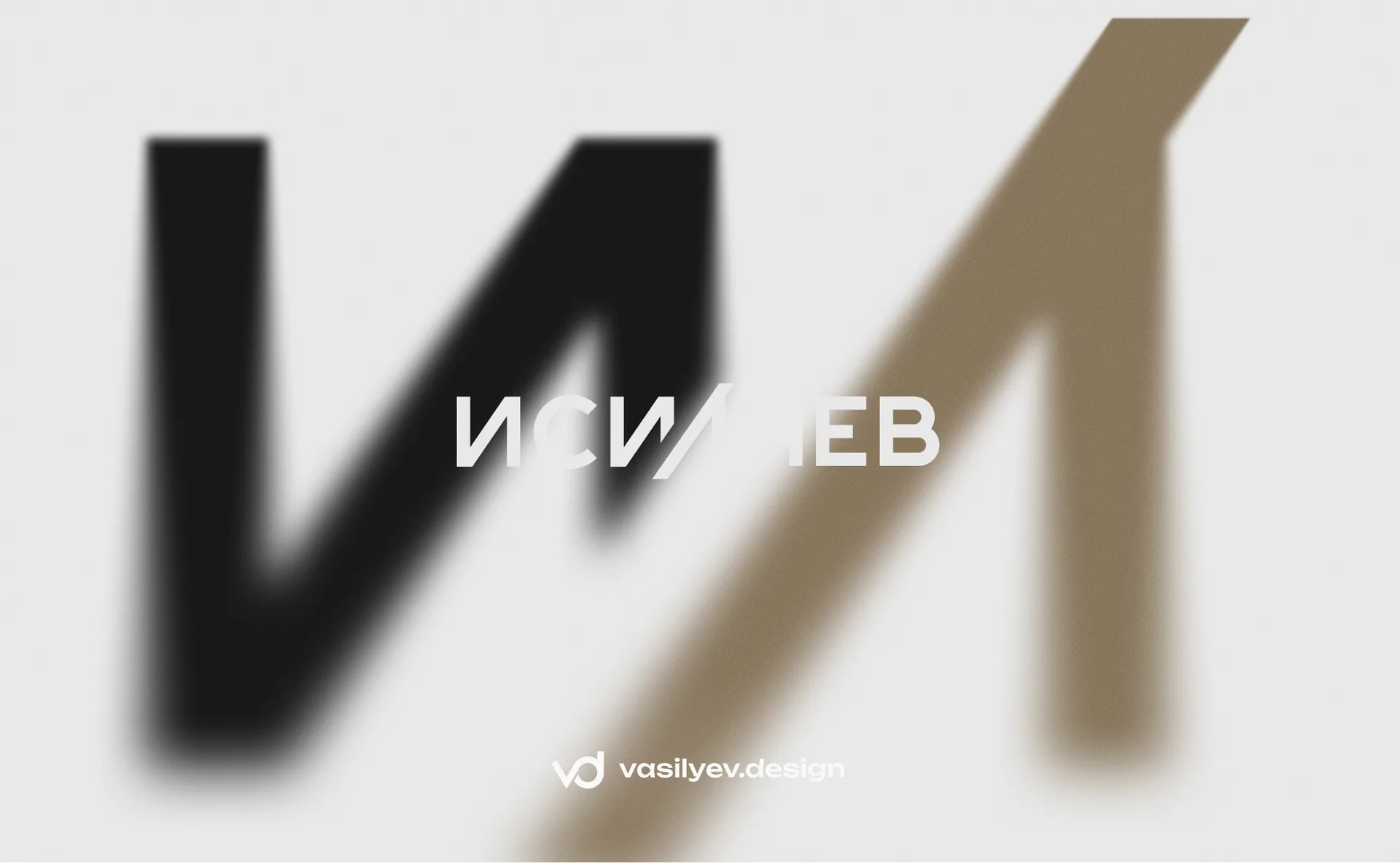
Monogram I/L. Two letters from the cores of the surname - “I” and “L” - are combined into one sign: the diagonal “I” goes into the inclined leg “L”, and the letters are linked into a solid form. The same ligature is repeated within the full spelling of ISILYAEV, and it appears before the word as an independent accent. This detail can be used separately from the full name - as a compact version for places where the entire word does not fit: clasp, fittings, minimalistic tag.
Author's typesetting. The remaining letters of the word “ISILYAEV” are not typed in a ready-made font, but in a hand-drawn style: sharp cuts, a characteristic slant of the “L”, which rhymes with the monogram. It is this condition that makes the logo protectable - the style cannot be reproduced in standard fonts, which means that the designation takes on its own, recognizable form, and does not remain “the text of the surname.”
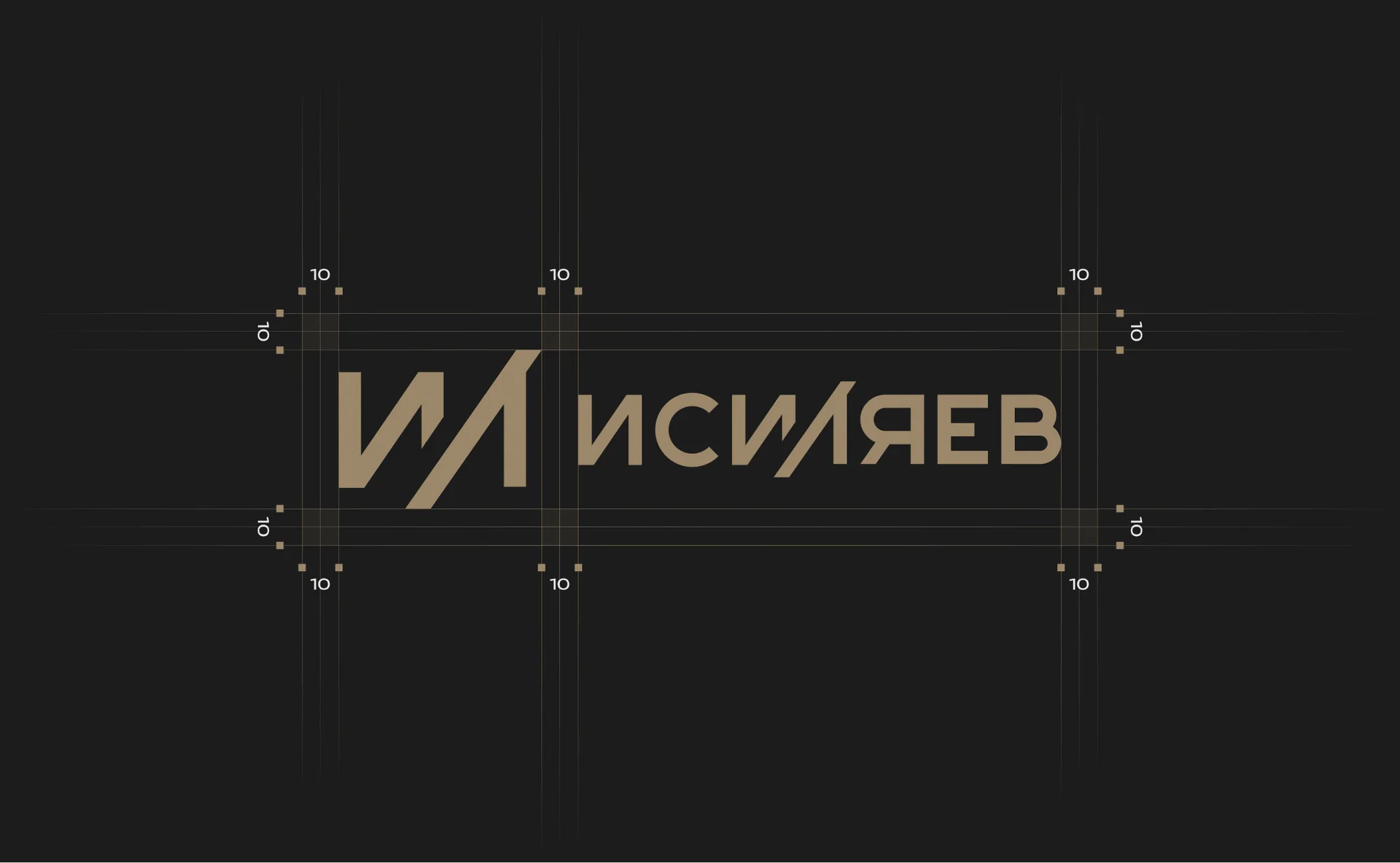
The combination of “monogram + typeface” is built on a modular grid: the proportions of letters, the distances between them and the security field around the entire block are fixed in development so that the logo does not lose its composure when scaling - from engraving to zippers to the sign.
Palette: restrained, but not impersonal
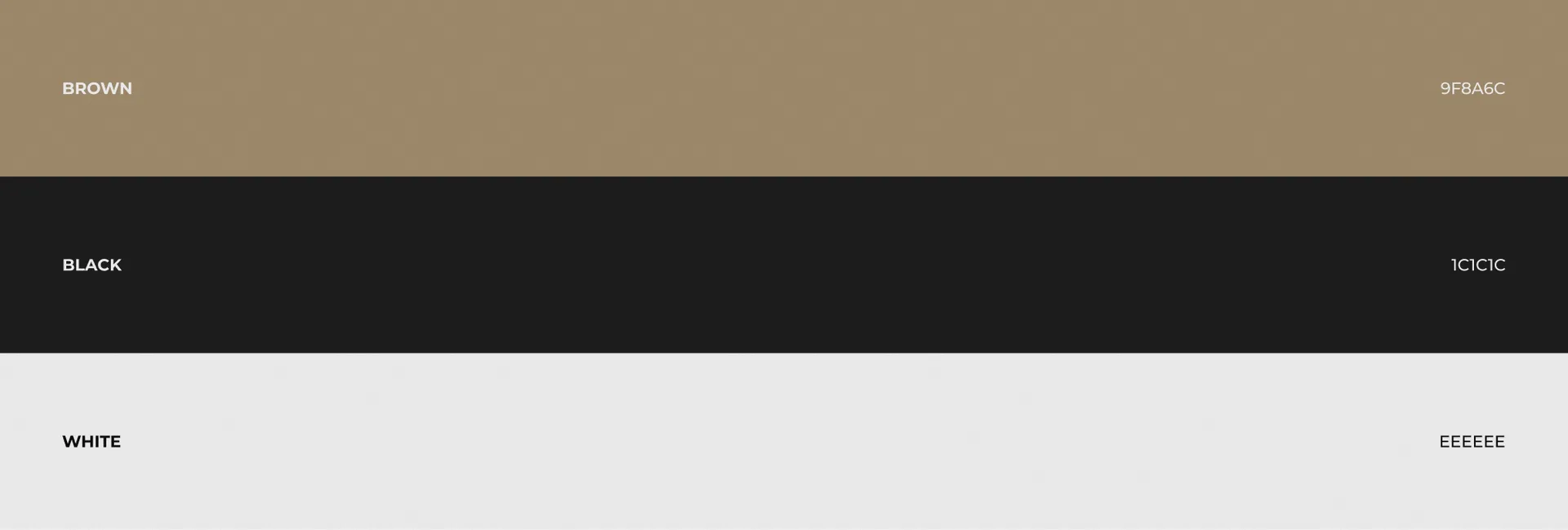
The color system is built on three constants: warm beige-brown (9F8A6C), deep black (1C1C1C) and light gray-white (EEEEEE). This is a conscious response to the brief “without much creativity, but also not strictly”: brown is directly read as the color of genuine leather - the material from which the product is made - and adds warmth without maintenance to flashy branding. Black and light neutral serve as working constants for text, background and versions of the logo on different surfaces.
The brand book contains a matrix of acceptable combinations of sign and background - from light pastel substrates to dense black, so that the logo remains readable on any packaging material or accessories.
Media: logo, designed for leather and metal
From the very beginning, the ISILYAEV logo was designed not for the screen, but for the physical product:
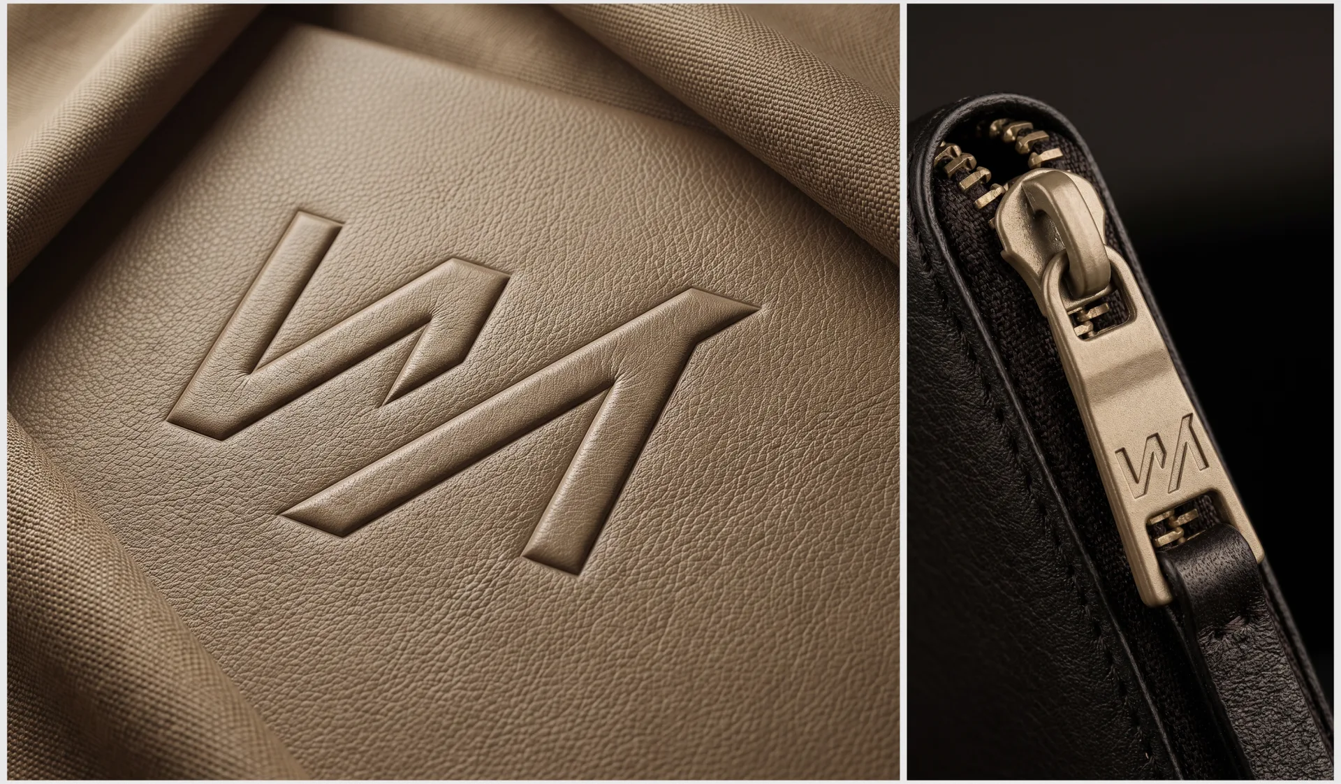
Embossing on leather - blind embossing of the monogram and full name on covers for documents: the relief is readable without paint, due to the texture and light and shade on leather.
Engraved on fittings - a compact version of the I/L monogram is engraved on the metal zipper puller: a detail that is visible even when the product is closed.
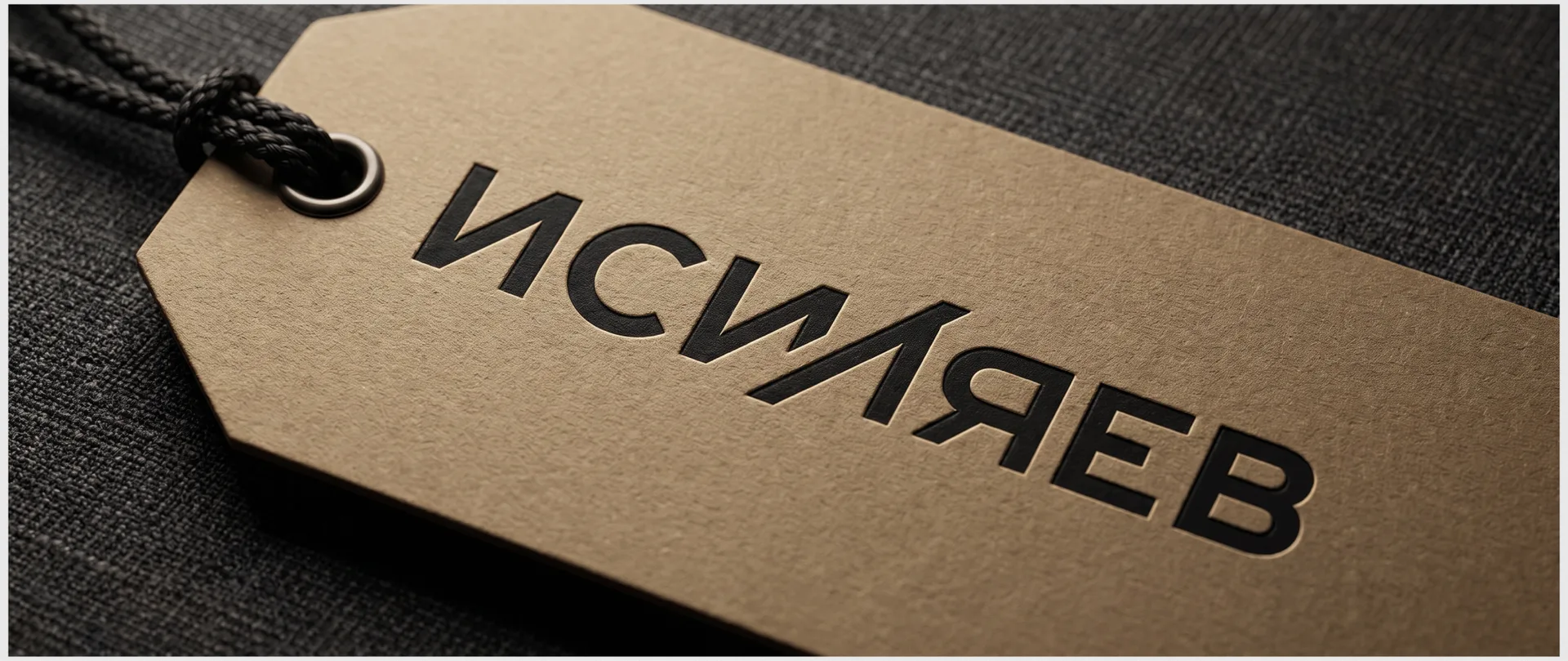
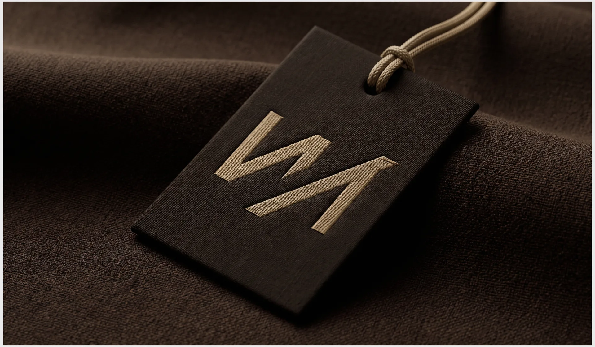
Tags and hangers - thread embroidery on a textile tag and foil stamping on a cardboard hanger - with the expectation that the customer will use both types of packaging depending on the product.
Such testing on different materials is an important part of the work: a logo that looks good in vector on the screen is not always readable in embossing or fine engraving. We planned the thickness of the lines and the openness of the forms so that the sign would not “float” on the skin and would not get lost in the small metal.
Scalability: from documents to the future line of bags
The client directly outlined the growth strategy: today it’s covers for documents, tomorrow it’s bags and backpacks. The logo is designed with this horizon in mind: the monogram is independent enough to become a compact label on a bag pocket or the flap of a backpack, and the full name with typeface remains the flagship version for the main points of contact - packaging, website, storefront.
What went into the project
Development of the I/L monogram and the author's typeface for the entire word.
Modular grid and security fields to maintain the proportions of the logo when scaling.
Color palette: brown 9F8A6C, black 1C1C1C, white EEEEEE.
Matrix of using the logo on different backgrounds.
Checking the sign on real media: embossing on leather, engraving on accessories, embroidery and embossing on tags.
Why it matters
Legal brand protection. Unique graphics are the only legal way to turn a family name into a protected trademark. Without this, a competitor can use a similar name without consequences.
Consistency with the material of the product.The palette and shape of the mark rhyme with the leather material of the product itself, rather than being chosen in the abstract.
Ready for expansion line. The monogram and full version of the logo work as a system that will serve both the current and future range of the brand.
Tested in production, not just on screen. The logo was tested in embossing, engraving and embroidery - media where a conventional text logo often fails readability.

Result
ISILYAEV received a logo that solves two problems at once: visually represents the brand and legally protects the right to the name. The I/L monogram and the author's typeface transform the surname from an ordinary word into a recognizable graphic sign - the case when the design literally becomes the basis for registration of a trademark.
FAQ: logo and trademark registration
Why a surname cannot simply be registered as trademark? The surname itself does not have distinctiveness - there can be many such surnames, and the patent office does not recognize the monopoly right of one person to a common or perceived as a personal name designation without a unique graphic form.
What makes a logo “unique” in the eyes of the patent office? Proprietary, not reproduced by standard ones in fonts, the outline of letters and/or an independent graphic element (monogram, symbol), which together form an original composition, and not just typed text.
Is it possible to use a monogram separately from the full name? Yes - in the ISILYAEV case, the I/L monogram is designed as an independent element for places where the full word does not fit: fittings, small engraving, compact versions on future products of the line.
How does a logo for a physical product brand differ from a logo for a digital product? A logo for physical products should work not only in a vector on the screen, but also in specific production techniques - stamping on leather, engraving on metal, embroidery. The thickness of the lines, the openness of the forms and the minimum dimensions of the parts are checked for these techniques at the design stage.
How long does it take to develop a logo with an eye to trademark registration? The time frame consists of two parts: the development of unique graphics (usually several weeks) and the subsequent legal procedure of registration with the patent office, which is separate from the design and can take from several months to year.
Are you planning to register a brand under your own name or surname? Studio vasilyev.design develops logos that not only look professional, but are also ready for registration as a trademark - write to us.