

Logo and brand book for the Pepper project
We developed a brand logo, color palette, typography, app icon, terms of use, and visual elements for the digital environment.
For the project"Pepper"we developed a logo and a full-fledged brand book - from the brand name and color palette to the application icon, rules of use and visual elements for the digital environment.
The goal of the project is to create a bright, modern and memorable visual style that will work well in different formats: on a website, in a mobile application, social networks, advertising materials, interfaces and other digital media.
Logo idea
The logo is based on the image of a pepper - a simple, understandable and emotional symbol. We made it not realistic, but stylized: dynamic shape, soft volume, bright accent and modern presentation.
The sign turned out to be laconic, but at the same time expressive. It works well as a standalone icon, as part of a logo, and as a brand graphic element.
This approach is especially important for digital products: the logo should look equally good on the website, in the application, on the smartphone icon, in social networks and advertising creatives.
Corporate identity
The project’s corporate identity is built on a bright red-pink accent, clean typography and the contrast of light and dark backgrounds.
The identity turned out to be rich, noticeable and modern.
It is not overloaded with details, but at the same time it has character and easily stands out among other digital projects.
As part of the brand book for the Pepper project, we worked out the logo and sign, rules of use, color palette, typography, application icon, options on a light and dark background, as well as visual elements for the digital environment.
Color Palette and Typography
The color system has become one of the key elements of the brand.
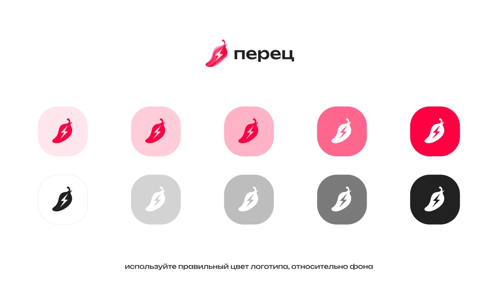
The main accent is a bright red-pink hue, which is associated with energy, dynamics and the very image of pepper. It makes the brand noticeable and helps to quickly read the visual identity of the project.
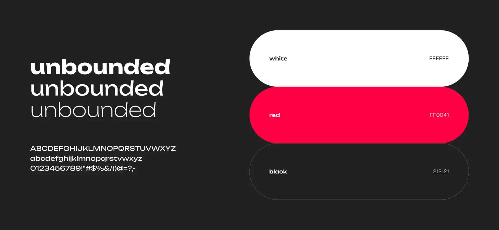
Additionally, options for using it on a light, dark and contrasting background were worked out. This is important for further work with interfaces, advertising, covers, applications and other digital materials.
Modern typography was selected for the project, which goes well with the shape of the logo and the overall visual character of the brand.
The font should have been:
- readable;
- modern;
— soft enough;
— suitable for the digital environment;
— convenient for use in interfaces and advertising materials.
Typography helps maintain brand integrity and makes the visual system more professional.
 Application icon
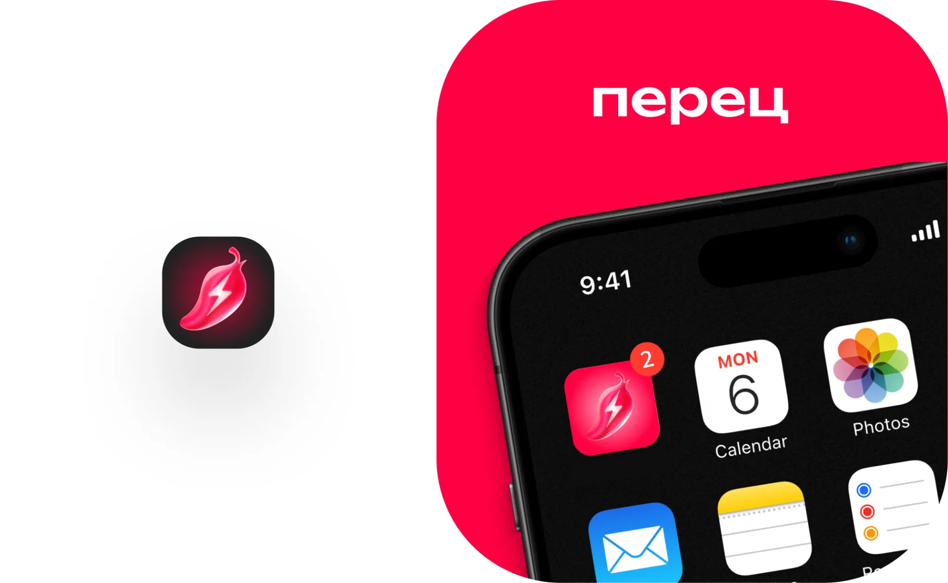
The application icon was specially designed.
For mobile products, this is one of the most important brand elements. The user sees the icon on the phone screen, in notifications, in the application store and inside the interface.
We adapted the logo so that it looks good in a compact format: it retains readability, volume, brightness and recognition.
The icon turned out to be noticeable, clean and well suited for a digital product.
Brand book
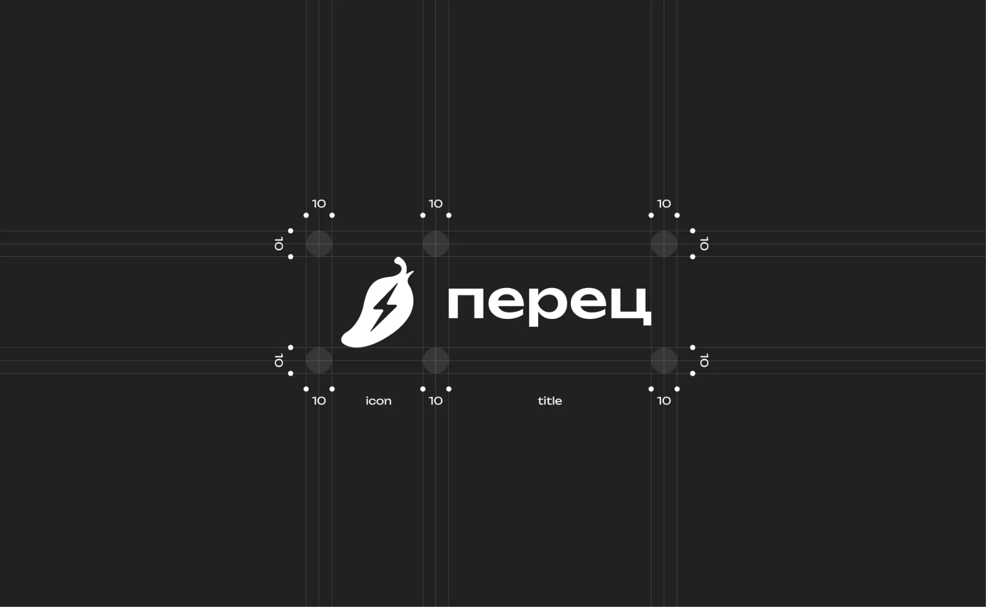
A brand book helps to document the rules for using a corporate identity and maintain the visual integrity of the project.
The document collected the main elements of identity: logo, sign, color palette, typography, application icon, placement options on different backgrounds and visual elements for the digital environment.
This approach helps the brand look consistent across all touch points: on the website, in the application, social networks, presentations, advertising banners and interfaces.
Digital adaptation
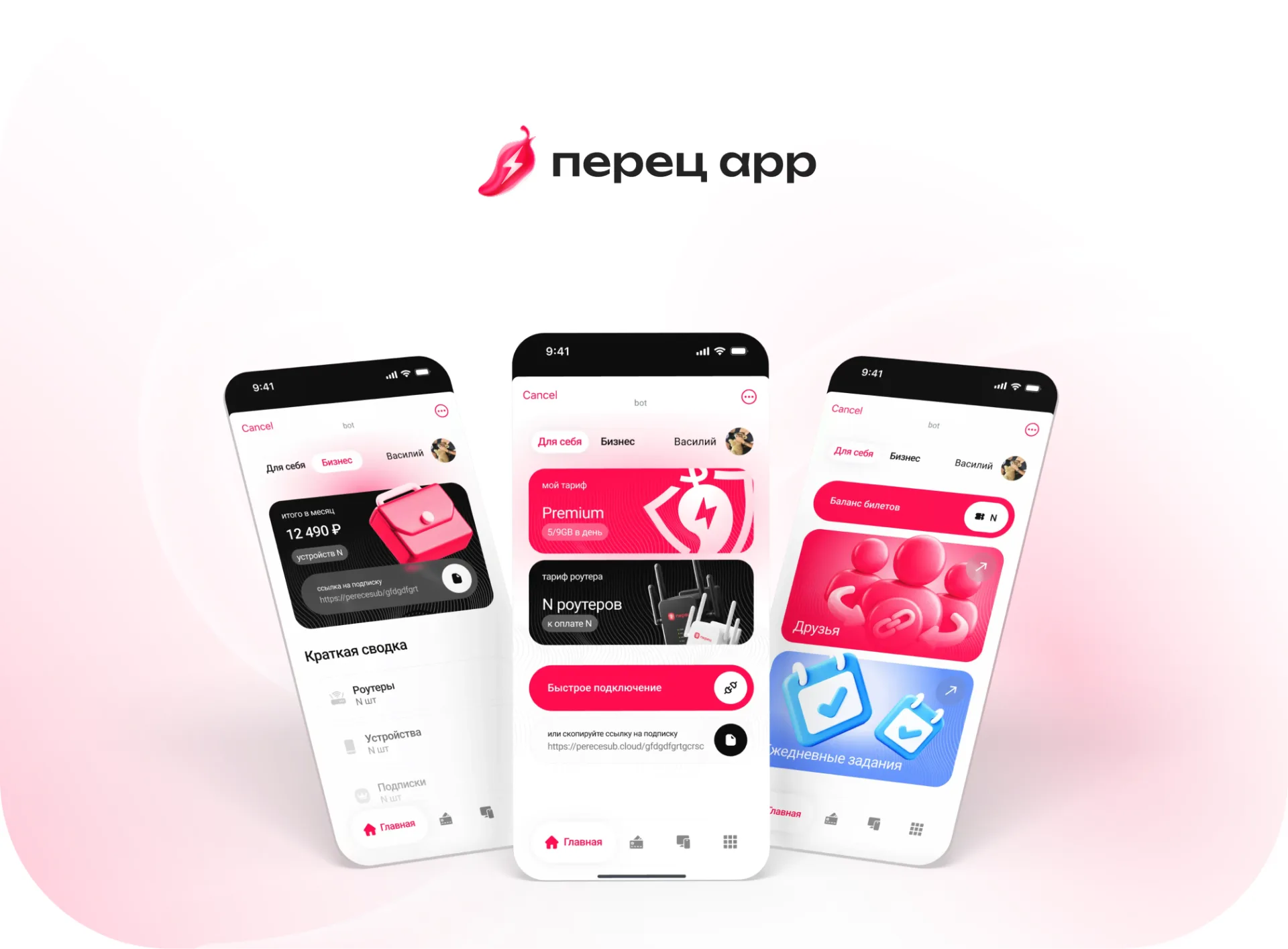
The identity of the Pepper project was initially created taking into account the digital environment.
The logo and branding elements had to work well:
— in the mobile application;
- on the website;
— in interfaces;
— on social networks;
— on advertising banners;
— in presentations;
— in promotional materials;
- on a light and dark background.
This makes the corporate style flexible and convenient for further development of the project.
Result
As a result, a bright, modern and recognizable visual style was developed for the Pepper project.
The project received:
— corporate logo;
- stylized pepper sign;
— a full-fledged brand book;
— color palette;
— typography;
— application icon;
— rules for using the logo;
— options on a light and dark background;
— a visual system for digital media.
The identity turned out to be clean, juicy and flexible. It is well suited for applications, websites, interfaces, advertising and social networks.

Bottom line
The logo and brand book for the Peretz project are an example of how you can create a simple but memorable visual image for a digital product.
We created a corporate identity that is easy to read, scales well and can be used in different formats: from an application icon to a full-fledged advertising campaign.
Such branding helps the project look holistic, modern and recognizable.