

PlatiKa: logo, brand book, and identity for a fintech service
Vasilyev.design case study: sparkle logo, brand book, and visual system for PlatiKa, an international virtual card service. Logo, colors, fonts, website, and app
Platika: spark logo and visual system for international virtual card service
Case study from vasilyev.design studio: development of a brand name, logo, palette, typography and brand book for PlatiK - and scaling the identity for card design, application, website, social networks and advertising materials.
The payment service sells something that cannot be touched: a virtual card exists only on the screen. The whole burden of the first impression falls on the design. PlatiKa helps you pay for foreign services - from Steam and PlayStation to ChatGPT Plus, Netflix and Airbnb - with a card that is issued in two minutes. We have built a visual system for the service, in which a brand is created not by one picture, but by a working set of rules: from the sign in the favicon to the landing page and photo style.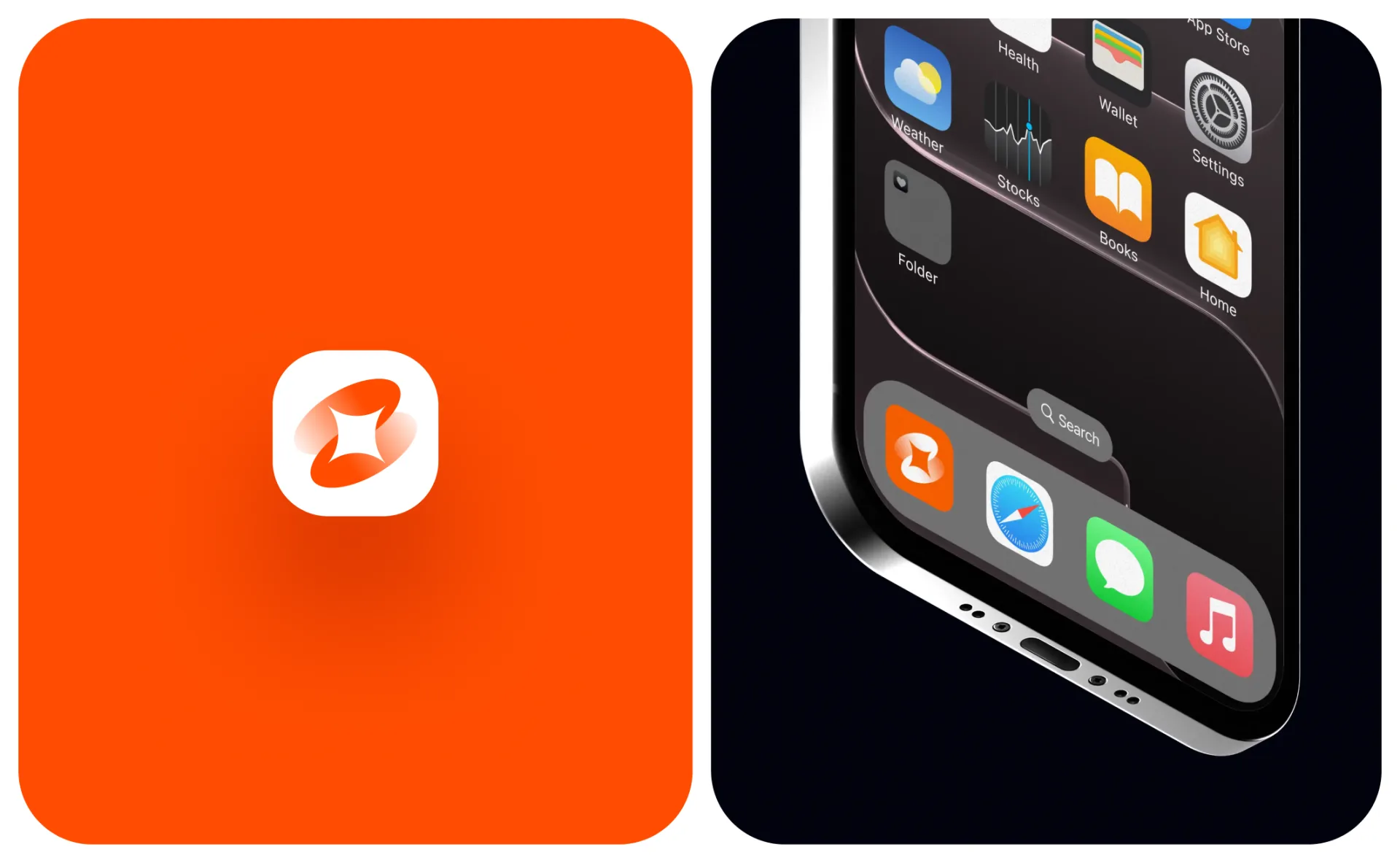
Sign: payment spark
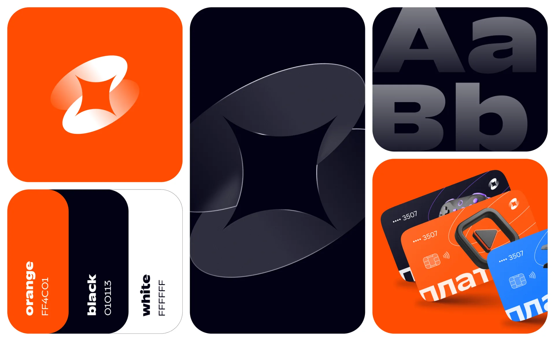
The identity is based on a dynamic spark sign. The four-pointed star, familiar to everyone from the glare on a bank card and the animation of a successful payment, is placed between two arcs twisted around the center. The form can be read in several ways:
- spark— the moment of payment, that “blink” when the payment went through;
- coin in motion— the rotation of the arcs creates a feeling of turnover of funds;
- flash of speed— the card is issued in two minutes, and the sign conveys this instantaneity.
The arcs are made with a gradient - from dense orange to transparent white - which adds volume and rotational energy to the sign even in static conditions. At the same time, the silhouette is built on simple geometry: the star remains recognizable in the favicon, application icon and on the chip card.
The sign is designed as an independent unit: in the brand book, its own security field is recorded for it according to the modular grid “10” - the same as for the full version of the logo.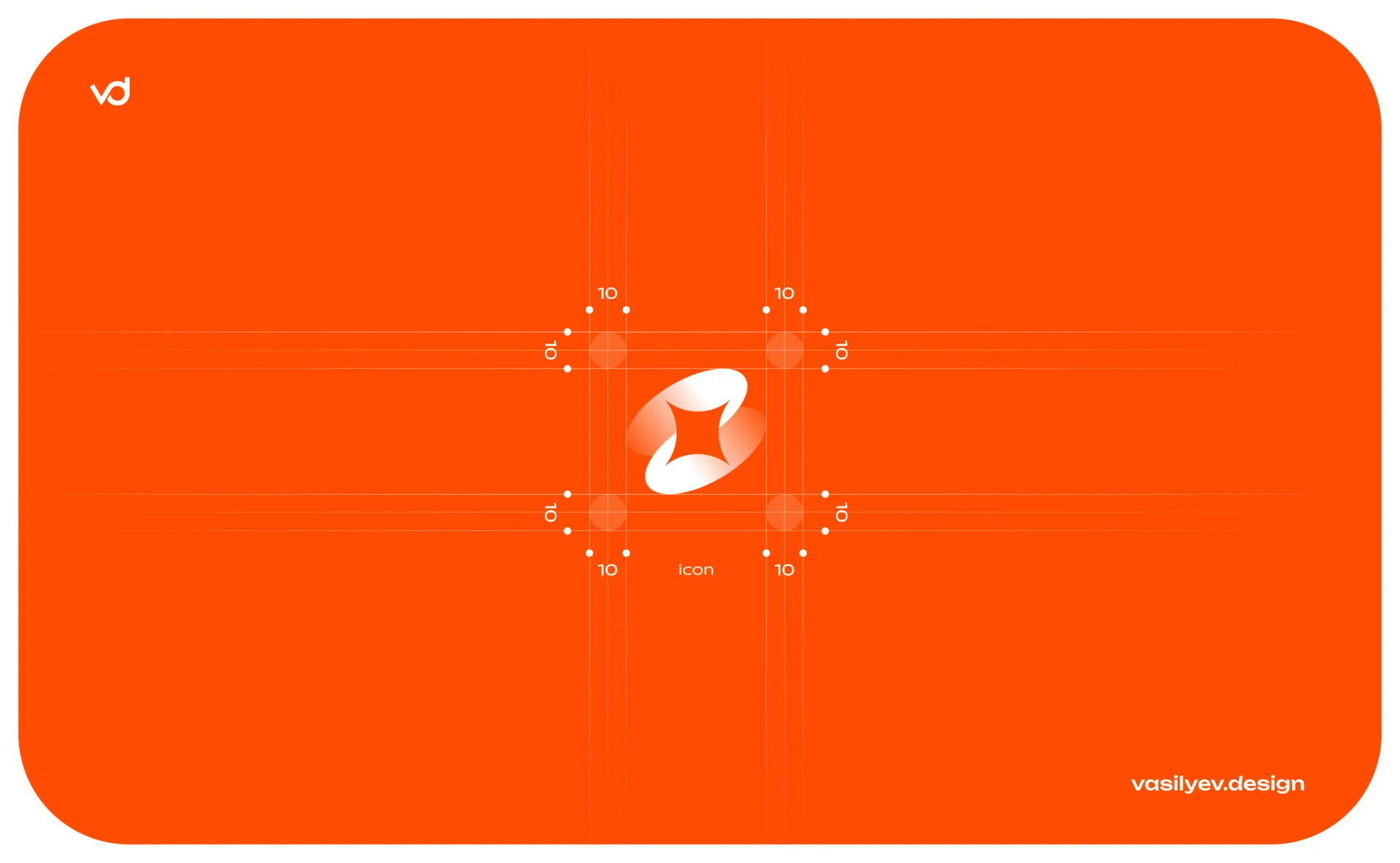
Logo: “pay” + “Ka”
The font part is a lowercase “platik” style in a wide bold sans serif. The name works like a small slogan: it contains the verb “pay” and “Ka” - card. The design of the media enhances this play: on virtual cards, the syllable “Ka” is highlighted in signature orange, turning the name into a call to action.
The full lock-up - the sign on the left, the name on the right - is built on the same “10” grid: the security fields around the icon and text are defined by modules and do not allow extraneous elements. For places where the text does not fit, a separate sign is used: application icon, favicon, chip zone of the card, social network avatars.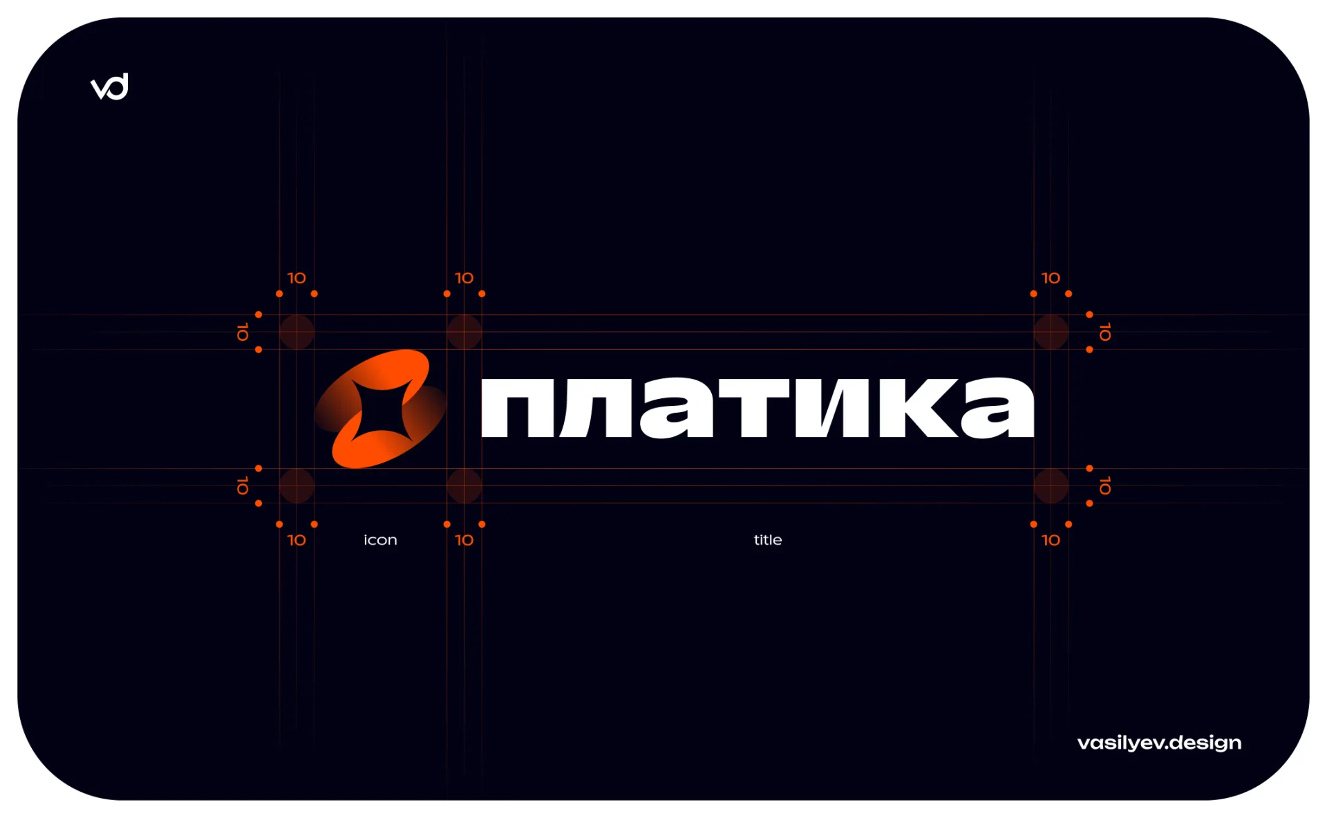
Palette: orange, which cannot be confused with a bank
The fintech market is flooded with blue. PlatiKa consciously moves away from the “banking” range to an energetic three:
#FF4C01Main brand identifier: backgrounds, buttons, accents, syllable “Ka”Black#010113Dark app theme, premium media, White text#FFFFFFLight surfaces, inversion of the sign, air in the layoutsCorporate black is not neutral#000000, and deep blue-black#010113: against its background, the orange spark burns especially brightly, and the dark theme of the application does not look “turned off”. At the same time, orange remains bold, but manageable: the brand book captures the “sign × background” matrix - from light peach bases to clean#FF4C01and complete darkness, with a separate monochrome ruler for gray surfaces. There is only one rule: use the correct color of the logo relative to the background - and it removes subjectivity for any contractor.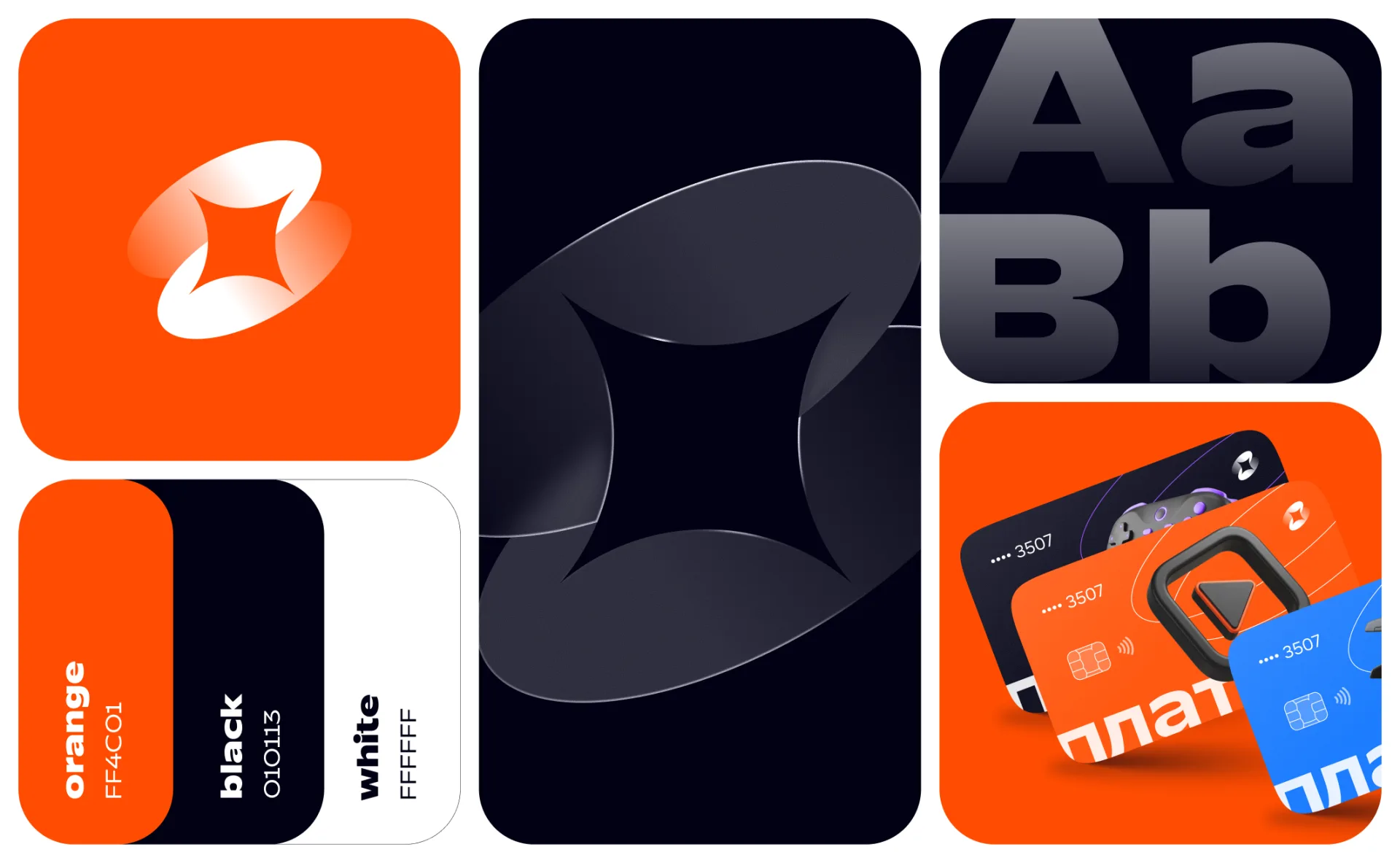
Typography: TT Runs + Geologica
The font system is built on a pair:
- TT Runs— header font: wide, dense sans serif with the character of a sports number on a T-shirt. He keeps big pins on the landing page (“Pay with Steam”, “Instant card issue from anywhere in the world”) and gives the brand a boost.
- Geologica— a workhorse for text and interfaces: neutral, highly readable sans serif with full support for the Cyrillic alphabet. It contains map descriptions, guide steps, FAQ and legal blocks.
The contrast of the pair - a loud headline and calm text - creates a rhythm that is recognizable on any medium: from a card in the App Store to a guide “How to pay for ChatGPT Plus.”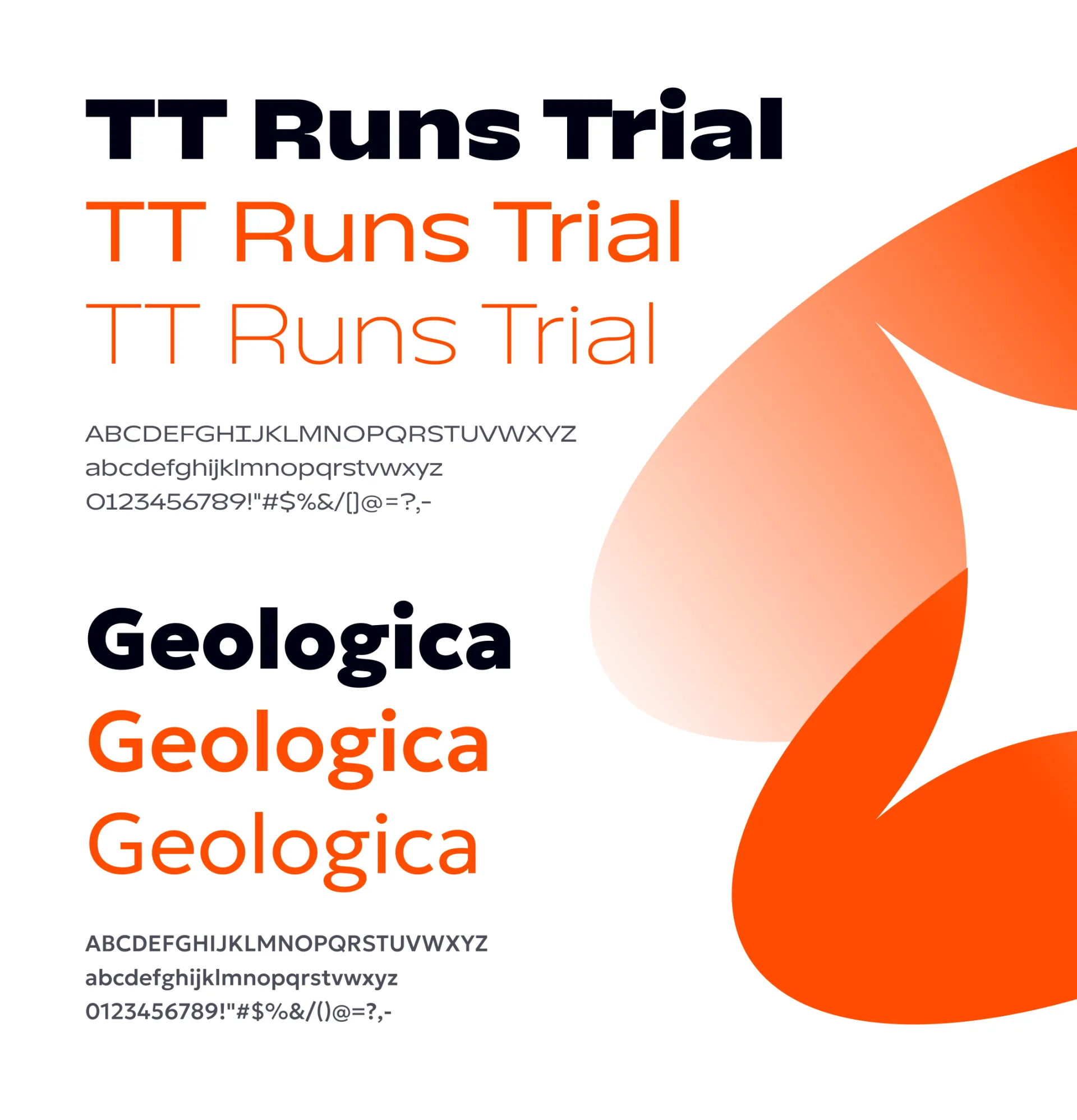
Design of virtual cards: three lines - three characters
PlatiKa cards are not abstract “plastic”, but product lines tailored to user scenarios. For each, we developed our own design with a 3D scenario icon:
- Subscription card— branded orange background and three-dimensional Play button: Netflix, Spotify, YouTube Premium, ChatGPT — 50+ international subscriptions.
- Card for games- deep black
#010113with a gamepad in purple accents: Steam, PlayStation, Xbox and 100+ game services. - Travel card— blue background with an airplane, passport and geotag: Booking, Airbnb, air tickets and shopping around the world.
Common elements unite the rulers into a family: a large inscription “payКа" with an orange syllable, a spark sign in the corner, an NFC chip and waves, a masked number "•••• 3507", a thin orbital line around a 3D object. The card remains recognizable in the application, in promos and in the user’s hands in photographs.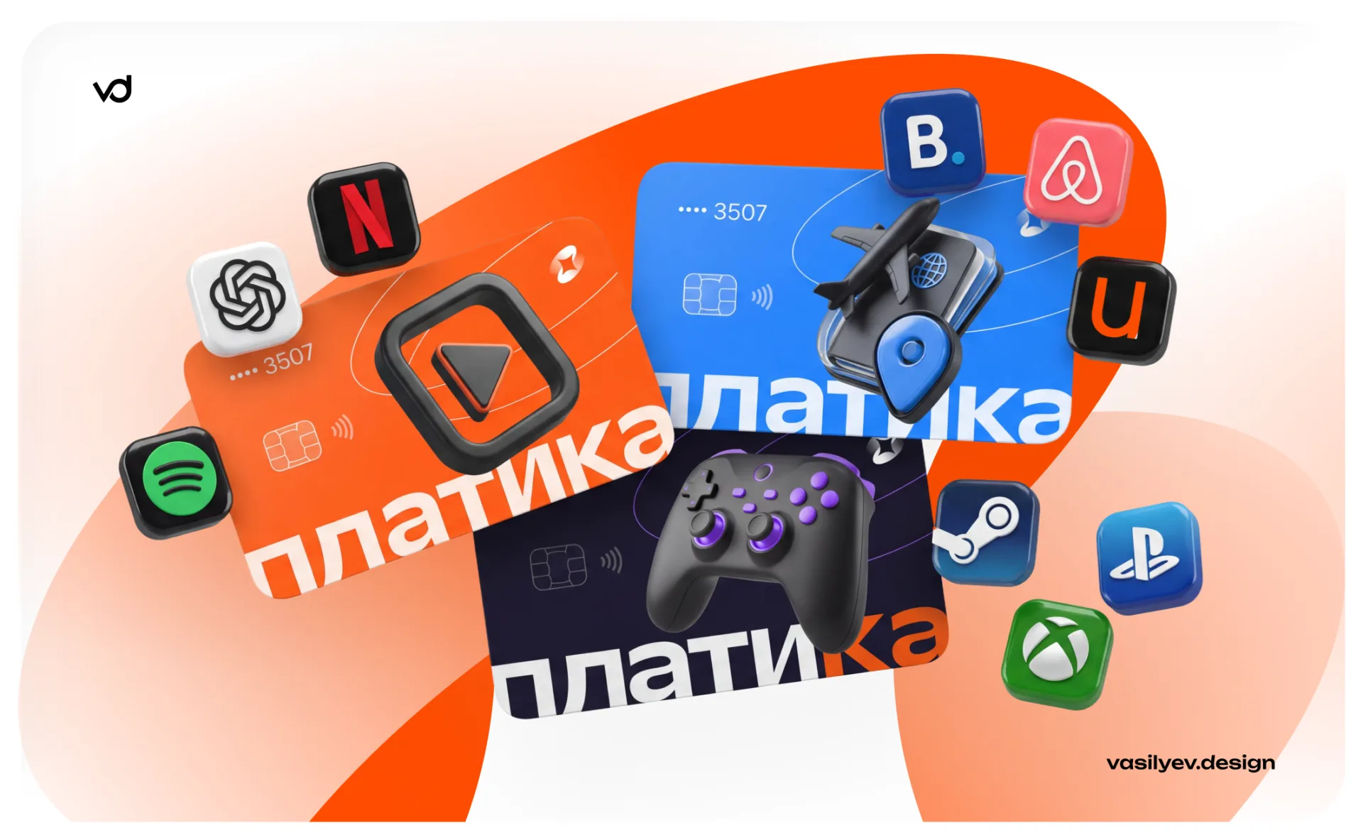
Addendum: dark theme and starring sparkle
The interface is assembled in a dark theme on corporate black: card categories with 3D covers, a selection of “Cards for You”, icons of supported services right in the list. Even the service screen “Technical work in progress” works for the brand: a large spark in the center, a “Write to support” button and a link to PlatiKa’s Telegram channel - the service situation has been turned into a point of contact, and not a dead end.
The application icon was tested in both versions - the sign on the orange plate and the inversion on the white one - in a real context: on the iPhone home screen next to system applications and in the App Store card (category “Finance”).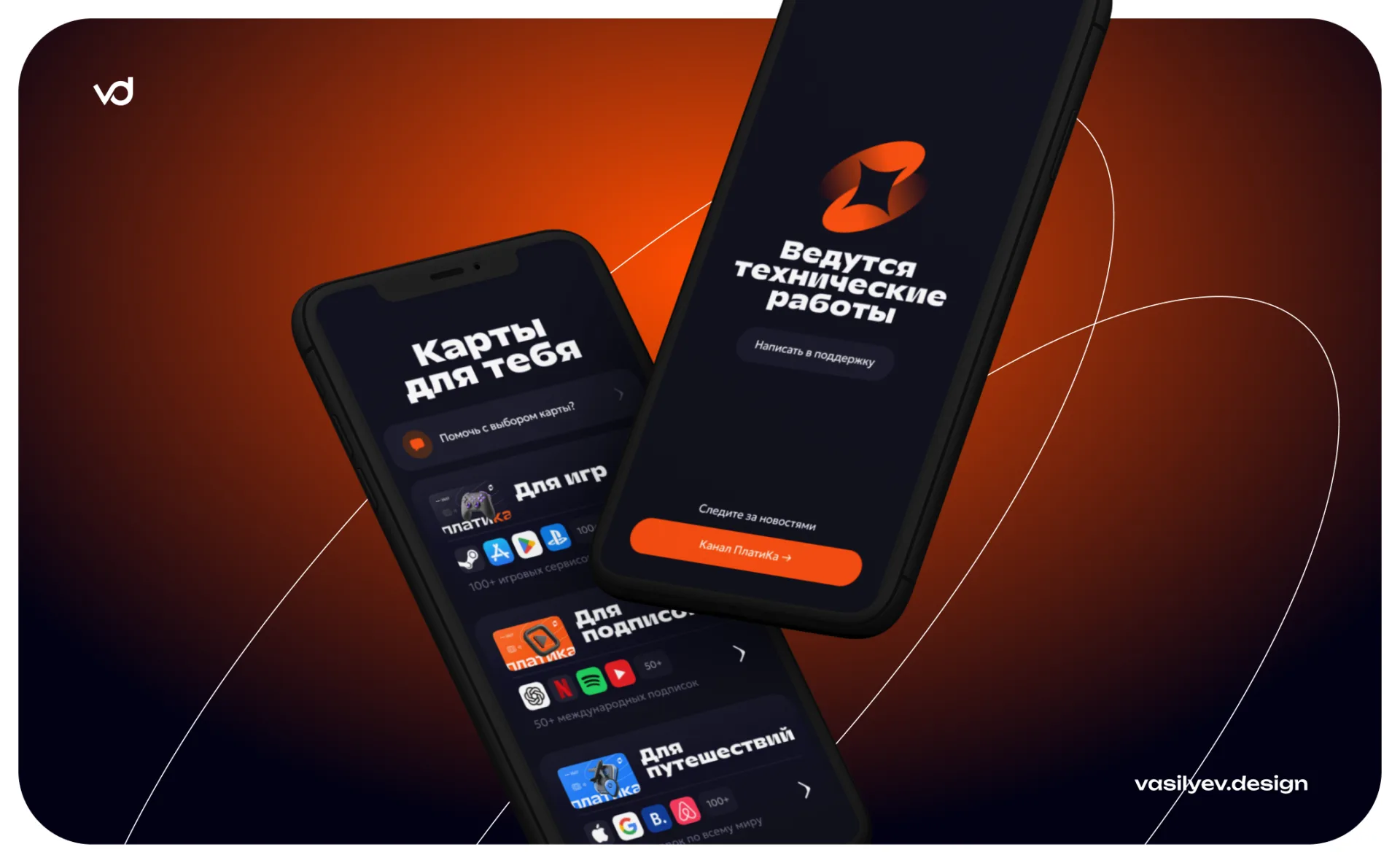
Website: landing pages that sell and guides that drive traffic
The web part of the system is not one landing page, but a bunch of pages for different tasks:
- Product landing pages— “Pay by Steam” with the “Issue a card in 2 minutes” button, blocks of benefits (0 ₽ for service, replenishment via SBP and cryptocurrency, transparent conditions without hidden fees) and a bento grid of possibilities: RUB → USD rate before confirmation, Apple Pay / Google Pay immediately after issue, 24/7 support.
- SEO guides— pages in the format “How to pay for ChatGPT Plus”: step-by-step instructions from seven cards (open the card in Telegram, top up the balance, turn on the VPN, go to subscription, enter data, confirm the operation, check the status), a recommended card with tariffs, a 30-day payment counter and a detailed FAQ. Such pages collect information traffic and convert it into card release.
Navigation follows lines (“Map for games”, “for subscriptions”, “for travel”, “Compare maps”) - the structure of the site follows the product logic, and the user gets to the desired scenario in one click.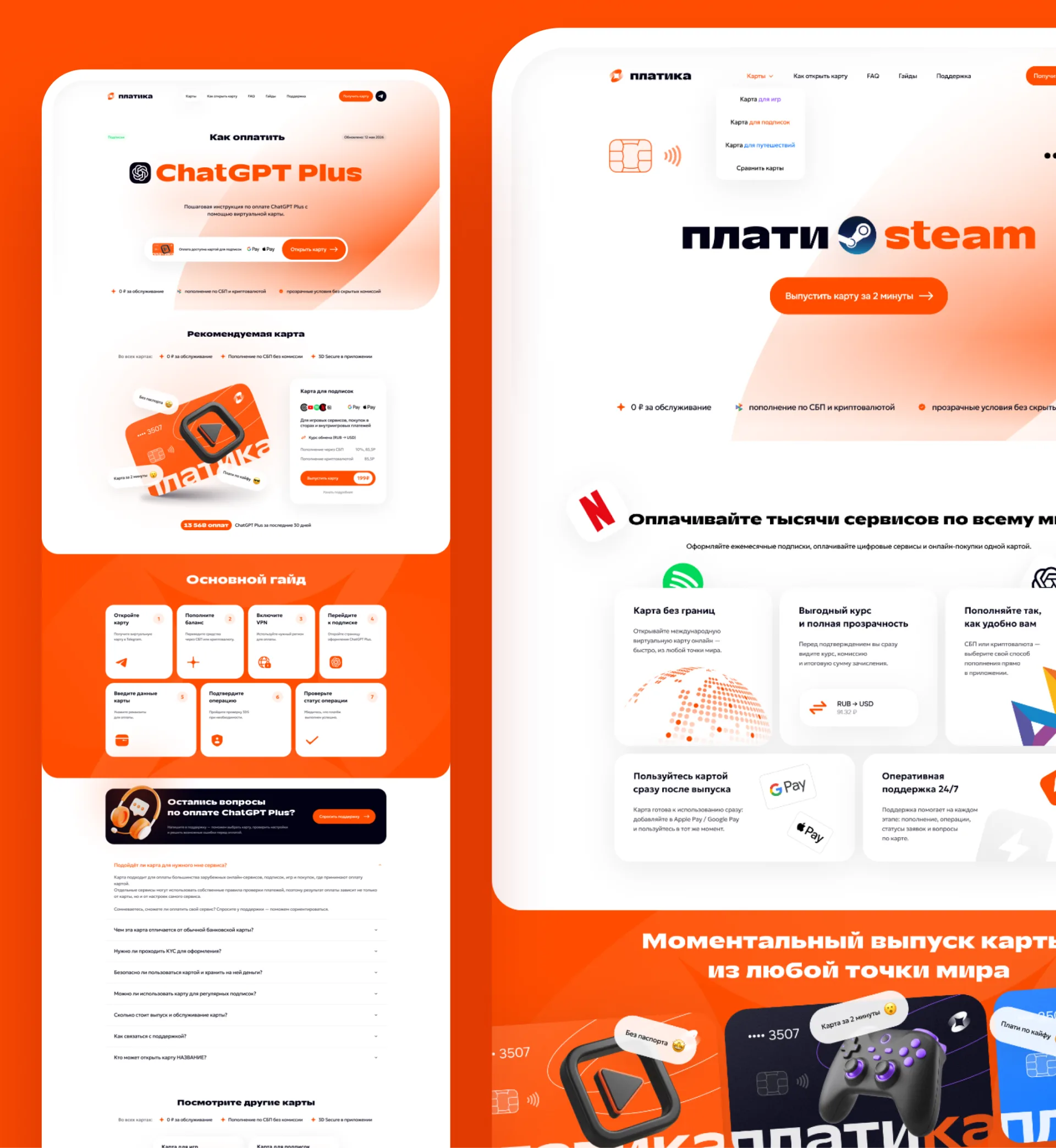
Corporate graphics, pattern and photo style
From the sign a pattern grew - a rhythmic series of rotating sparks that covers large surfaces: covers, social media headers, banner backgrounds. Enlarged petals of the sign are used as abstract background graphics on the cover of the brand book and promotional pages.
The photographic style is also subject to the system: subject shootings with orange shoppers and lifestyle shots, where a map and phone with an application are included in the frame along with the corporate color in the props. Even 3D service icons (Netflix, Spotify, Steam, PlayStation, Booking) are designed with single rounded tiles - third-party brands are integrated into the composition without destroying it.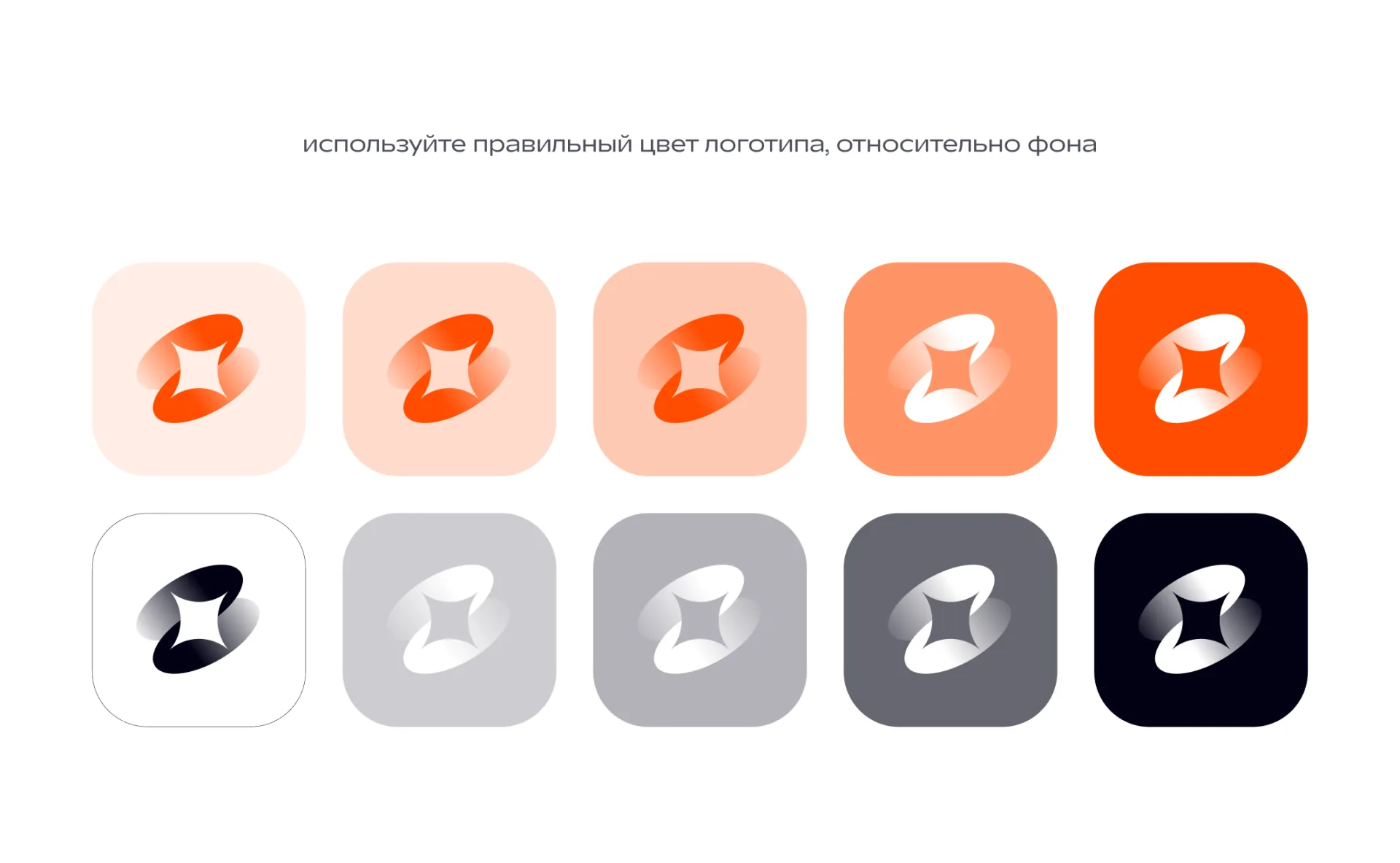
Brand book: rules that protect the brand
Everything is collected in a guide to using a corporate logo:
- Construction of a sign and full logo, modular grid, security fields “10”.
- Palette with HEX codes:
#FF4C01,#010113,#FFFFFF. - Sign × background matrix: color and monochrome versions for ten background gradations.
- Typography: TT Runs for headings, Geologica for text.
- Pattern and corporate graphics from the elements of the sign.
- Adaptations: iOS icon, App Store, card design, application screens.
The brand book makes the system reproducible: a new banner, story or website page is assembled from ready-made constants - without “creative interpretation”, which blurs the brand.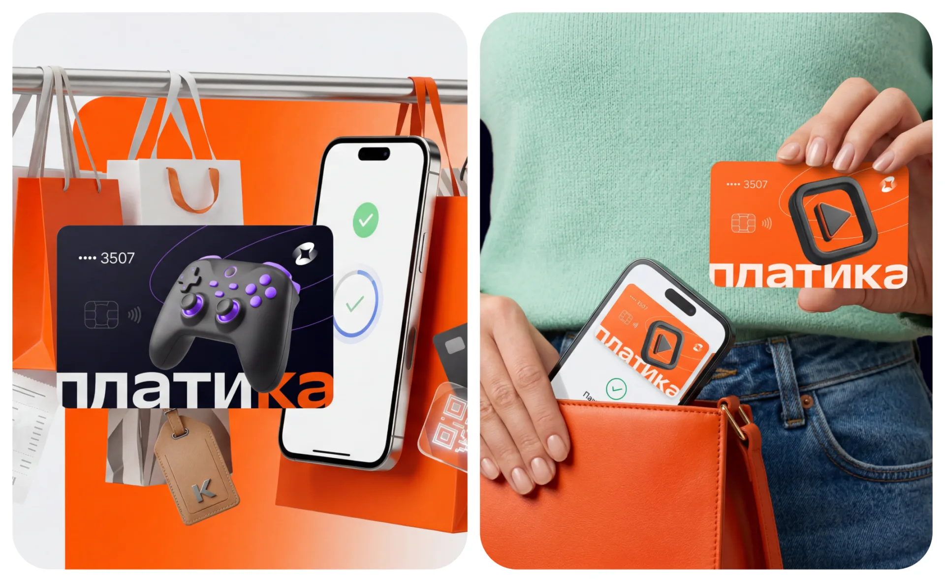
Why does it work
- Differentiation.The orange sparkle on blue-black instantly makes PlatiKa stand out among the blue fintech brands - in the store, in the feed, in search.
- A system, not a picture.One sign generates an icon, a pattern, a map, a technical work screen and a photo style - all touches speak the same language.
- Design related to marketing.SEO guides and product landing pages are built into the visual system, so traffic lands on a recognizable brand and not on faceless instructions.
- Ready for growth.A new line of cards or a new channel is added according to the rules of the brand book - without involving a studio for each layout.
Result
PlatiKa received an identity at the level of an international fintech product: a spark sign that can be read from the favicon to the exterior, a daring and disciplined palette, a font pair with character and a brand book that keeps the system in good shape. This is an example of an integrated approach, where the brand of a digital product is not a logo on a white sheet, but the environment in which the user lives: map, application, website and every point of contact.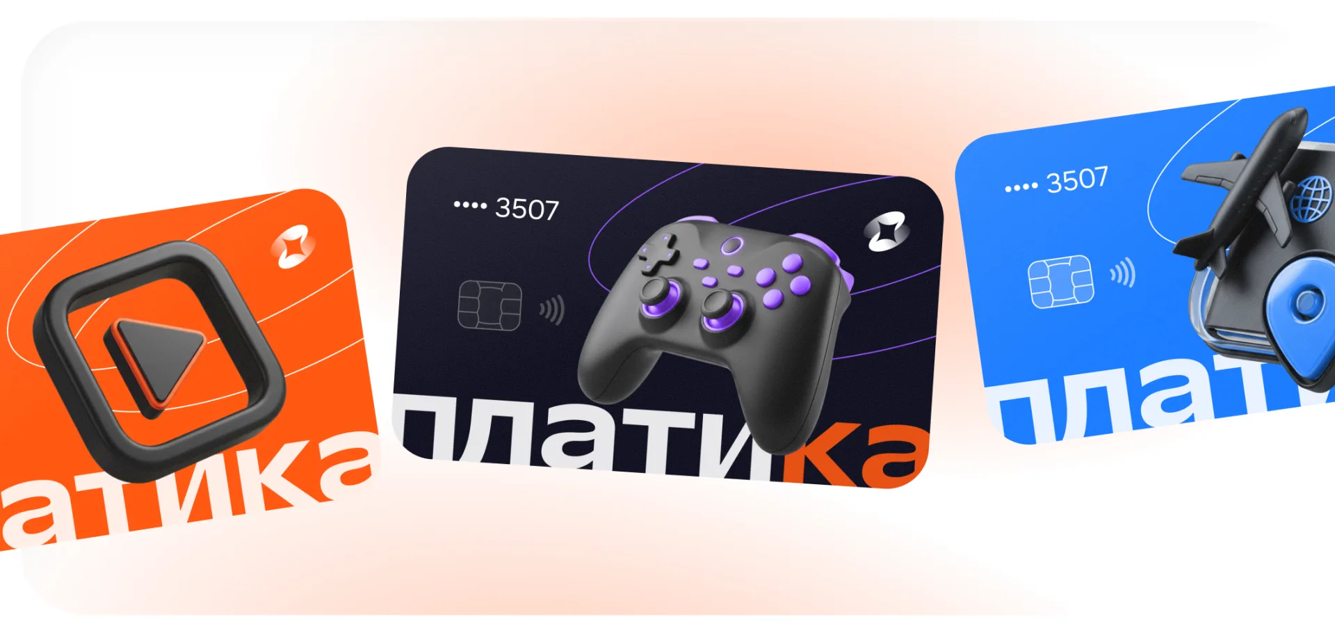
FAQ: fintech service identity
Why was orange chosen for the payment service and not the “reliable” blue?Blue in fintech is no longer a differentiator - everyone has it. Orange#FF4C01PlatiKa stands out in the store and feed, and trust is ensured by the discipline of the system, neat typography and transparent interfaces.
How is a visual system different from a logo?The logo is one element. The system is a sign plus colors, fonts, pattern, card design, media templates and rules for their use. It is the system that ensures recognition in all channels.
Why does each line of cards need a separate design?The map is a showcase of the scenario. The user selects “for games”, “for subscriptions” or “for travel” in a second, based on the cover - just like choosing a playlist. Common elements keep the family within one brand.
What does security field “10” record in the brand book?The minimum space around the sign and logo, a multiple of the grid module. Text and graphics are prohibited inside the field - this preserves the readability of the logo in any layout.
Is it possible to scale an identity without a studio?Yes - this is the meaning of the brand book: new banners, pages and materials are assembled from the described constants. The studio is needed for the development of the system, and not for each layout.
Are you planning to launch or rebrand a financial service? The vasilyev.design studio develops turnkey logos, corporate styles and brand books for digital products - write to us.