

Website design for PlatiK: how we packaged the virtual card service
Case: website design for the fintech service PlatiKa - virtual cards for paying for foreign services. Structure, identity, 8 page types, UI kit, mobile version
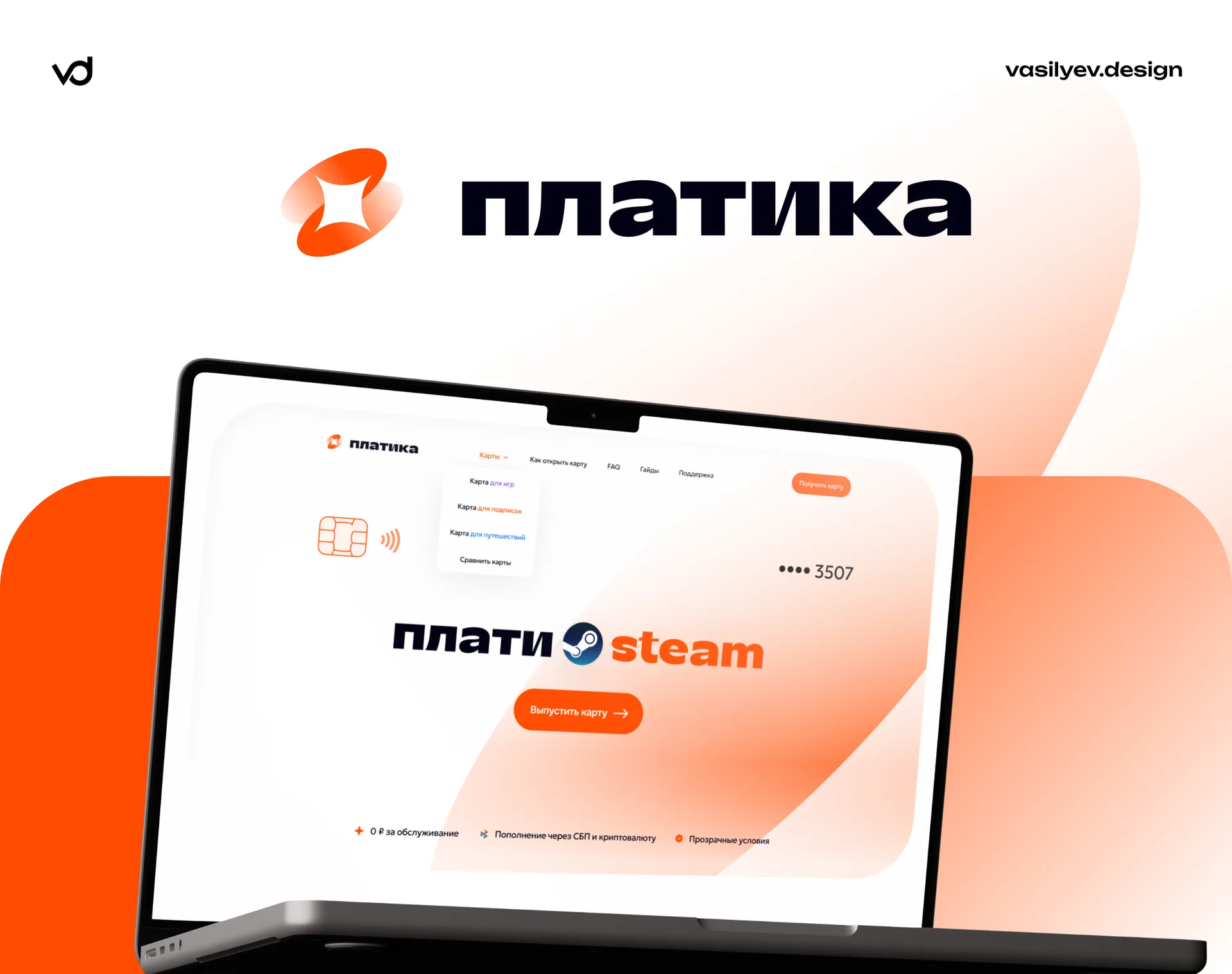
Context: why did this product need a website
PlatiKa issues international cards that can be used to pay for Steam, Netflix, ChatGPT Plus, Google Play, Booking, Spotify, Airbnb, Uber - a total of thousands of services that are not available for direct payment with local cards.
The product then falls into an area that is inconvenient for marketing. On the one hand, there is fintech: people are afraid to enter data, give money, or link a card to an account. On the other hand, there is a rather narrow practical task: the person came not to “choose a bank”, but to solve a specific problem like “I can’t renew my subscription to ChatGPT.”
Hence the main design task: remove mistrust and bring a person from his specific pain to the release of the card as quickly as possible. The site had to simultaneously work as a selling landing page, as a reference book and as an SEO attraction channel.
Goals that we set at the start
Explain the product in one screen. A person must understand what it is and why, without scrolling and without financial jargon.
Lead the audience into scenarios. The gamer, traveler and streaming subscriber come with different questions - and should not read other people's.
Remove objections before they will sound. Tariffs, conditions, hidden fees, “is this legal”, “and if it doesn’t work” - all this should be on the surface.
Build an SEO foundation. The main search traffic in this niche is queries like “how to pay for [service]”. This means that the site needs a scalable guide template.
Lay a system, not a set of pages. The product adds new maps and services constantly - the design does not have to be redesigned for each update.
Research and work with the structure
We analyzed the competitors in the niche and saw a recurring problem: almost all virtual card service websites are designed as one long landing page. Everything falls out on the user at once - tariffs, instructions, and a list of supported services. As a result, the page does not accurately answer any search query and converts all segments equally poorly.
We went from use cases. We divided the audience into three cores:
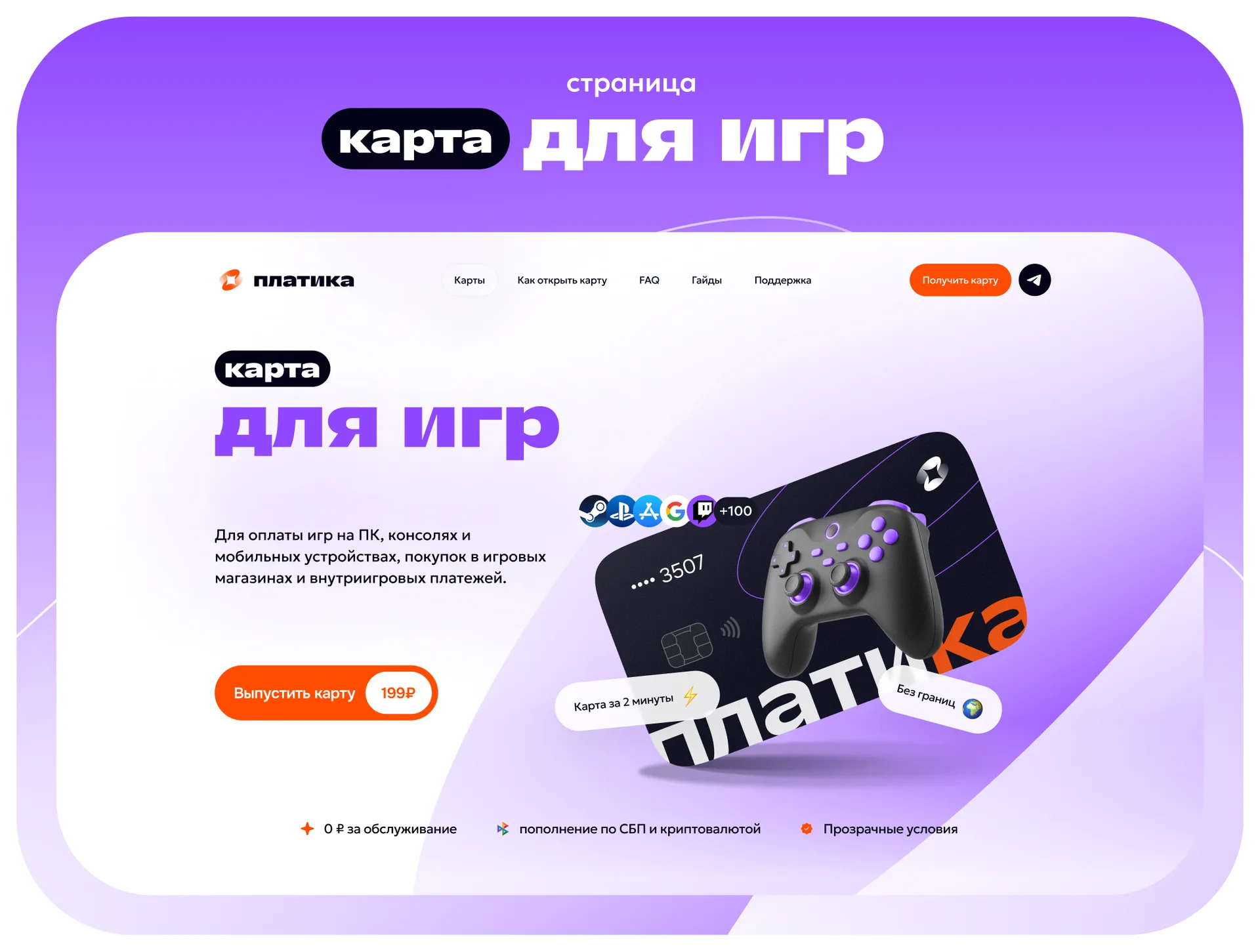
Games - purchases on Steam, in-game payments, subscriptions on consoles, mobile stores.
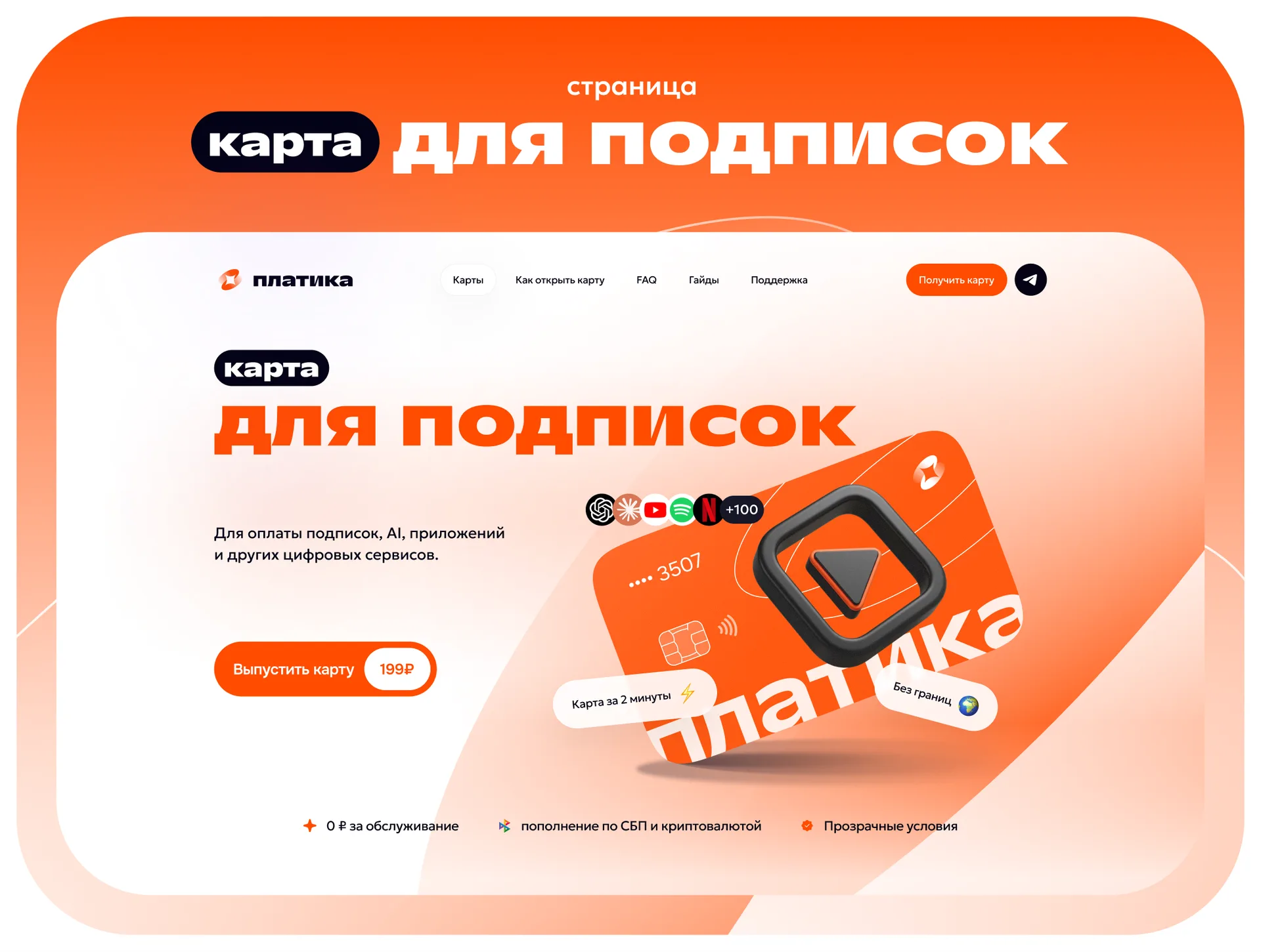
Subscriptions - streaming, AI services, clouds, software according to the model SaaS.
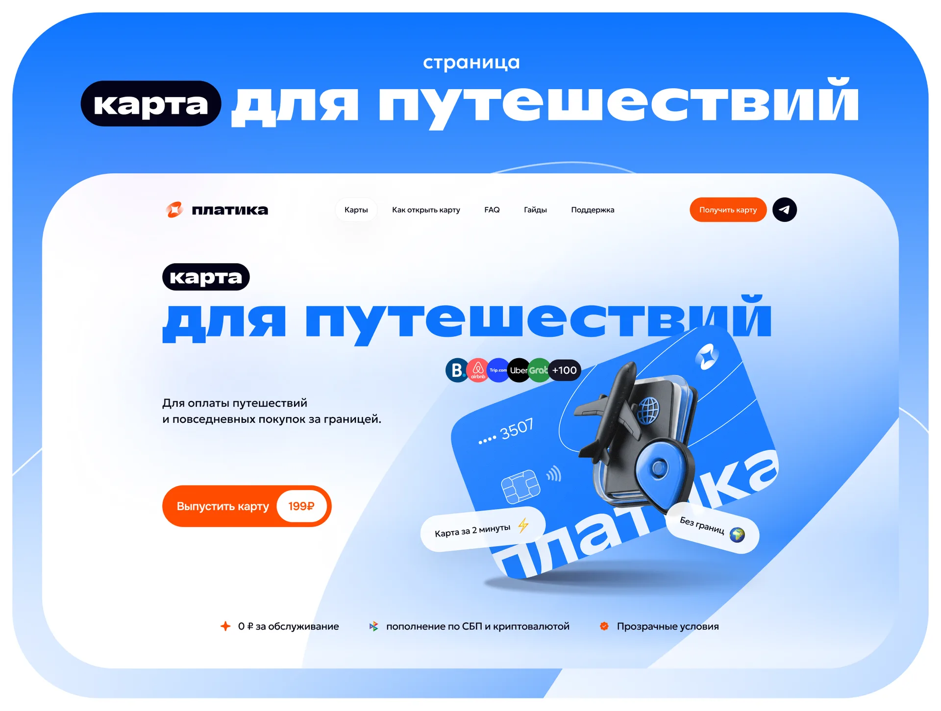
Travel - accommodation booking, air tickets, car rental, everyday shopping abroad.
Each scenario has its own product page with its own argumentation, its own set of logos of supported services and its own map display. The general structure and logic are preserved: the user who switches between pages is not retrained.
Final site map:
Home
Map for games
Map for subscriptions
Map for travel
Guide catalog
Guide page (template) + its SEO version
Support
Service pages
Identity: what trust looks like in orange
Logo
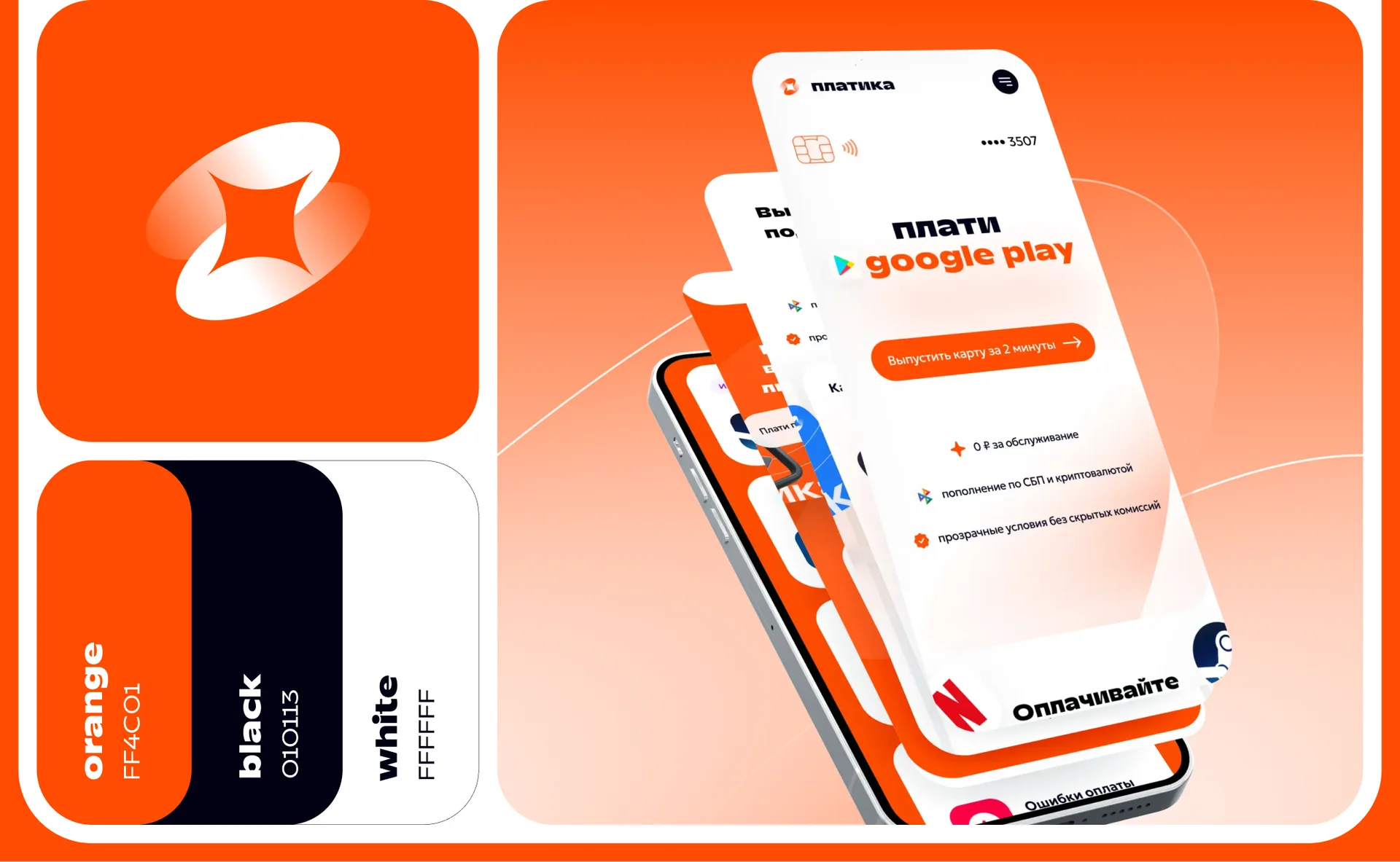
The sign is a rounded square with a carved four-ray shape inside. It can be read in two senses at once: as a stylized map and as a “plus”/connection point. The form works consistently both in a small favicon size and as a large pattern - from a repeating sign we have collected a proprietary texture for decorative blocks.
Color
The basis of the palette is rich orange, deep almost black and white. Orange represents energy and call-to-action, black represents the “seriousness” of a financial product, white represents air and readability.
A separate solution is color coding of scenarios. Each product line received its own accent:
orange - subscriptions (basic branded),
-
blue - travel,
purple - games.
This gives the user an instant navigation hint: by the color of the screen it is clear which page he is on, and map cards are recognizable in any block of the site, including the “see others” link cards.”
Typography
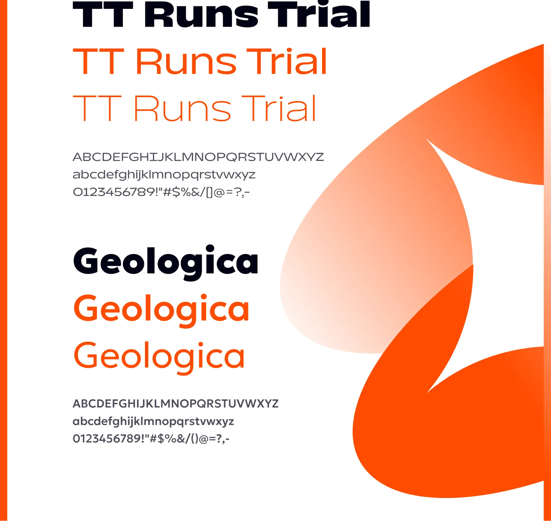
Font pair TT Runs + Geologica. TT Runs, with its dense, wide headers, gives the right volume in the hero blocks and acts as the voice of the brand. Geologica is responsible for the interface and long text arrays - it has a wide range of styles and good readability in small fonts, which is critical for pages with tariffs, conditions and step-by-step instructions.
3D graphics
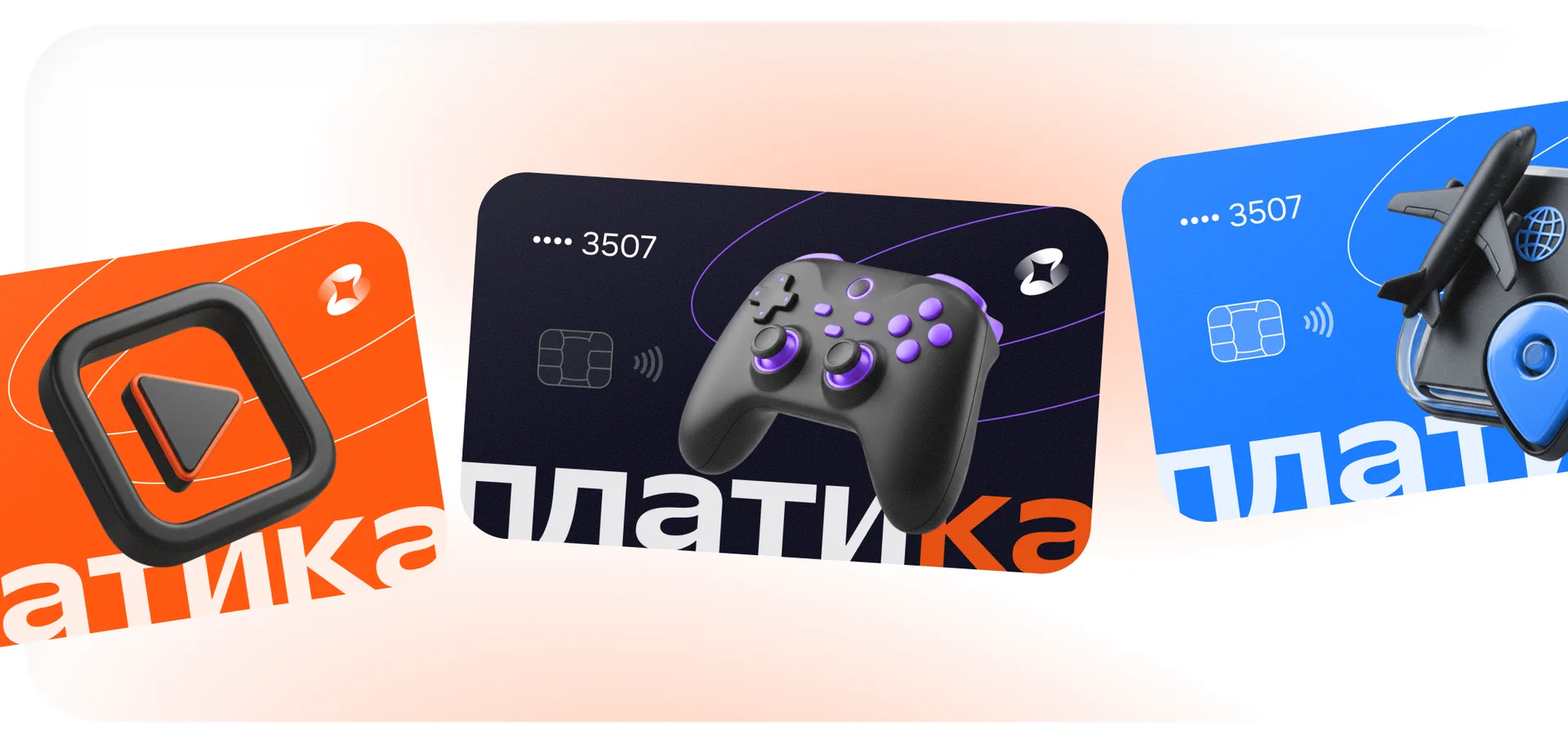
The key visual technique is cards with three-dimensional objects “stuck” to them: a gamepad for a game card, a VR helmet and globe for travel, a play icon for subscriptions. This solves a completely practical problem: the user understands the purpose of the card without reading the text. Plus, three-dimensional objects draw out the composition - without them, a screen of flat cards would look ordinary.
Home page
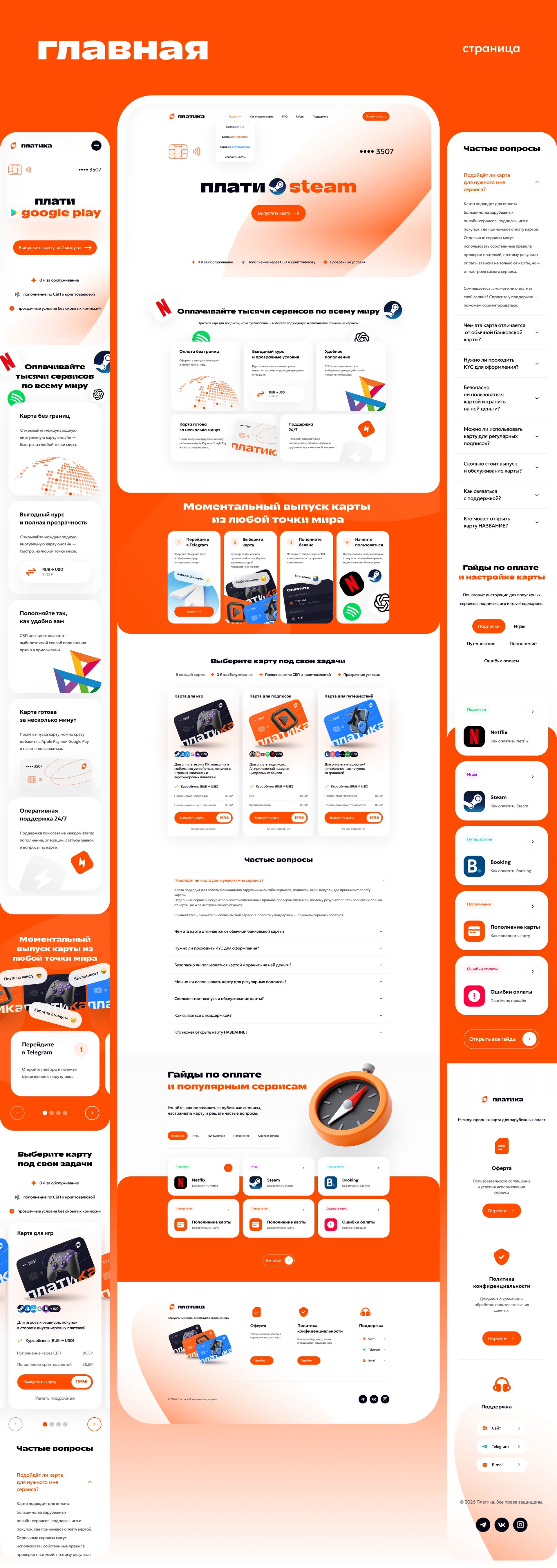
The first screen is built around a dynamic offer: the “pay → [service logo]” design cycles through Steam, Netflix, ChatGPT and other popular services. In two seconds, a person receives an answer to the question “what’s going on here” - without abstract formulations about “financial solutions of a new generation.”
Then the page works through the objections in order:
“Pay for thousands of services around the world” - bento-grid with key advantages: geography, speed, support, replenishment methods. The tile format allows you to give different weights to different arguments without turning a block into a boring list of six identical icons.
“Instant card release from anywhere in the world” - a four-step process on a contrasting orange background. The block answers “how long will it take” and “what do I even need to do.”
“Choose a card for your tasks” - a showcase of three cards with prices and a short comparison. This is the main distributor of traffic: from here a person goes to the product page he needs.
FAQ accordion — questions about legality, commissions, payment refusals, support.
Guides block — an entrance to the help section, which at the same time deters a user who is not ready to buy directly now.
Product pages: three cards, one frame
All three pages are assembled on one modular frame:
Hero with card name, key benefit, release button and 3D visual of the card.
“Suitable for payment” - a dense row of service logos. The fastest way to answer the visitor's main question: “does my service work for you?”
Advantages - 3-4 arguments specific to this particular scenario.
Tariffs and conditions - openly, in numbers, without footnotes in small print. In fintech, trying to hide a fee costs more than the fee itself.
Issue process - the same four steps on a colored background.
FAQ - questions specific to scenario.
“Look at the other cards” — linking within the product line.
Modularity here is not about saving the designer’s time, but about the fact that the product can launch the fourth and fifth cards independently, by assembling a page from ready-made ones blocks.
Guides section: the main SEO asset of the site
People in this niche almost never search for a “virtual card”. They are looking for “how to pay for ChatGPT Plus”, “how to renew Netflix”, “how to top up Steam”. We designed the section so that the site could cover these requests with hundreds of pages.
Guide Directory
A grid of service cards with logos, filters by category (streaming, games, AI, travel, marketplaces) and search. The catalog solves two problems: it gives the user quick access to the necessary instructions and creates the correct structure of internal links for indexing.
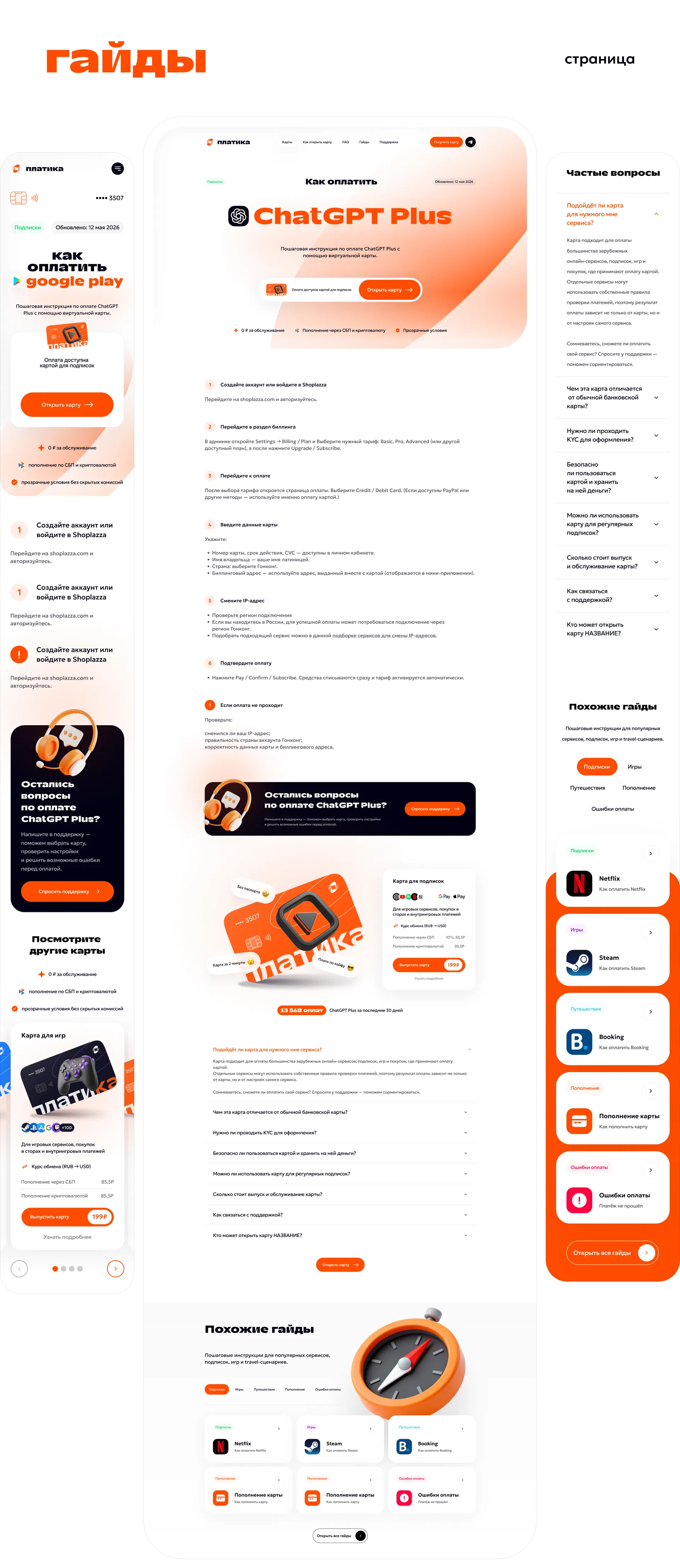
Guide page template
Three-column composition:
Center — step-by-step instructions with numbering, screenshots and tips for complex steps.
Right sidebar — “Frequently asked questions” for a specific service and the “See others” block cards.”
At the bottom is a support banner (“Do you still have questions about paying for ChatGPT Plus?”) and a block of similar guides.
We worked separately on conversion point inside the content : the “Recommended Map” block is built right into the instructions, where the person already understands the process and is ready to act. A classic mistake in help sections is to give the user an answer and let him go without an offer.
SEO version of the guide page
For priority search queries, we made an expanded version of the template: additional text blocks, a featured map block at the top, a “Main Guide” in the form of a tiled grid of steps, an expanded FAQ, additional linking to maps and other guides.
The point is that a page for search traffic and a page for a user who came from the menu are different tasks. The first one needs volume, semantics and internal links. The second is speed and a minimum of unnecessary things. Instead of a compromise that loses both ways, we made two templates based on a common design basis.
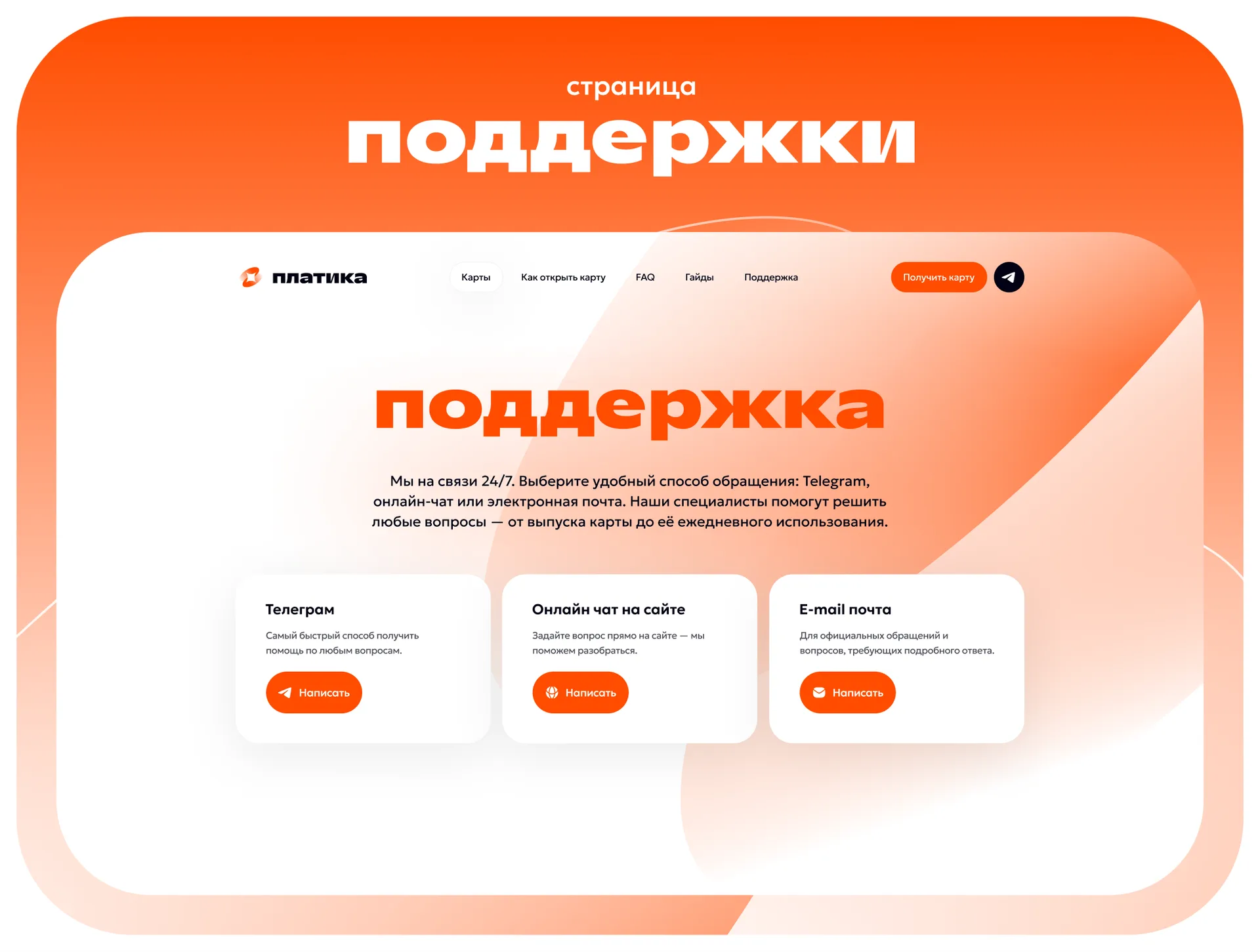
Support Page
Three channels - Telegram, online chat on the website and mail - are presented in separate equivalent cards indicating what each is suitable for and how quickly they respond. In a fintech product, visible, accessible support is not a service section, but a selling element: it directly reduces the fear “if something goes wrong, I won’t have anyone to write to.”
Mobile version
All pages are designed separately in the mobile version, and are not “compressed” from the desktop. Key solutions:
benefits and card grids turn into vertical stacks and horizontal carousels;
rows of service logos fold into a compact dense grid;
key card release button duplicated as you scroll;
long tariff tables are reformatted into lists of parameter-value pairs;
sidebar FAQs are moved to the main stream in the form of accordions.
UI kit and transfer to development
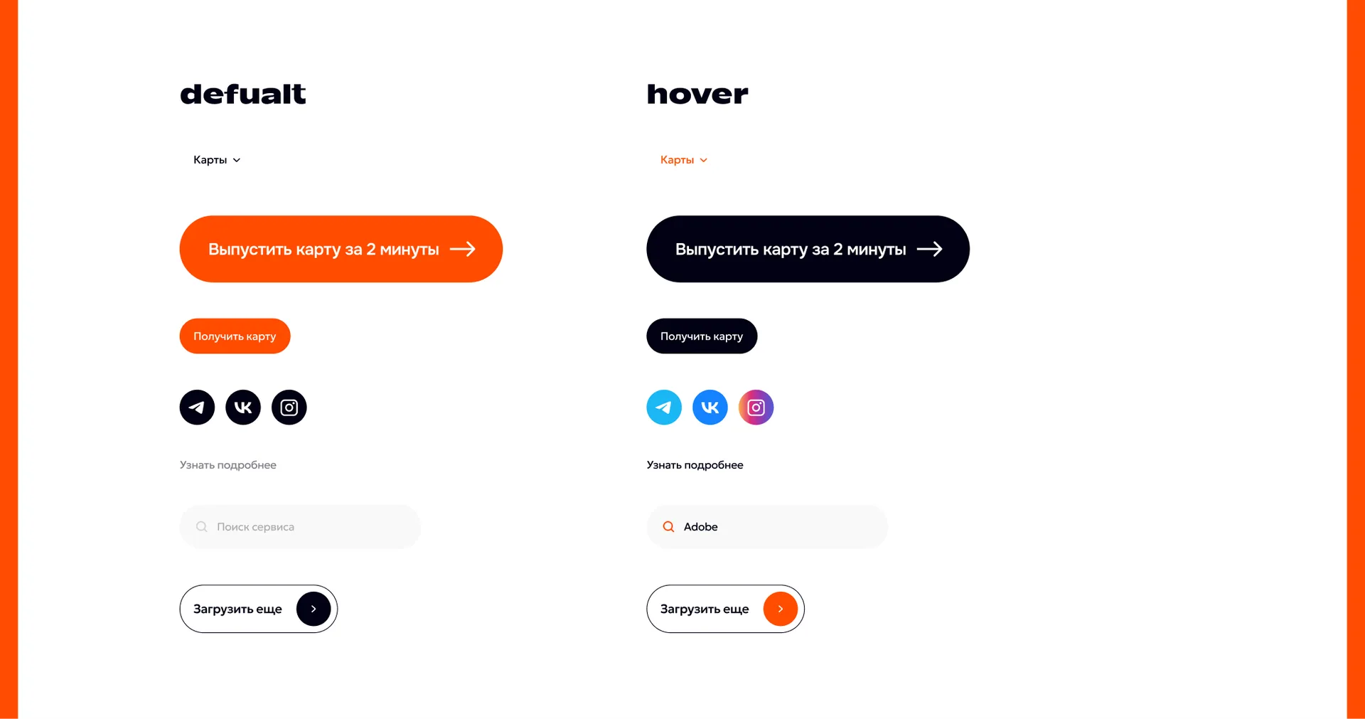
We collected a library of components with all states: buttons (default / hover), input fields, social icons, tags, accordions, cards. All sizes, paddings, radii and colors are put into variables.
The practical meaning is simple: development should not think anything out. Each interactive state is defined in advance, so at the layout stage there are no questions about “how does this behave on hover” and ten shades of orange do not appear instead of one.
How design works for SEO
We kept search tasks in mind from the structure stage, rather than screwing them in after rendering layouts:
Scalable template for requests “how to pay for [service]” - hundreds of potential pages on one design framework.
Product pages for scenario requests - “card for paying for games”, “card for travel”, instead of one landing page for everything immediately.
Strict hierarchy of headings in each template: one H1, meaningful H2 in blocks.
FAQ blocks on all key pages - template for FAQPage markup and extended snippets.
Thoughtful linking: catalog → guide → similar guides → map → other maps. No page is a dead end.
Text blocks are included in the layout, and are not added later “somewhere down” - SEO text looks like part of the design.
Result
Instead of one overloaded landing page, we got a system of eight types of pages, which:
closes three different user scenarios with separate landing pages;
scaled with new maps and guides without the participation of a designer;
handles trust objections with open rates, a transparent process and visible support;
ready for the growth of search traffic due to reference section.
Measurable Results: [insert actual data - increase in conversion to card issue, positions on queries “how to pay...”, traffic from search, time on the site. If the project is just being launched, replace the block with “The project is under development, we will add metrics after launch.”]
Frequently asked questions
How much does website design for a fintech service cost? The cost depends on the number of page types, the depth of research and the need for identity. A project of this size - 8 types of pages with a mobile version, UI kit and 3D graphics - is calculated individually. [Add a plug or link to the services page.]
How long does it take to develop a website design? For a project of comparable size - from [X] weeks, including research, structure, design concept, rendering of all pages and preparation for layout.
Do you do only design or also development? [Describe your format of work: design + preparation for layout, or a full cycle with development.]
Is it possible to use a design system for new pages on your own? Yes. We transmit a UI kit with components and variables, so new pages are assembled from ready-made blocks without reworking the layouts.
Do you take SEO into account when designing? Yes, at the structure stage. We lay out the hierarchy of headings, places for text blocks, FAQ sections and linking scheme before rendering the layouts.
Do you need the same result for your product?
We design websites for fintech, SaaS and service products: from structure and identity to transfer to development.