

prem: logo, corporate identity and brand book
star logo with orbit, branding, animation and Mini App design for prem - a digital goods store on Telegram: Premium, Stars, TON, eSIM
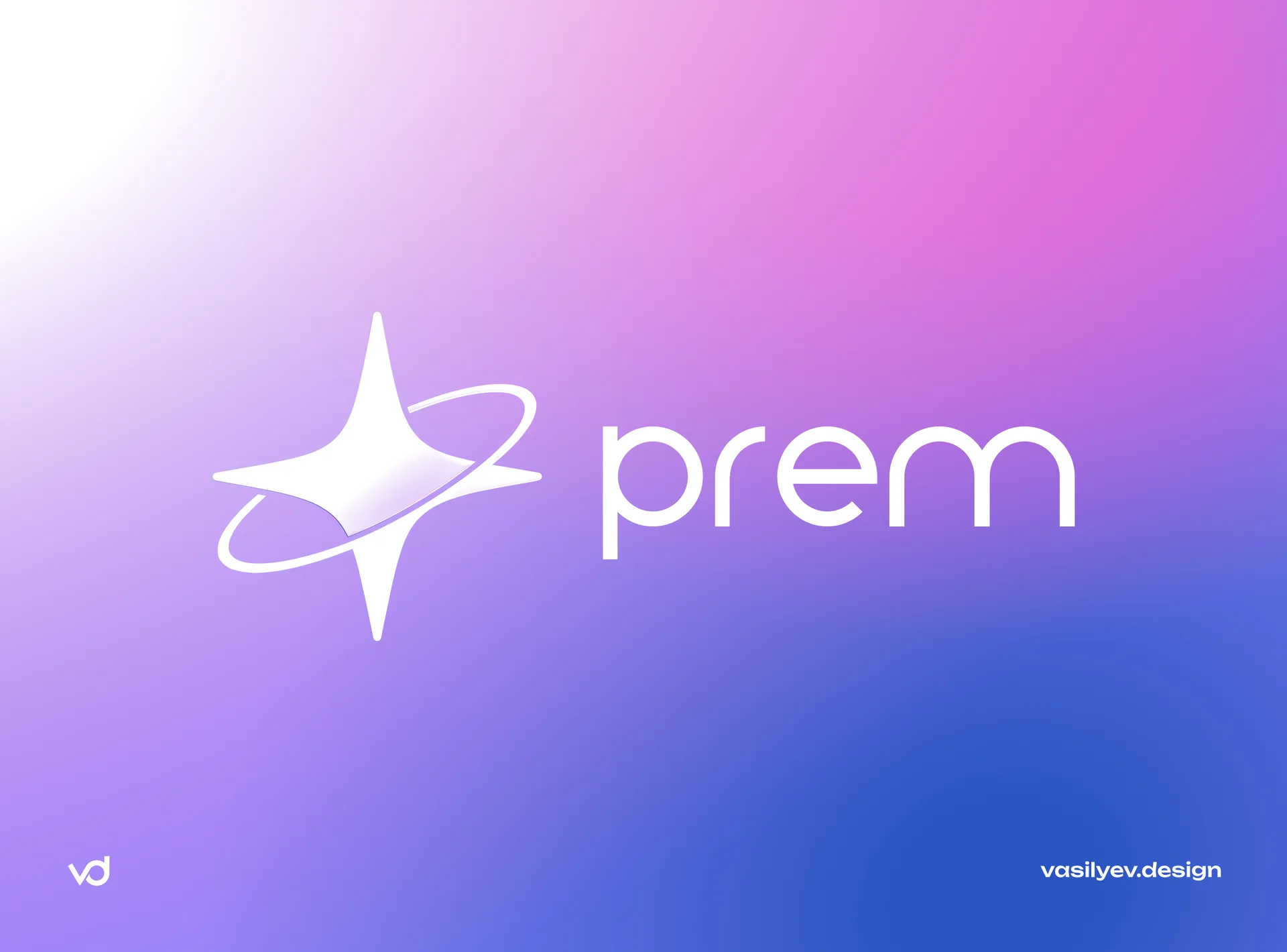
Telegram has become an independent platform with its own economy: Stars, Premium, TON, gifts, Mini Apps. Along with it, a new type of product appeared - services that live inside the messenger and sell digital goods directly in the chat. For such a service, the brand must solve an unusual problem: to look like a native element of the Telegram ecosystem and at the same time not disappear among hundreds of bots with the same icons. This is exactly the problem we solved for prem.
About the product: not a VPN, but a digital store
prem began as a VPN service, but by the time of our work it had grown into a universal store of digital goods. In one application, the user can:
buy Telegram Premium, Stars or TON - for themselves or as a gift using username;
connect a VPN with a tariff designer for their devices;
order a Wi-Fi router with delivery;
issue an eSIM for travel;
replenish Steam;
open loot boxes for rubles or points;
earn from the referral program and participate in sweepstakes.
Key positioning decision made together with the client: prem is not “another VPN”, but a digital store for all tasks. This determined the logo, the presentation of the brand, and the structure of the interfaces: on the first screen of the web version, the user sees the purchase of Premium/Stars/TON, and not a subscription to a VPN.
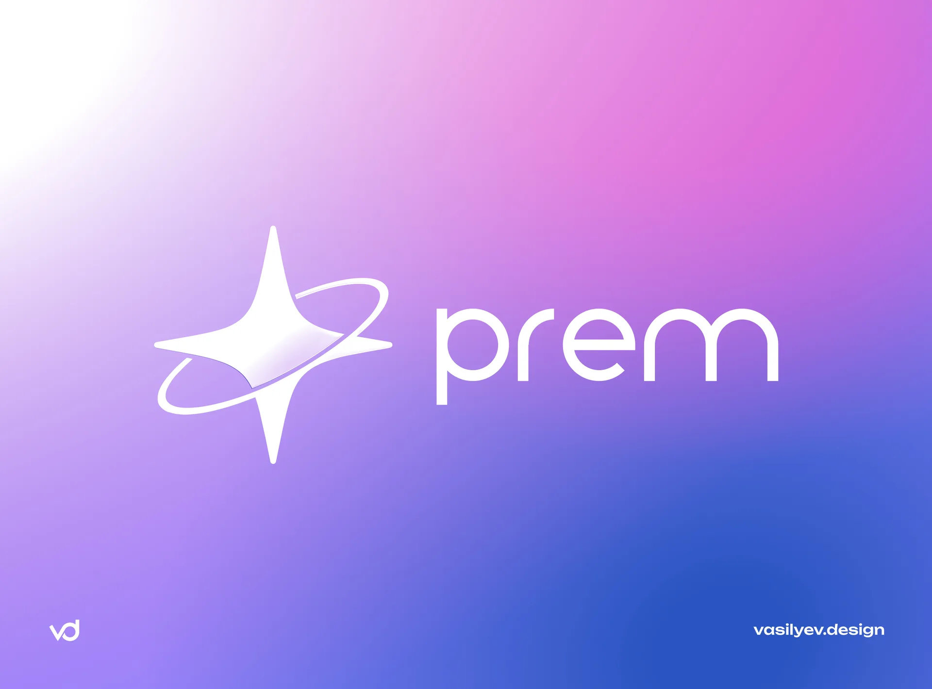
Task for the logo: native to Telegram, but recognizable
The brief for the sign was precise:
One sign for the entire service - not a VPN icon, not a store icon, but a symbol that unites a dozen different products.
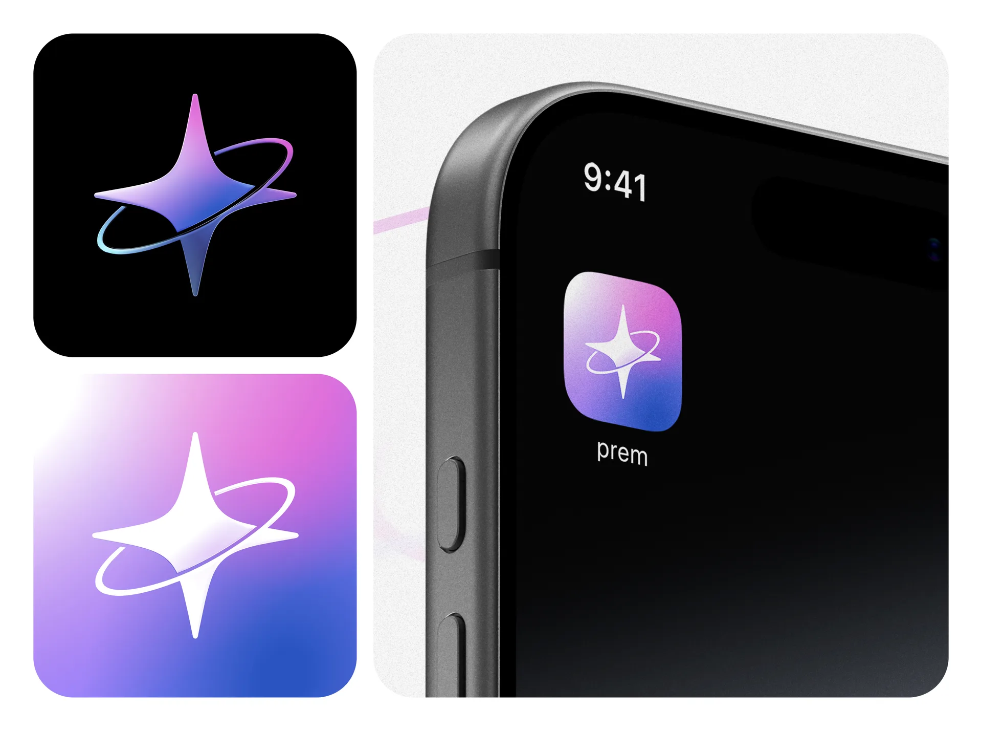
Nativeness for Telegram - the reference point was the squircle icons of Telegram itself and Telegram Stars: a white glyph on a gradient that looks appropriate in the list of chats and in the Mini Apps catalog.
Without the letter P - the client immediately refused the obvious monogram: the letter P on the block is found in hundreds of services and does not give distinctiveness.
The sign must work in black without a background - the basic version is given as a clean silhouette so that the team can color it for any media.
Finding a solution: from shield to star
The first direction was a shield with a cutout - a metaphor for protection for the VPN roots of the service. The concept was rejected at the sketch stage: the shield pulls the brand back to “security and VPN,” and prem moved away from this positioning. In addition, the airplane cutout inevitably read as a reference to the logo of Telegram itself - and the brand should be part of the ecosystem, and not a copy of it.
The second direction - the star - hit the target for several reasons. Star in the Telegram context is directly associated with Stars, one of the key products of prem. The four-ray shape with concave edges reads as “spark”, “premium”, “magic” - the very shade that is contained in the very name prem (from premium). And, unlike a monogram, a star works equally well in both a bot icon and a banner.
Sign: four-pointed star with an orbit
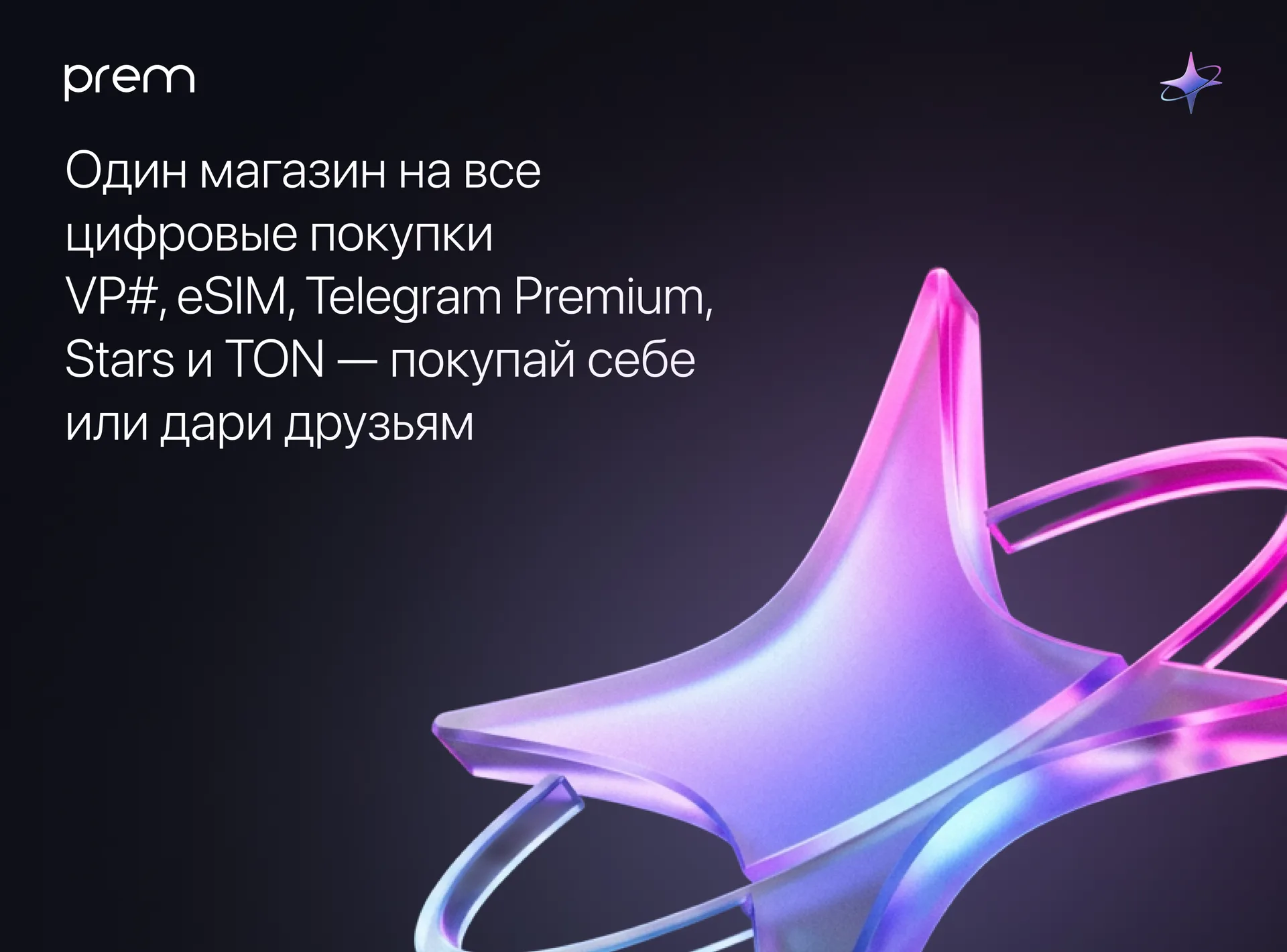
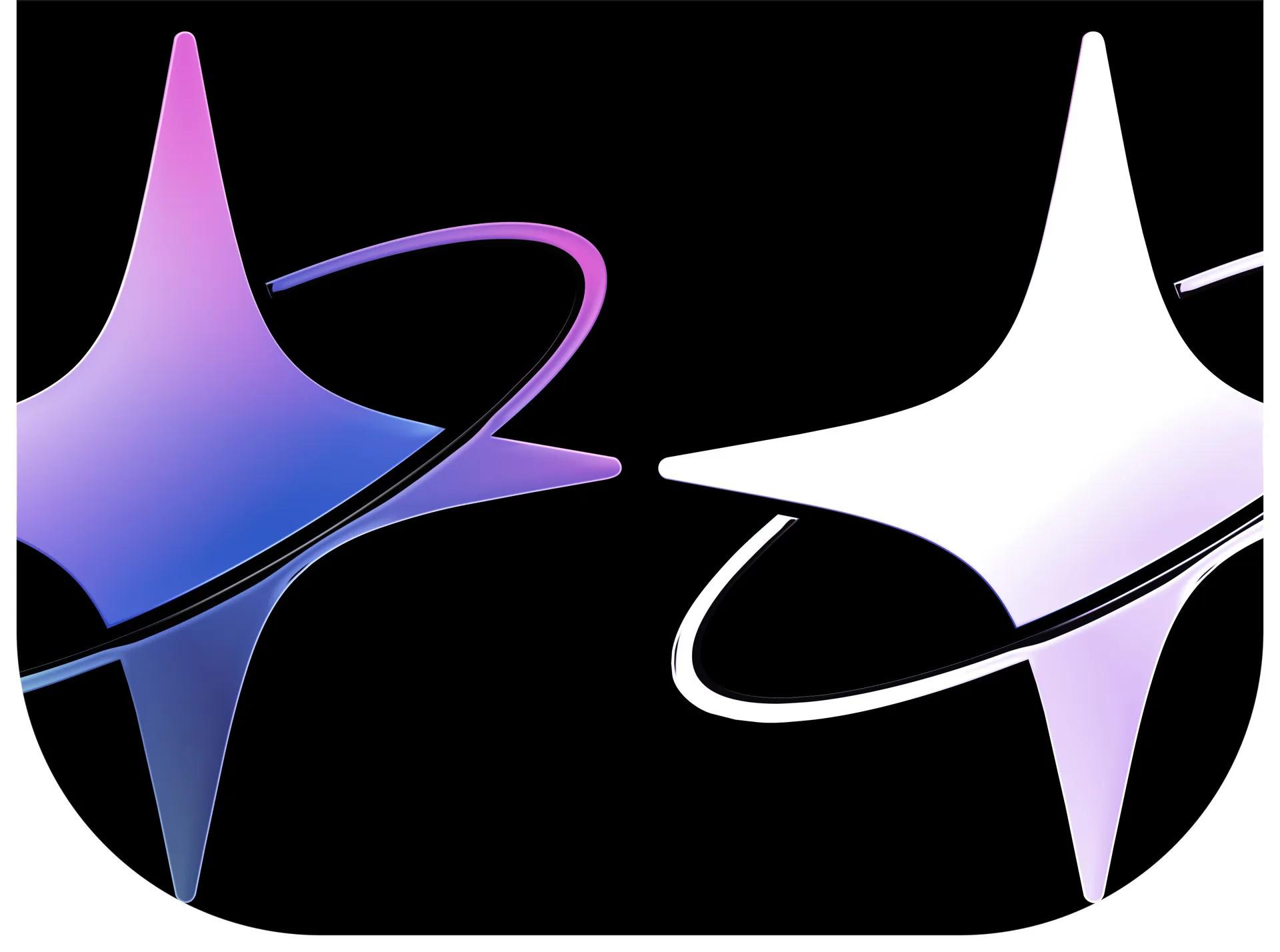
The final logo is a four-pointed star with a thin orbit-ribbon running around it. The orbit does not just surround the star: it passes diagonally in front of it, cutting the lower part of the silhouette, and goes behind the star on the upper-left arc. This intersection of layers creates volume and movement in a flat sign - the star literally “rotates” in place even in static conditions.
The metaphor is multi-layered:
star - Stars, premium, value;
orbit - ecosystem: all prem products revolve around one center;
intersection - dynamics, “live” service, in which there is always something is happening.
The mark is built on clean silhouette forms without small details: it is readable in the bot's avatar, favicon and Mini App icon the size of a fingernail - and remains expressive on the big screen.
Word mark and branding feed
The name "prem" is written in lowercase letters in a rounded geometric sans serif - friendly and modern, without corporate strictness. The lowercase spelling rhymes with how the names of bots and services look inside Telegram.
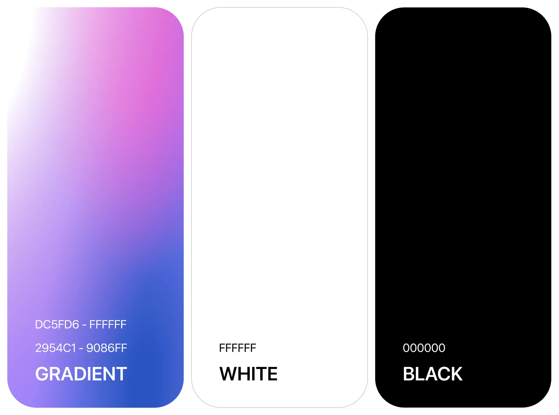
The brand’s signature presentation is a white logo on a gradient: from pink through purple to deep blue, with light arcs that echo the orbit of the sign. This is a direct echo of the aesthetics of Telegram Premium and Stars - rich gradients, glow, the feeling of a “premium” product - but in its own prem palette, which does not coincide with any official Telegram product.
Logo Animation
For presentations, promos and loading screens, we made an animated version sign. The logic of movement follows from the very design of the logo:
the sign appears from the center with a slight twist, followed by the letters of the word mark rising one by one;
a running flare goes along the orbit - a light object with a tail, which goes behind the star on a hidden arc and comes out with on the other hand, emphasizing the layering of the sign;
soft iridescence of corporate colors pass through the white logo, and rare sparks flash around.
The animation is rendered frame-by-frame from vector source rather than screen recording, so gradients and glows remain clean at any resolution. The final version is 12 seconds, Full HD, without sound, with a long “hold” at the end so that it can be cut to fit any slide or screensaver.
Telegram Mini App Design
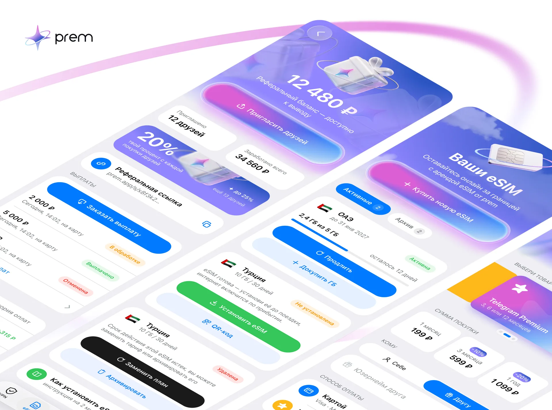
In parallel with branding, we are designing the product itself - Telegram Mini App in the current iOS style 26: glass surfaces, cards with large roundings, squircle icons, floating glass tab bar. The user should not feel the boundary between the Telegram interface and the prem application.
Designed scenarios:
VPN - main screen with the status of the subscription and router, “My devices”, tariff designer (devices and traffic whitelists), payment by card or Telegram Stars, additional purchase volumes through a modal window.
eSIM - select a country and tariff, purchase without unnecessary steps.
Store - Premium, Stars, TON, Steam replenishment, loot boxes.
Trial subscription - a modal window with conditions depending on the user’s status in Telegram.
Giveaways - a wheel of prizes with spins for purchases and referral balance, monthly mega draw.
Referral program - with link, statistics and payments.
Profile - topics, purchase history, support, promotional codes.
Here the design is inseparable from the business logic: we worked out not only the screens, but also the rules - how wheel spins are counted, how trial periods work, where promotional codes live in the interface. Product thinking, not “drawing beautifully.”
Web version: website and personal account
The third contour of the project is a web application with the same UI kit, adapted for desktop and phone. Principle: the site is not a showcase, but a store from the first screen. The user immediately sees a Premium/Stars/TON purchase block with a switch, username field and payment choice; eSIM, VPN and Steam top-up are available without authorization, and access to your personal account - via Telegram or mail - is offered after payment, when you really need it.
Visually, the web version inherits the style of modern Telegram services: white page, gray cards without outlines, pill buttons, clear even scale typography. One UI kit for the Mini App, website and personal account - the transition between them is invisible to the user.
What was included in the project
Positioning strategy: from VPN to digital store.
Brand mark - four-pointed star with orbit; color versions, white and black silhouette.
Prem wordmark and full logo.
Signature presentation: gradient palette and light arcs.
Logo animation for presentations and promotions.
Telegram Mini App design: VPN, eSIM, store, sweepstakes, referral, profile.
Web version: store website and personal account on a single UI kit (in work).
Why it works
One sign - the whole ecosystem. A star with an orbit unites a dozen dissimilar products under a single symbol and does not tie the brand to one of them.
Nativity without imitation. The logo and interfaces look part of Telegram, but do not copy it: their own palette, their own form, their own character.
Brand and product from one hands. Identity, Mini App and website were designed by one studio on one UI kit - visual consistency is built in, and not “adjusted” later.
Design that sells. Purchase on the first screen, minimum steps before payment, authorization only when needed - interface works on conversion, not on demonstrating features.
The result
prem received a brand that matches its new scale: a star sign with an orbit, recognizable in Telegram and beyond, a premium gradient presentation, an animated version for promos - and product interfaces designed according to the same principles. From logo to application - a single system, ready for service growth.
FAQ: design for Telegram services
How does the design of Telegram Mini App differ from the design of a regular mobile application? Mini App lives inside Telegram and should inherit its patterns: system roundings, tab bars, glass surfaces, behavior of modal windows. The user should not feel the transition from the messenger to the application. At the same time, the brand must remain recognizable - the balance between nativeness and identity is the main task.
Why didn’t they use the letter P for the prem logo? The P monogram on the plaque is the most common solution for services with this name; it does not provide distinctiveness. The star with the orbit connects the brand with the key product (Stars), with the idea of “premium” and with the concept of the ecosystem - and remains unique.
Why does the Telegram service need a separate website? The web version opens sales to users outside of Telegram, supports purchases without authorization and provides a full-fledged personal account on the desktop. A single UI kit with Mini App ensures that this is the same product, and not two different ones.
What does logo animation do? An animated sign works in presentations, promotional videos, loading screens and social networks. For a brand with a “rotating” sign design, animation reveals the dynamics inherent in it, which a static logo only hints at.
Can I order just the logo, without the app design? Yes. But in the prem case, the value lies precisely in the connection: the logo, Mini App and website were designed by one team, so the brand looks the same at every point of contact.
Are you launching a service in Telegram - a bot, a Mini App, a digital goods store? Studio vasilyev.design develops logos, corporate identity and product design for the Telegram ecosystem on a turn-key basis - write to us.