

BIKEGO - logo and corporate identity for electric bicycle rental
How we made a logo, brand book and VKontakte design for Bikego, an electric bicycle rental service for couriers in Tomsk
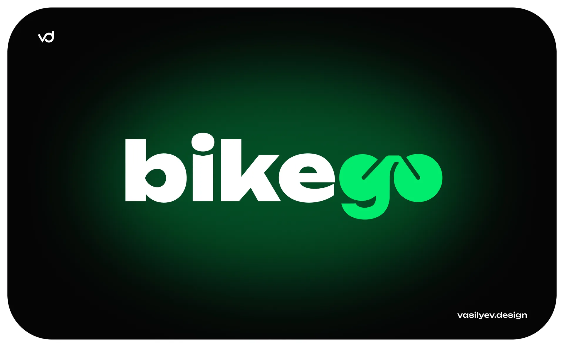
Bikego rents electric bicycles to couriers in Tomsk. We developed a logo and corporate identity for the service, put together a brand book, designed the VKontakte community and made posts, stories and business cards.
Below we tell you how we came up with the idea for a logo and how it spread across all media.
Task
The client needed a recognizable logo and a unified style for all materials. The service communicates with clients on VKontakte and through a bot in MAX, so the style had to work primarily there.
The courier chooses a rental quickly: he saw the post, wrote, and picked up the bike. This means that the brand must be read in a second and look the same on the avatar, banner and business card.
The client sent one reference that he liked, but suggested that we look for our own solution.
Why we abandoned the bicycle icon
The first thing that comes to mind for rental is the bicycle icon next to the name. We tested the following options: a bicycle made of lines, a frame in the form of a lightning bolt, a wheel with an arrow, and a cargo bike silhouette. They all looked like hundreds of other niche logos.
The detailed silhouette also has a practical problem: on a VKontakte avatar it turns into a blur. Abstract signs and a monogram were better read, but did not provide the main thing - a connection with the name.
Then we decided that the name itself would become the logo.
How the logo works
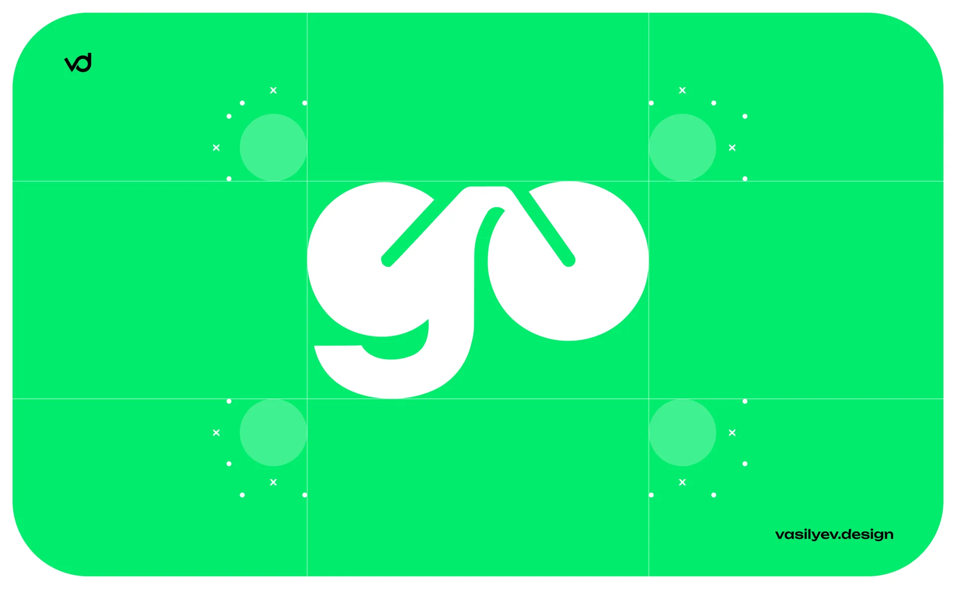
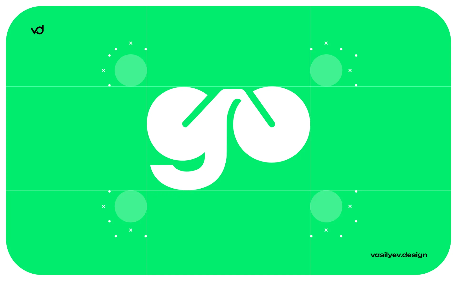
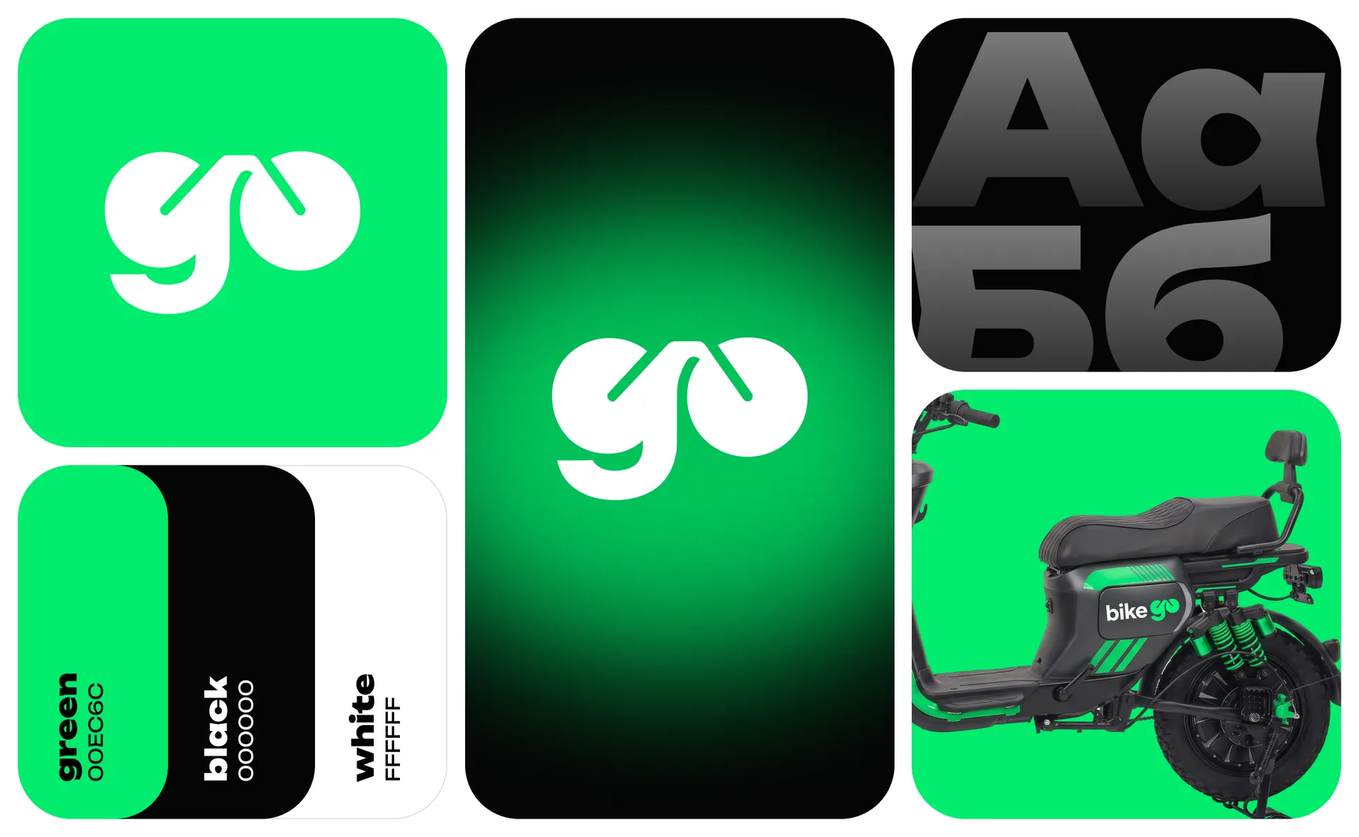
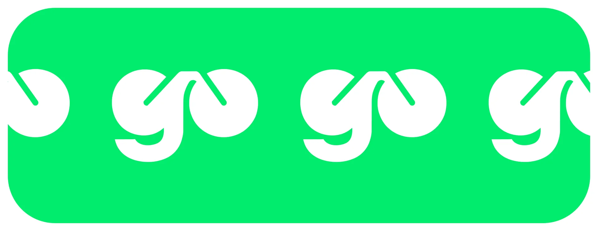
The bikego logo is a word with a bike hidden in it. The letters g and o are drawn as two wheels, and the lines between them act as a frame. The word is read immediately, but you notice the bike at a second glance, and it is this moment that is remembered.
The bike part is typed, and the go part is drawn separately. To make the two parts look like one word, we tried on about three dozen fonts for go and adjusted each one to the height of the lowercase and baseline.
We chose Unbounded Black. It has round letter cups and a dense stroke, like go wheels, so the joint between the inscription and the sign is not visible.
The go sign also works on its own: on an avatar, an icon, in a pattern, on the side of a bike.
Color and font
The corporate color is bright green #00EC6C. Black and white were added to it, and there are no more colors in the style. One bright color is recognized in the feed before they have time to read the text.
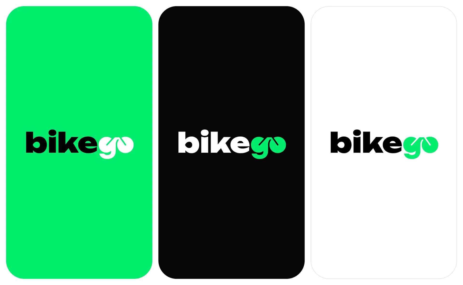
Green was chosen from forty options: from dark and lime to turquoise shades. Each one was tested on a white, black and green background, because the logo lives on all three.
The font is in the same style, Unbounded. Black goes for headings, Regular and Medium for signatures and text. The font has a Cyrillic alphabet, so the Russian text in posts looks the same as the logo itself.
VKontakte design, stories and posts
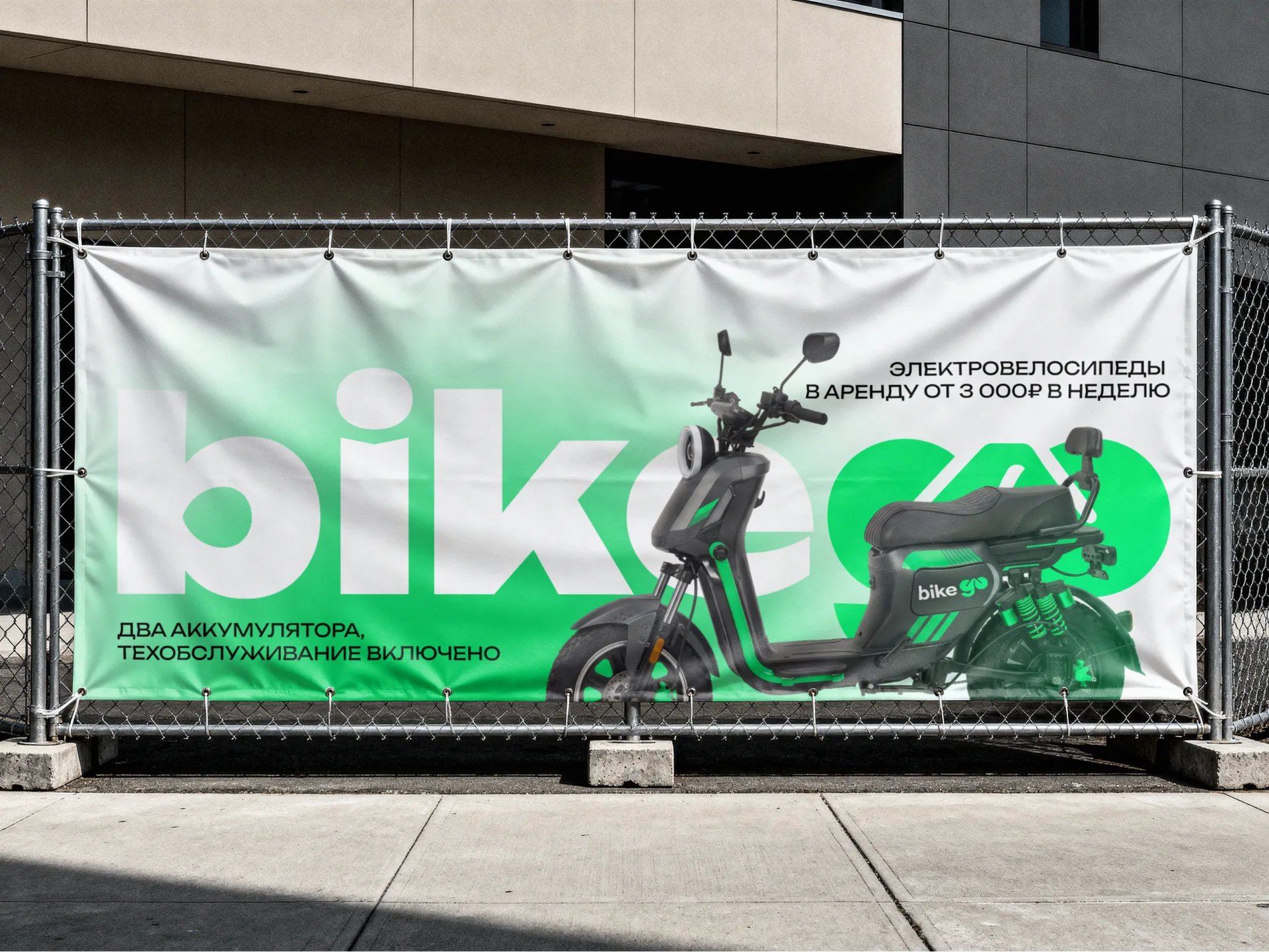
For the VKontakte community we made a cover for a computer and a mobile cover, an avatar and four menu covers: reviews, tariffs, rules and repairs. All of them are built on the same technique: a white background, a blurry green spot with grain, large white text and a photo of a bike.
For the menu, glass tiles with icons were drawn. They are repeated in posts, so the whole design looks like one system.
For regular publications, we prepared post templates: free bike, giveaway, change in tariffs. We also made a story for the launch of the bot in MAX. A new promotion or news can now be assembled from the same elements in a few minutes.
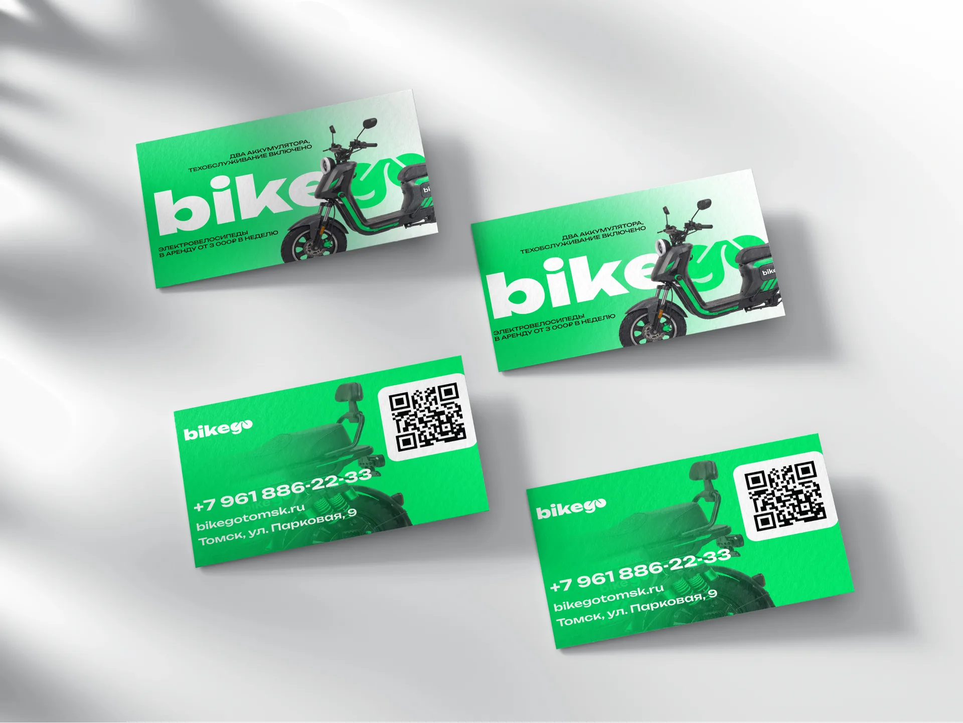
Business cards and photos of bikes
Business cards were made double-sided, 90 by 50 mm format. On the front side there is a large logo and bike, on the back there is a phone number, website, address and QR code. The layout is ready for printing: overhangs are 2 mm, text and QR code are no closer than 4 mm to the cutting line.
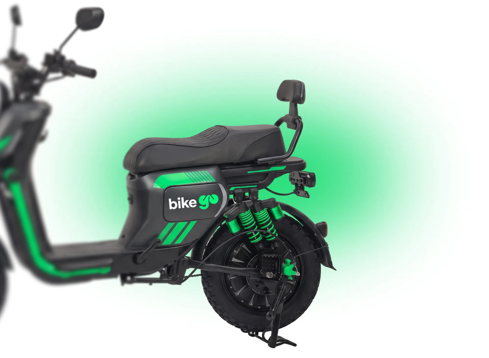
Photos of the bikes were processed: the quality was increased, the manufacturer’s logos were removed, the accents were repainted in the company’s green and the bikego logo was applied to the sidewall. So the bikes in the photo look like the service’s own fleet, and not pictures from a catalogue.
Brandbook
We have collected all the solutions in a brandbook. It is needed so that the style does not spread when other people start working with it: an SMM specialist, a printing house, a website developer.
The brand book includes:
building a logo and a security field
building a sign go
colors with codes
typography and typesetting rules
logo versions in green, black and white
sign color for light and dark backgrounds
pattern from a sign
examples of media: business cards, VKontakte design, posts
The security field is calculated from the thickness of the stroke of the letter i. Neither text, nor pictures, nor the edge of the sheet are placed closer to this distance from the logo. This rule can be easily checked on any layout without a designer.
What is important in the corporate style of a rental service
As a result of the project, we have developed several rules. They are suitable for any rental: bicycles, scooters, cars, tools.
The logo must be read on the avatar. Check it is the size of a fingernail: the complex silhouette of the equipment turns into spot.
The idea inside the name is remembered better than the picture next to it. A person remembers one image, not two.
One bright color is stronger than the palette. It is recognized in the feed among dozens other people's posts.
Post templates save time. A promotion or news can be released quickly, and the style does not fall apart.
Your photos of equipment are more important than beautiful stock images. The client should see exactly the bike you will receive.
Need a logo or corporate identity?
We make logos and corporate identity from 5 days, brand books from 7 days. We also design social networks, make turnkey websites and bots for Telegram and MAX.
Tell us about your project, and we will suggest where to start