

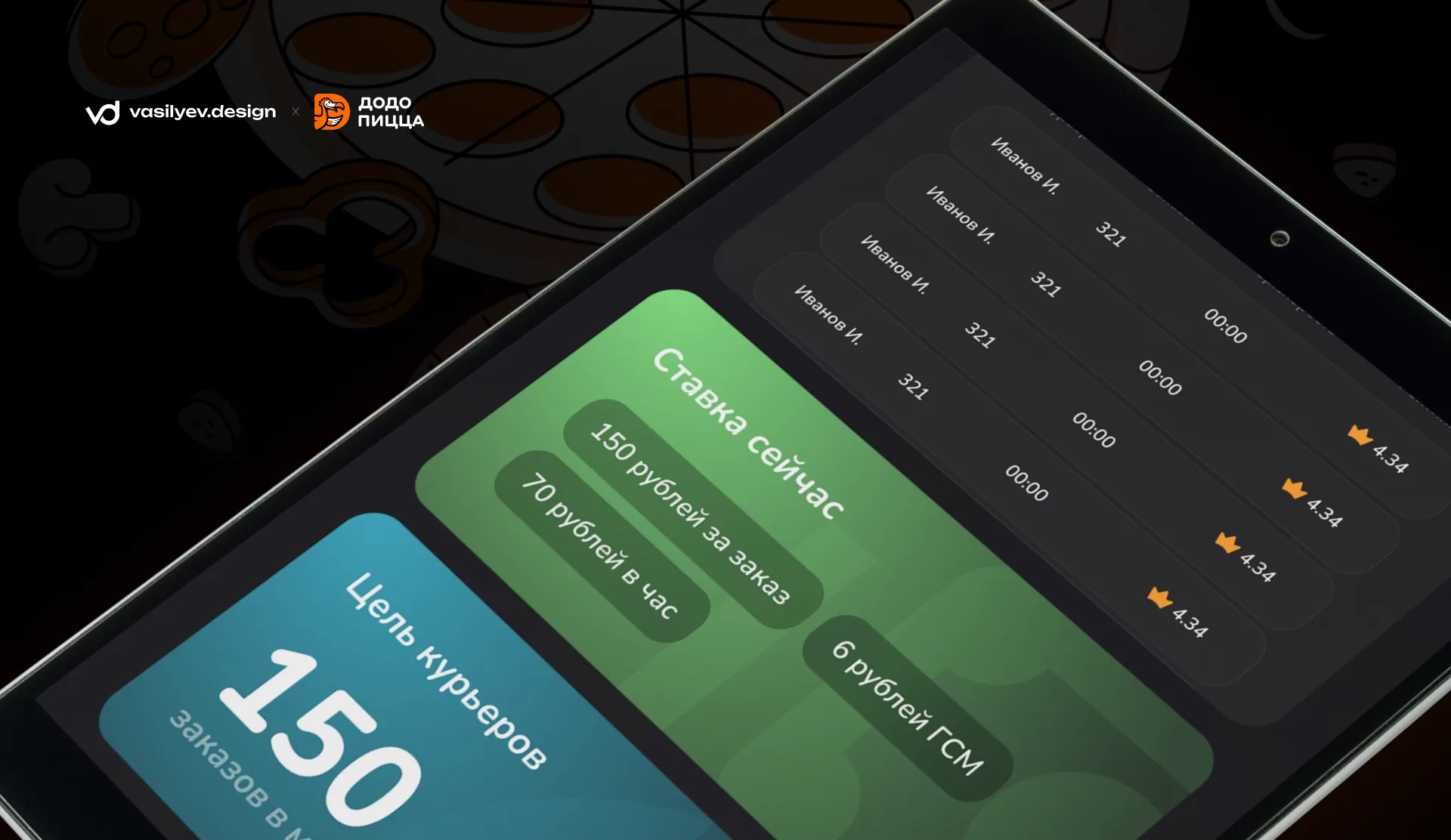
Courier motivation screen design for Dodo Pizza
Courier motivation screen design for Dodo Pizza
For the projectDodo PizzaWe developed the interface design for the courier motivation screen - an internal tool that helps employees track performance, see current information and receive feedback on their work.
The main goal of the project is to make the screen not just informational, but truly useful for the courier: understandable, quick to understand and visually convenient for daily use.
What has been done
As part of the project, we prepared several interface screens, each of which solves a separate problem
First screen - basic information
The main screen contains key indicators of the courier: number of orders, status, goals and operational metrics.
The interface is designed so that the most important information is visible immediately, without unnecessary transitions and searching through sections.
We created large information cards, a clear visual hierarchy and accent elements that help you quickly read the data.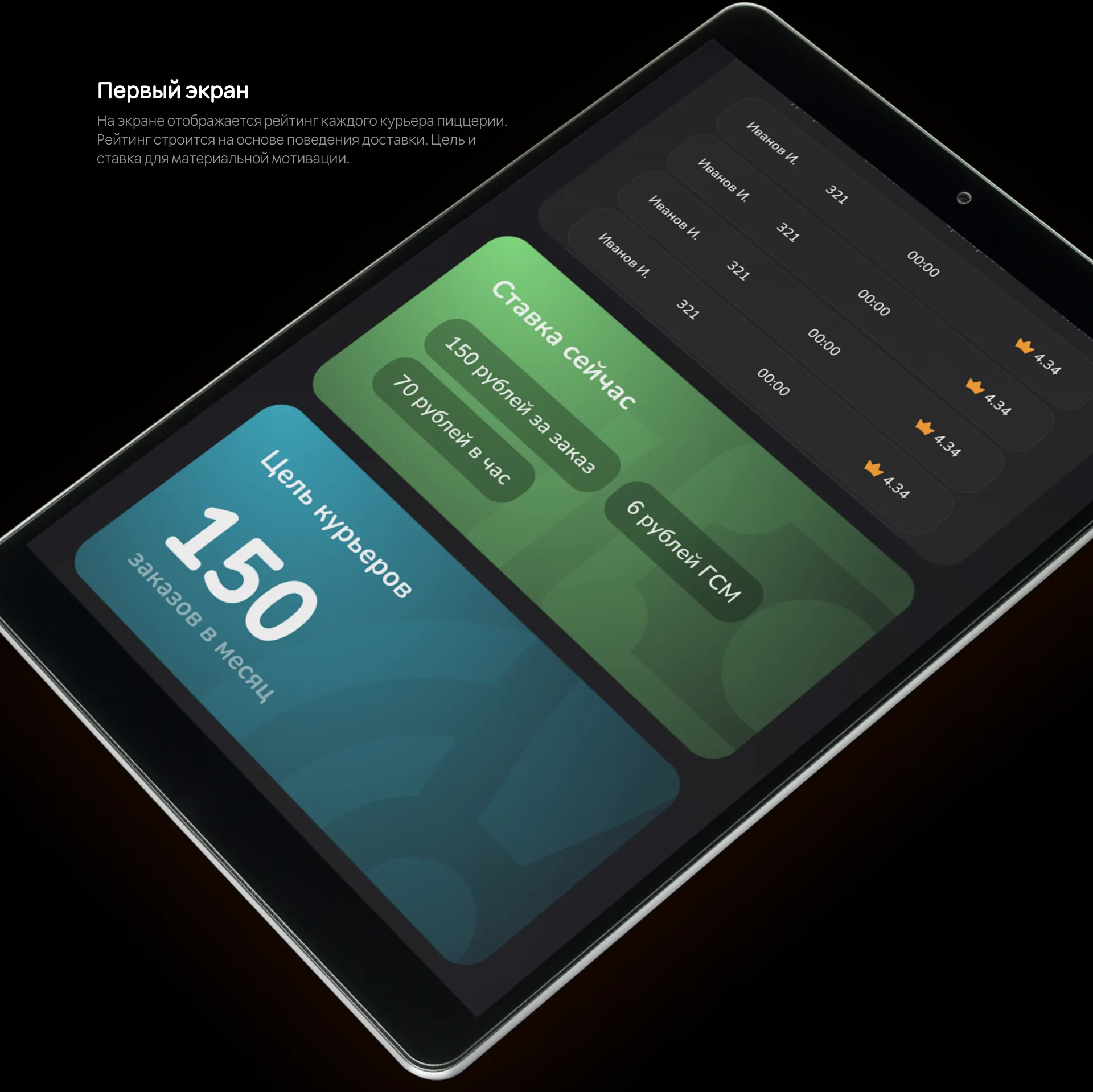
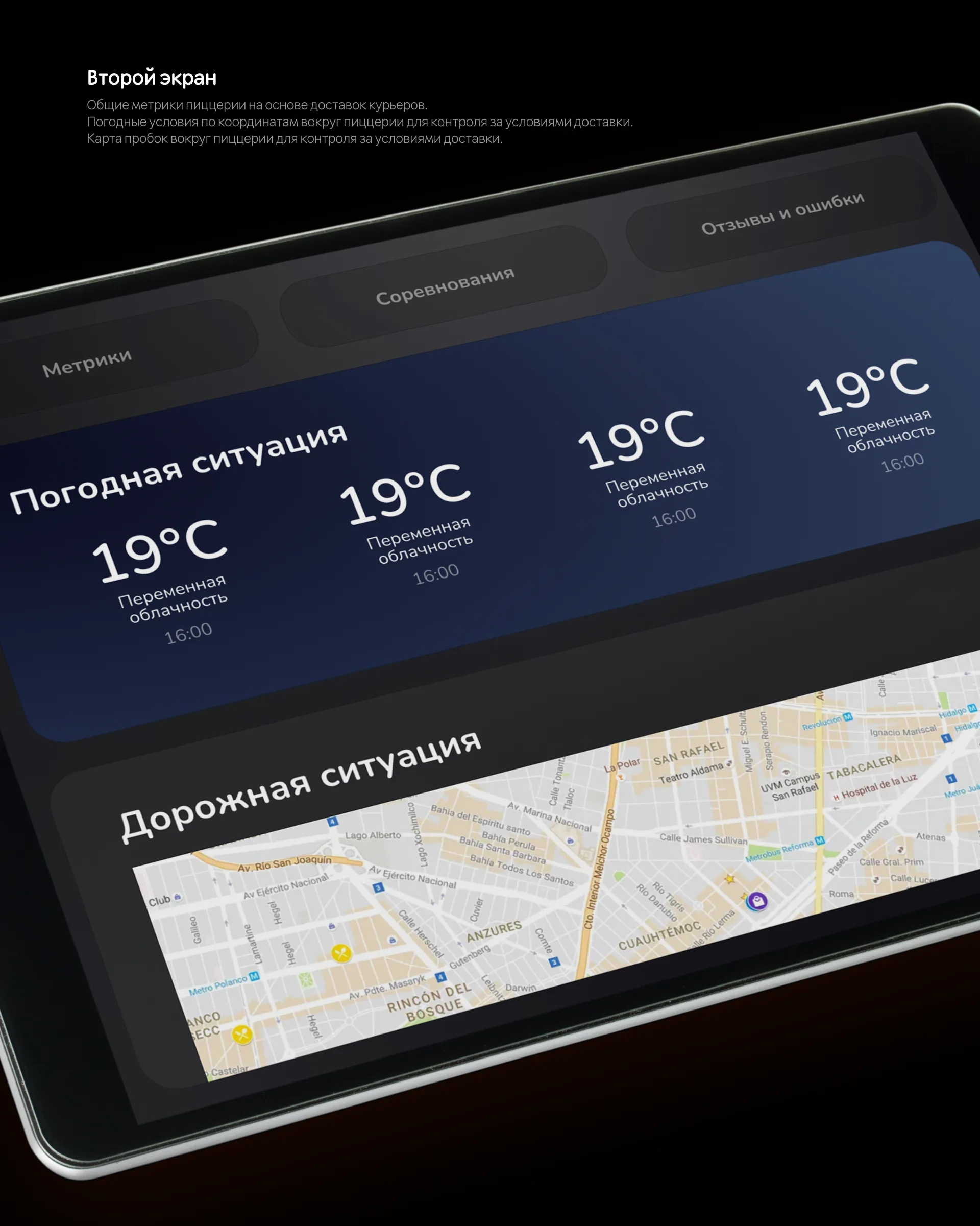
Second screen - weather and traffic conditions
It is important for a courier to understand the conditions in which he works. Therefore, a separate screen was dedicated to weather and road conditions.
It displays:
- temperature;
— weather conditions;
— route data;
— a map with the traffic situation.
This block helps the courier quickly navigate and take into account external factors during the shift.
Third screen - competition block
A screen with elements of competition and motivation was also developed.
It shows positions, results and comparisons, helping to create additional fun in the workflow.
The idea of such a block is not just to show numbers, but to add a sense of progress and involvement. When an employee sees dynamics, goals and results, it is easier for him to understand his growth and strive for better results.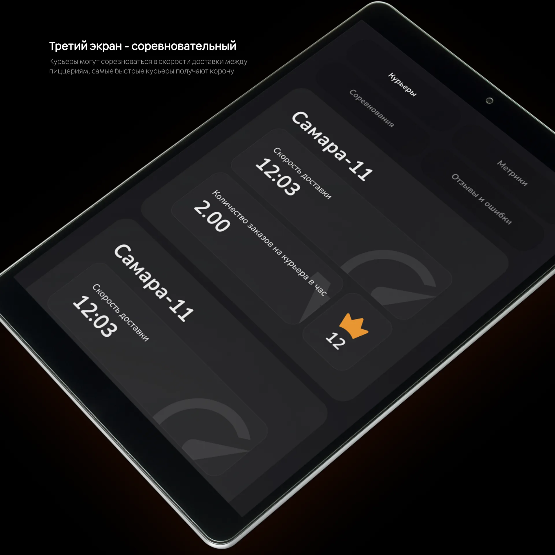
Fourth screen - reviews and feedback
We worked separately on the section with reviews.
The courier can see ratings, comments and feedback, which is directly related to the quality of his work.
We made this screen calm and readable: reviews do not overload the interface, the rating is clearly visible, and the information is perceived quickly and clearly.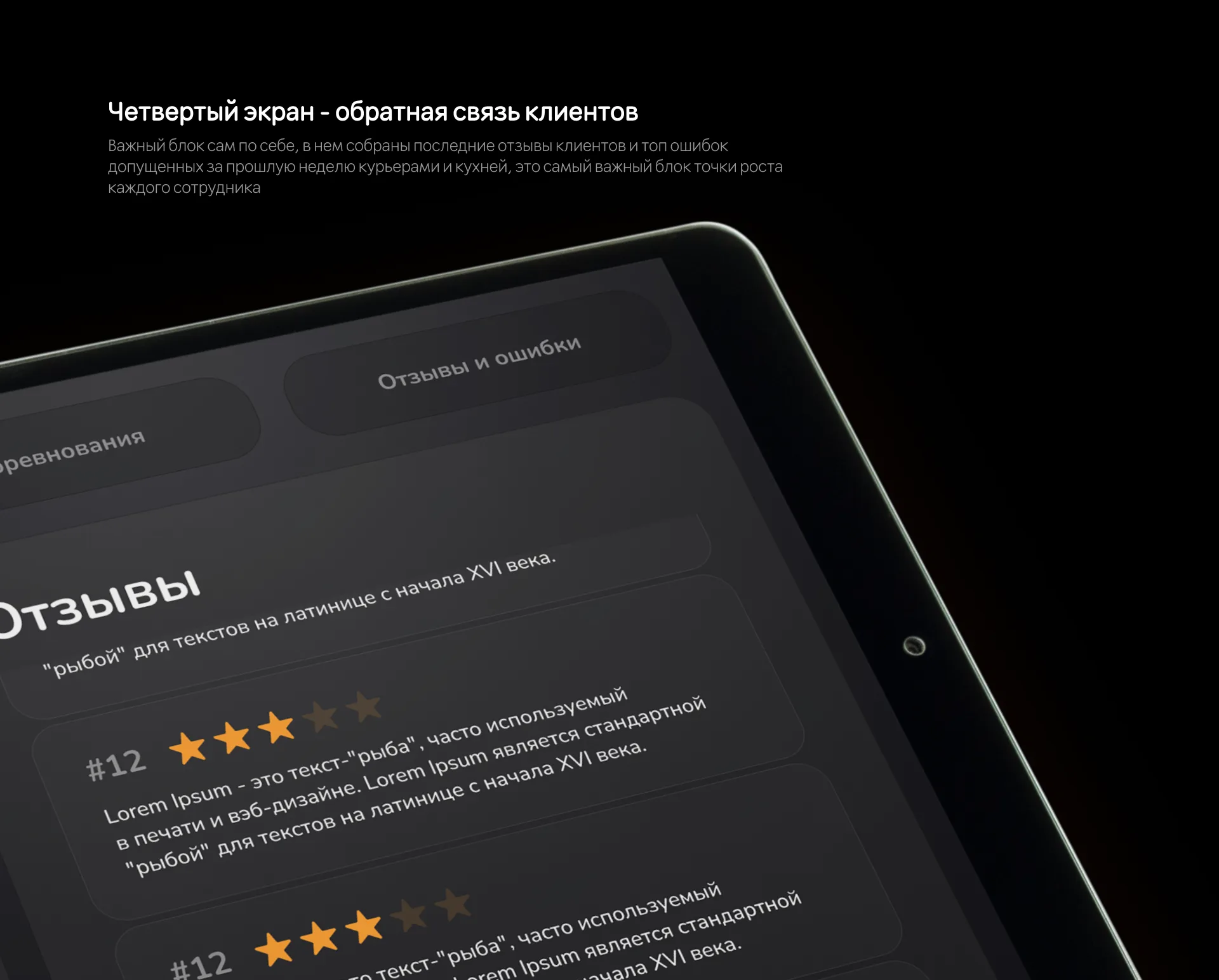
Error Screen
A screen with errors and requests was also developed.
It helps to systematize problem situations, see the number of requests and understand what points require attention.
This section is important for internal analytics and improving the quality of work: the courier receives not just dry information, but a clear structure for his actions and feedback.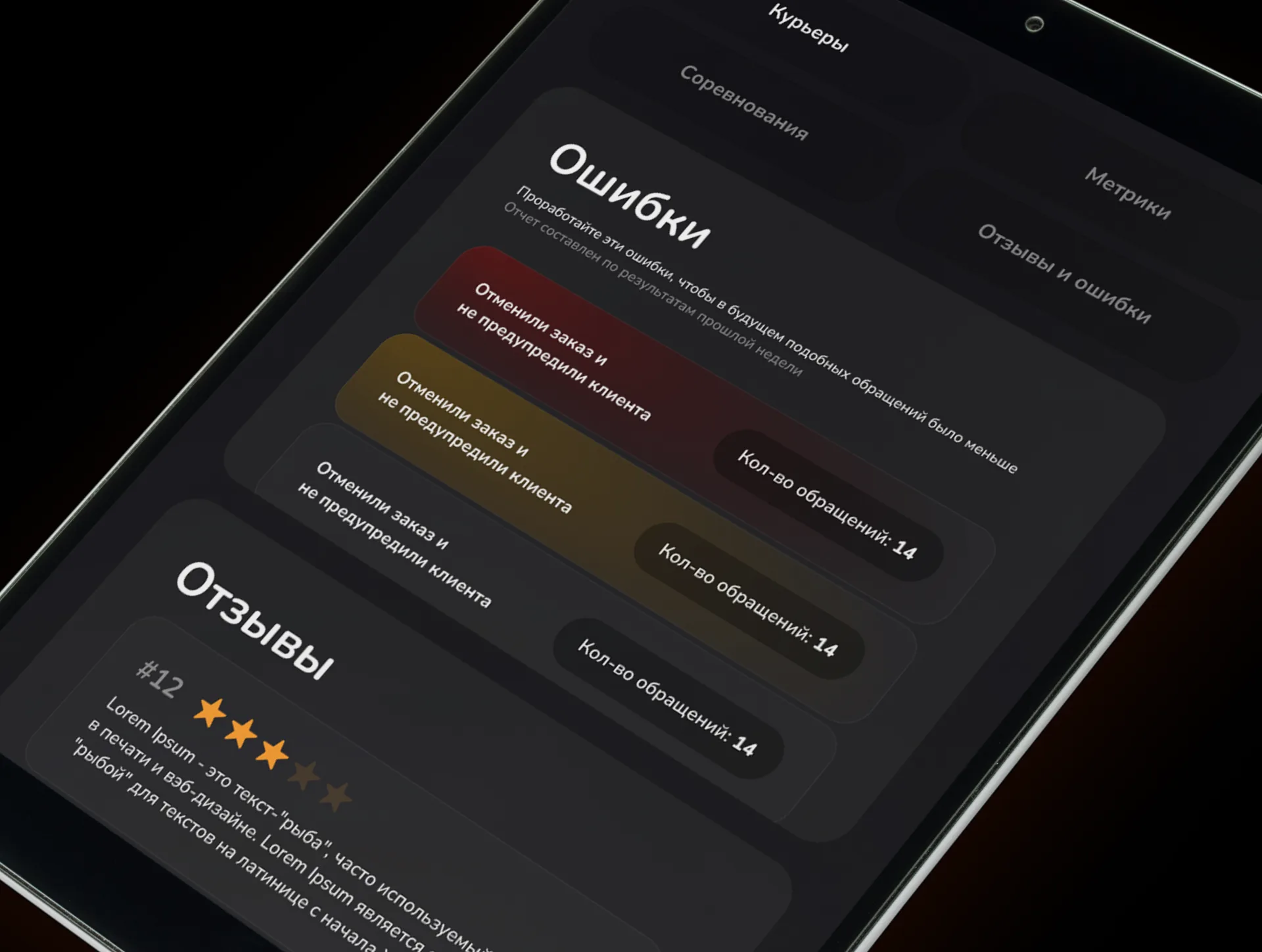
UI/UX approach
When developing the interface, we focused on speed of perception.
The courier does not need an overloaded screen with dozens of small elements - it is important for him to quickly understand the situation and continue working.
Therefore, the design used:
- large cards;
- clear grid;
- dark theme;
- contrasting accents;
— minimum number of unnecessary elements;
— simple navigation between sections.
The interface turned out to be visually calm, but at the same time quite expressive. It does not distract from the data, but helps to perceive it faster.
Visual style
The design is made in a dark style with neat colored accents.
This approach works well for work screens: it reduces visual load, makes the interface look modern, and helps highlight important elements.
Cards, graphs, review blocks and statuses are collected in a single system so that the entire interface is perceived as a whole.
Particular attention was paid to the presentation of the case: screens were placed on tablets in dynamic angles to show the interface not just as a set of layouts, but as a full-fledged digital product.
Result
The result is a modern courier motivation screen interface forDodo Pizza, which combines analytics, motivation, feedback and work information in one product.
The screen helps the courier:
— track your performance;
— see ratings and reviews;
— understand the situation on the roads and the weather;
- monitor progress;
— receive feedback on errors;
- be more involved in the work process.
This is not just a beautiful interface, but a tool that helps improve the user experience within the team and make the work clearer.