

GEMERA GPT: logo, brand book and social networks
logo update, brand book and complete design of social networks for Gemera GPT - an AI platform for generating images, videos and music.
Gemera GPT: logo, brand book and social networks for the AI platform - constant work with the product
Studio case vasilyev.design: updating the logo and brand book, as well as complete visual design of social networks for Gemera GPT - a platform for generating images, videos, music and communicating with the best AI models.
There are one-time projects, and there are partnerships. Gemera GPT is our regular client: instead of one layout, we manage the brand over time - from updating the logo and brand book to daily visual support of social networks. This is a different type of work: not “give it up and forget it,” but keep the brand assembled over the long haul while the product grows and is frequently updated.
About the product
Gemera GPT is an AI platform that combines image, video and music generation, as well as chat with the best language models, in one interface. For the user, this is a single entry point into the world of generative AI: there is no need to maintain separate subscriptions to a dozen services - Gemera gives access to models for pictures, video, audio and text in one place.
The product lives in a fast cycle: new models, interface updates, promotions, technical work - updates come out frequently, and each of them needs not just to be released, but to be shown to the audience.
Task: a brand that can withstand the frequency
The AI market is the fastest-changing digital segment. The winner here is not the one who released one beautiful video, but the one who keeps the pace: announces features, reacts to technical pauses, launches promotions - and does it visually equally recognizable every time. The studio’s task in working with Gemera GPT was precisely this:
update the logo and fix it in the brand book so that the brand does not spread across dozens of versions;
build a system that can cope with the high frequency of publications - without the design burning out by the third month;
design social networks completely: not just one cover, but a working set of templates for all types of messages product.
Logo and brand book
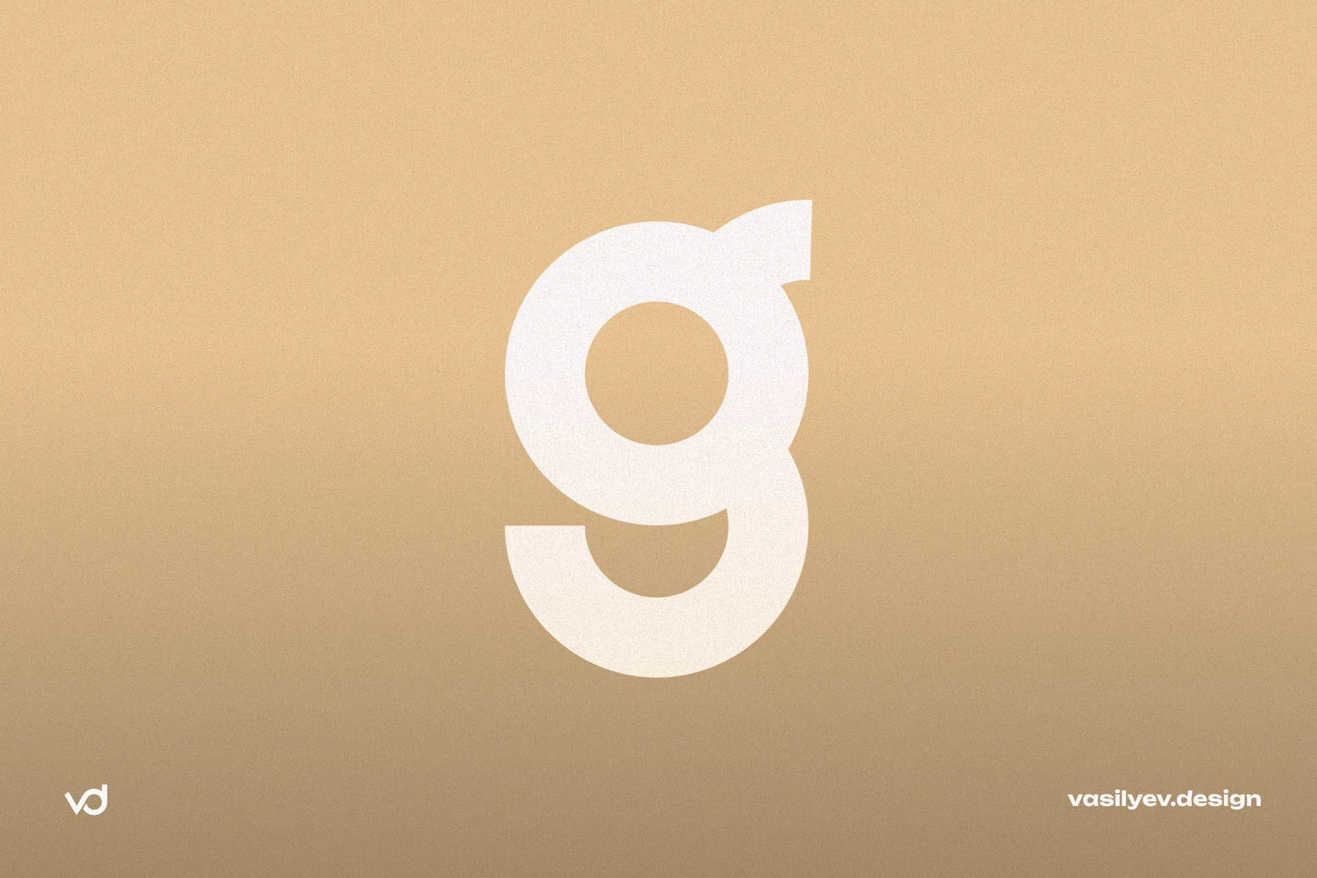
The updated Gemera GPT logo is a wordmark in lowercase letters: “gemera” is typed in a regular style, and “gpt” is placed in a separate capsule-plate in a contrasting color. This solution does two things at once: it preserves the readability of the brand name and clearly marks the technological part of the name - it is immediately clear that this is an AI product, and not just “gemera”.
In the brand book, this combination is recorded as a mandatory lock-up: the capsule with “gpt” is not separated from the main word and does not change the proportions - this way the brand remains recognizable on any medium, from a Telegram avatar to a large banner.
Palette and graphic language
Gemera GPT's visual system is built on a warm, earthy palette - deep brown and graphite black backgrounds, creamy beige and golden accents. This is an atypical choice for an AI brand: the market for generative neural networks is flooded with cold neon and purple-blue gradients. Warm colors set Gemera apart from its competitors and at the same time remove the “sterility” that is often associated with AI products - the brand looks more humane and friendly.
Branded typography is based on one principle: a large bold title of two or three words and a short explanatory caption under it. The headline is immediately readable in the feed on the mobile screen, the caption adds context for those who linger with their gaze.
An additional layer of identity is a barely noticeable background pattern of a repeating brand name, placed under the main composition. This detail works like a watermark: even if the banner is reposted without indicating the source, the background gives away where the material came from.
3D illustrations as a language of communication
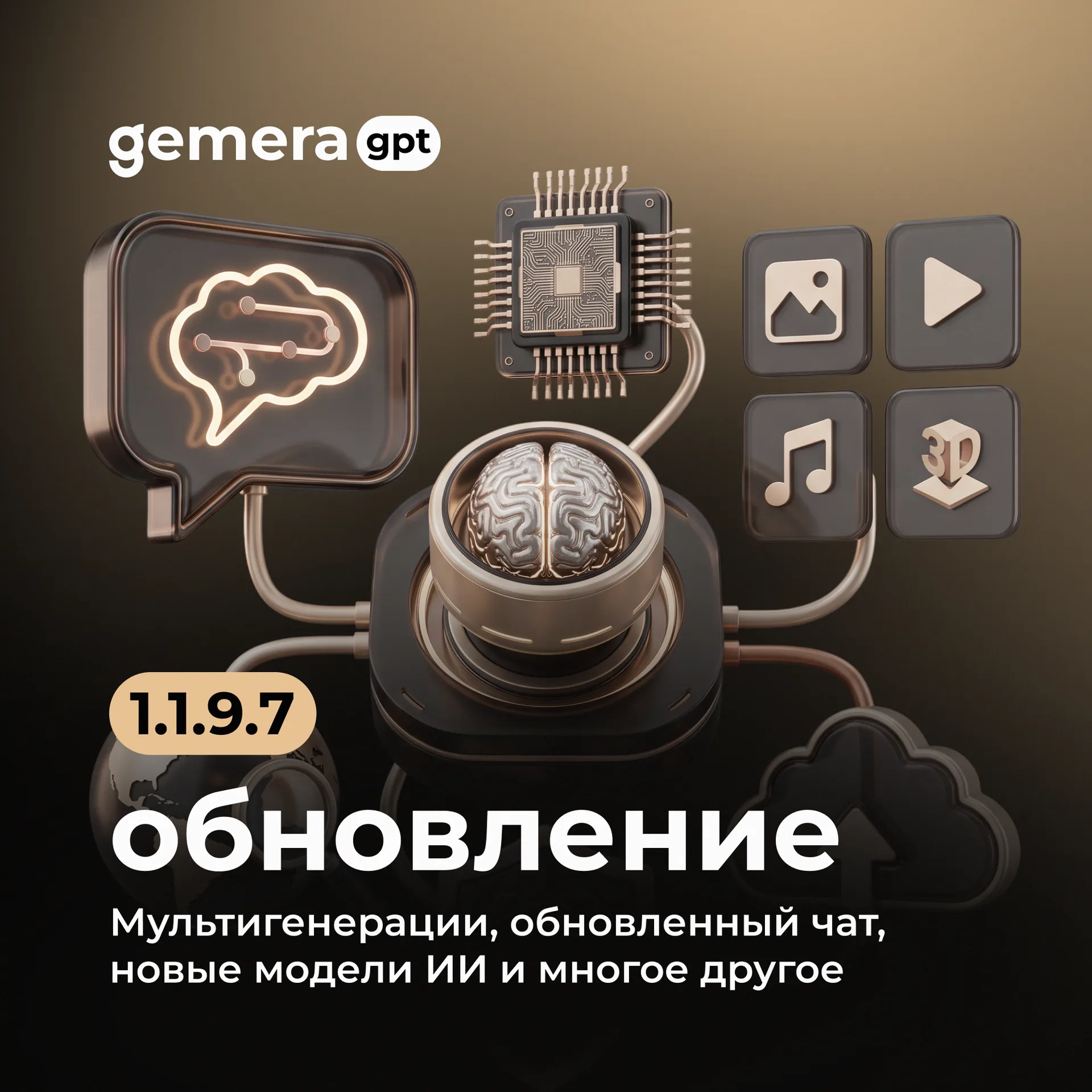
The key element of the system is large 3D objects that visualize abstract technological concepts: a brain with highlighted neural connections for the theme of AI thinking, a chip with tracks for engine updates, image/video/music/3D icons for the announcement of multigeneration. A friendly robot with a wrench has become a character for messages about technical work - instead of the dry “service is temporarily unavailable” the user sees a clear and non-irritating picture.
The 3D style was not chosen by chance: it gives volume and “materiality” to abstract AI concepts that would otherwise be difficult to illustrate. The user does not read the text about neural networks - he sees a glowing brain and immediately understands the topic of the post.
Social networks: a system for all types of content
We took upon ourselves the complete visual design of Gemera GPT social networks - not a one-time kit, but a working system that covers all regular product formats:
Update announcements - large version number, title and list of innovations, supported by a thematic 3D illustration for a specific update
Maintenance - a robot with tools and a clear indication of downtime: the service message is designed as neatly as a promo.
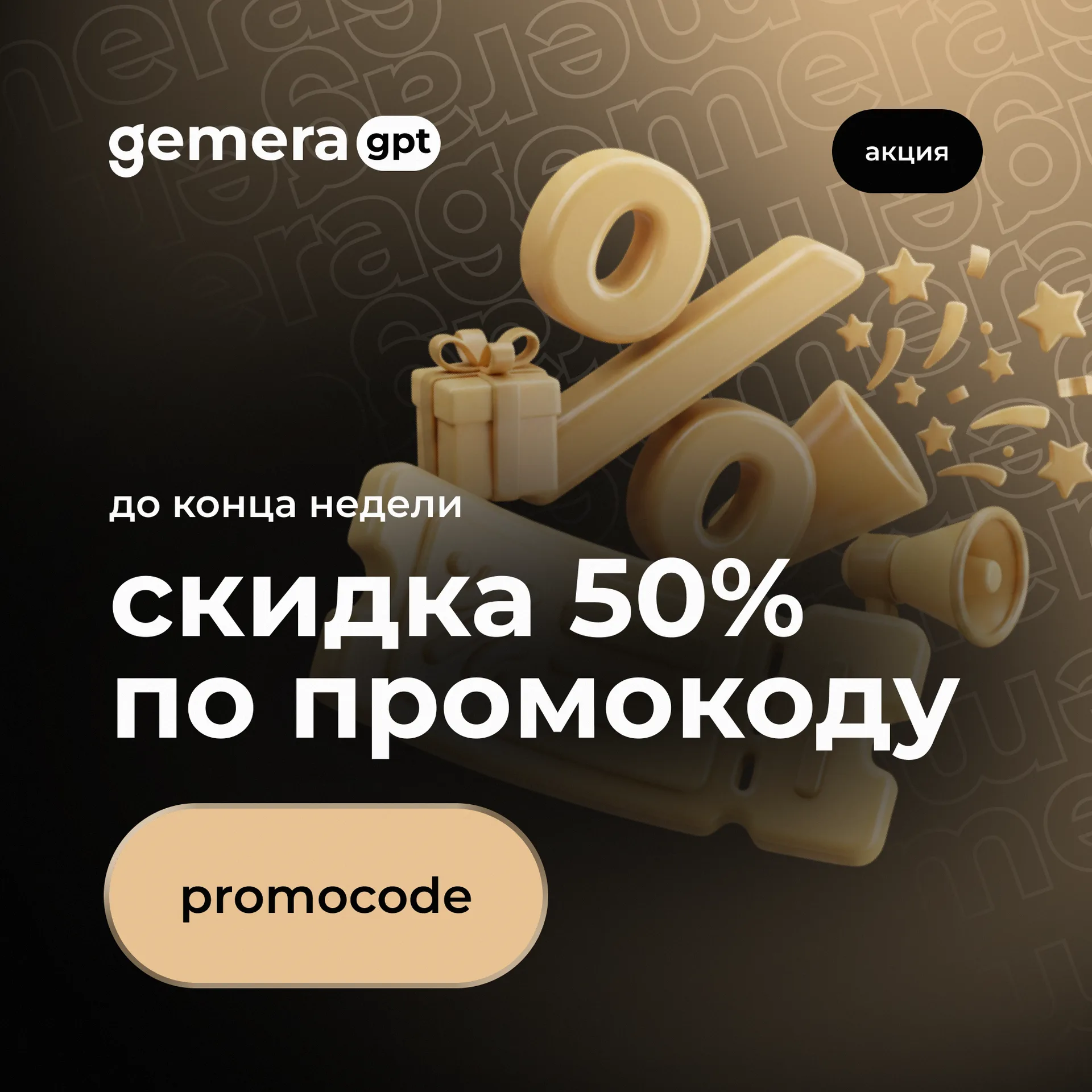
Promotions and promotional codes - golden 3D objects (interest, gift, confetti), a large discount number and a button with promo code.
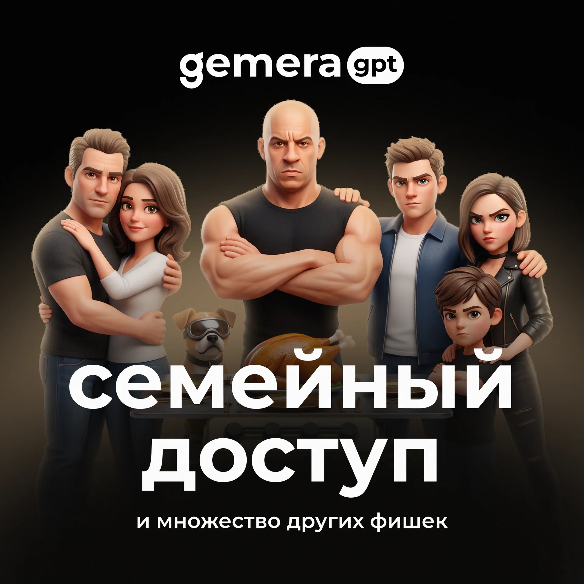
Presentation of new features — for each significant function (for example, family access) a separate story banner with characters and a caption-explanation is assembled.
Each format is marked with a label in the upper right corner - “news”, “notification”, “promotion” - this is how the user reads the type of message even before reading the title, and the product team is guided in its own content plan at first glance banner.
Why it works as a system, and not a set of pictures
Publishing speed without losing quality. When an update comes out weekly, the team doesn’t have time to put together a banner from scratch. Template system with fixed palette, typography and 3D illustration slot reduces production to just a few element replacements.
Recognizability in the feed. The warm palette and characteristic font distinguish Gemera GPT posts from competitors with typical AI neon - the subscriber recognizes the brand without reading the text.
A single brand over a long distance. The logo fixed in the brand book and the graphic language of banners grow from the same system - a new designer or contractor cannot accidentally “break” the style, because the rules are already written down.
Partnership, not a one-time project. Constant work allows the studio to see the context of each next announcement and propose proactive solutions, rather than adjusting the design to the already prepared text of the post.
Result
While working with Gemera GPT, the studio completed the full cycle of visual support for the brand: updated the logo and recorded it in the brand book, built a corporate palette and graphic language based on 3D illustrations, and also took on the design of turnkey social networks - from announcements of updates to promotions and technical notices. This is an example of what an AI product brand looks like that releases updates every week and at the same time does not lose visual discipline.
FAQ: working with an AI product brand
Why does an AI platform need to update its logo if the product is already growing? A growing product quickly outgrows the initial visual: the team grows, there are more communication channels, and the old logo may not hold the load - it is difficult to read in small formats or gets lost among competitors. The update locks the brand into a system that can handle growth.
Why did the AI brand choose a warm palette rather than the typical neon? The generative AI market is visually uniform, with blue and purple gradients repeating from product to product. The warm brown-beige palette makes Gemera GPT stand out in the feed and makes the brand more human compared to “cold” competitors.
What is included in turnkey social media management? Not a one-time set of banners, but a working system: templates for all regular content formats (news, promotions, technical notices, feature presentations), with a single palette, typography and illustration style - plus the production of new banners as updates are released.
What is the difference between a one-time project and ongoing work with a brand? In a one-time project, the studio delivers the finished layout and transfers the files. In constant work, the studio maintains the context of the brand in time: it sees what has been published before, monitors consistency and offers solutions for new product problems without the need to re-explain the brand from scratch.
Do you need constant visual support for your brand - from updating the logo to maintaining social networks? Studio vasilyev.design takes on turnkey design: logos, brand books, websites and social networks - write to us