

swap.coffee: logo and brand book of the DEX aggregator on TON
Case study from vasilyev.design studio: developing a brand name, logo, palette and typography for swap.coffee - a token exchange platform with smart routing, limit orders and trading tools - and assembling a guide to using the brand for the team and partners
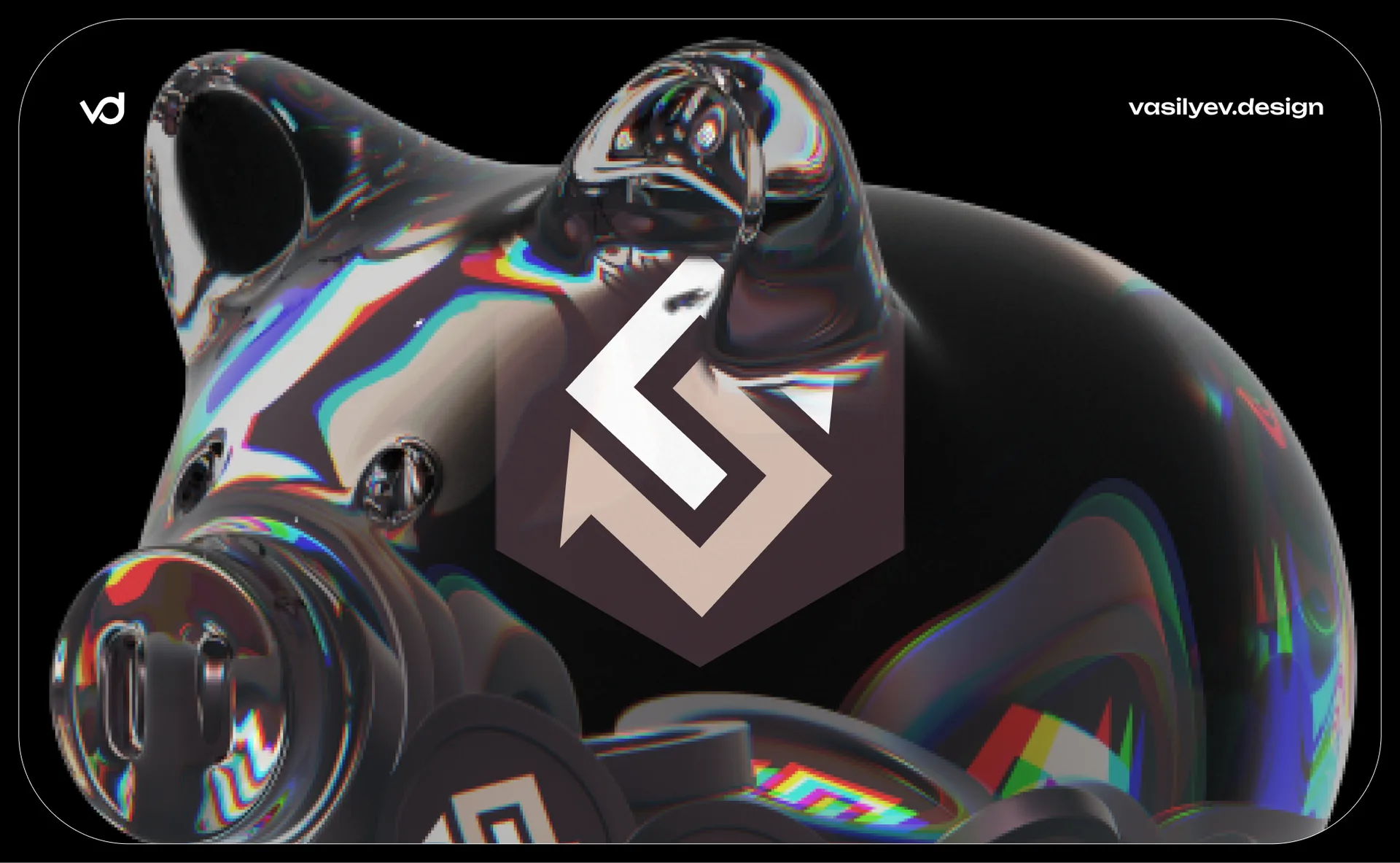
swap.coffee: arrow logo and brand book for a DEX aggregator on TON
Studio case study vasilyev.design: development of a brand name, logo, palette and typography for swap.coffee - token exchange platforms with smart routing, limit orders and trading tools - and a compilation of brand guidelines for the team and partners.
A crypto product sells trust before functionality. The user connects the wallet and trusts the platform with the movement of real money - before understanding the routing of swaps or the mechanics of limit orders, he reads the reliability from the logo, interface and how collected the brand looks. For swap.coffee — DEX aggregator on the TON blockchain — we built an identity that conveys this reliability from the first touch, and designed it into a clear brand assets system for the team, partners and media.
Challenge: balance between DeFi and humanity
DEX aggregators compete in an environment where mistakes cost the user money, and the market is flooded with designs with the same “crypto aesthetic”: neon gradients, abstract polygons, template boards. swap.coffee - a service for smart routing of swap trades, limit orders, DCA strategies and liquidity pools - needed an identity that:
reads as reliable - without the visual noise characteristic of part of crypto projects;
remains warm and humane - the very name “coffee” suggests an informal, friendly tone, rare for DeFi;
works in themes Web3 interface - dark background, glass panels, quote charts;
scaled to partner materials — the sign should look equally good in articles, on data aggregator exchanges and in its own application.
Sign: arrow in a hexagon
The identity is based on a monogram of a broken arrow inscribed in a hexagon. The form is readable in several layers at once:
letter S - the first letter of the name swap, encrypted in the bends of the line;
exchange arrow - directed geometry is directly read as a swap, exchange, transition from one asset to another;
hexagon - honeycomb shape, sending to the word “coffee” through the image of grain and at the same time giving the sign a strict, engineering contour characteristic of blockchain brands.
The sign is built on dense silhouette graphics without small details: clean diagonals and one break in the line remain readable in the size of a favicon, wallet icon and avatar in the Telegram community chat. It is this rare combination - the “crypto-geometry” of the hexagon and the softness of the letter S - that distinguishes swap.coffee from typical DEX logos with abstract polygons.
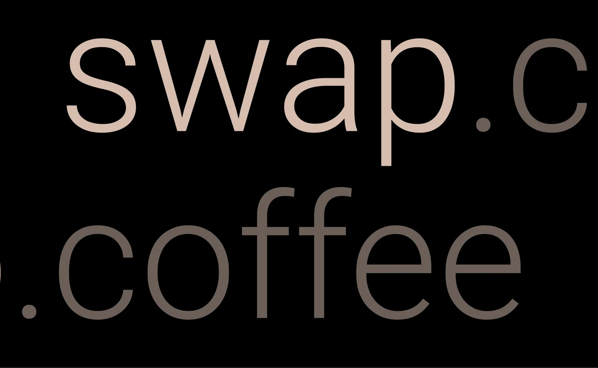
Logo: swap.coffee lowercase
The font part is the name swap.coffee in lowercase letters, typed in two gradations of the same warm shade: “swap” is lighter, “.coffee” is darker. The color breakdown separates the product name from the domain part and at the same time hints at the layering of the coffee - light crema and dark espresso in one cup. The lowercase style removes the typical DeFi rigor: swap.coffee speaks to the user in human language, not terminal language.
Full lock-ap - sign on the left, title on the right - is used on light and dark backgrounds equally: the brand assets page explicitly warns that you need a good contrast between the logo and the background, and gives both versions at once.
Palette: coffee pink instead of crypto neon
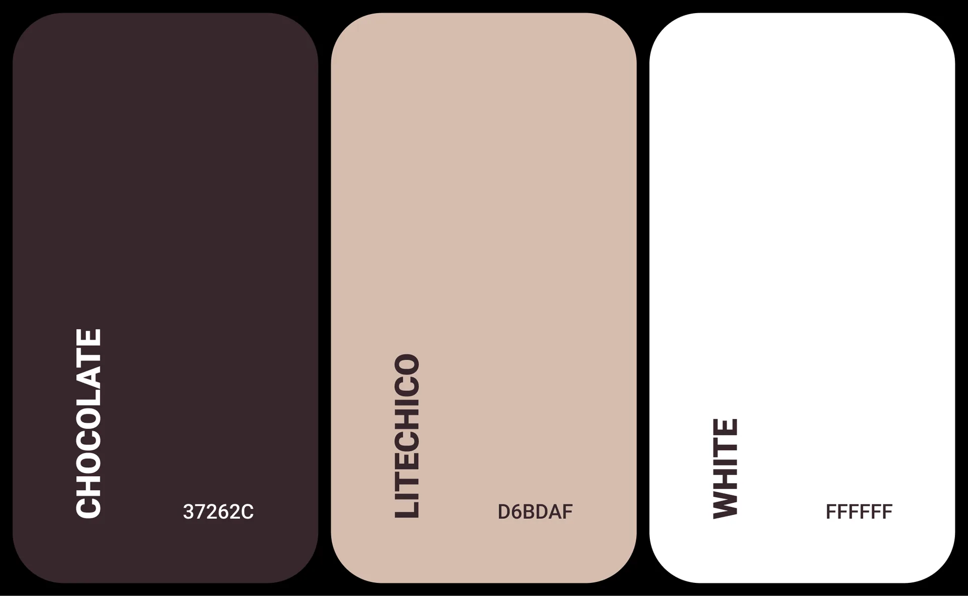
The color system is based on three constants:
Main color, #37262C. Deep coffee brown is a rare choice for Web3, where blue and purple dominate. The shade directly works for the brand name and makes swap.coffee stand out among visually similar DEX projects.
Logo color, #D6BDAF. Warm pinkish-beige is the accent color of the sign itself and the verbal part. It softens the strict geometry of the hexagon and turns the crypto tool into a friendly product.
Logo color, #FFFFFF. White version of the sign and text for dark and colored surfaces - an inversion for the interface, which runs in the dark theme by default.
In addition to the flat palette, the signature graphics use a multicolor gradient element - a group of overlapping spheres in purple, green, turquoise and orange. This detail does not compete with the main palette of the logo: it lives as a separate decorative layer against the background of dark pages, creating a sense of asset movement and liquidity, but is never used in the sign itself.
Typography: Roboto
The signature font is Roboto, a variable family designed for screens. The choice is consciously neutral: where the sign and palette take on the emotional part of the brand, the font remains the ultimate readable tool - for quotes, transaction amounts, wallet addresses and interface signatures, where accuracy is more important than character.
Dark interface: brand in action
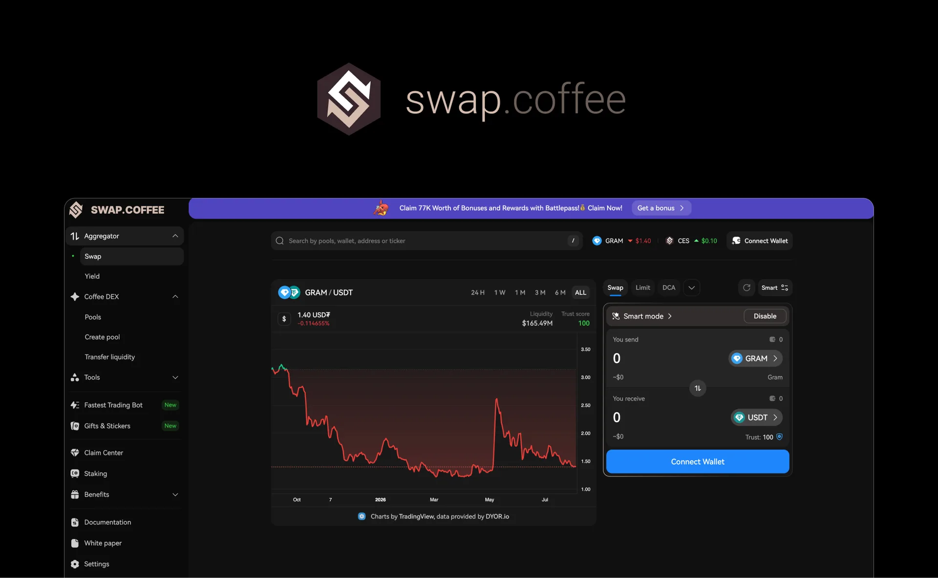
Product interface swap.coffee - working test of identity in battle. The dark theme remains unchanged - this is the standard of Web3 tools, where the user spends hours looking at charts and orders:
Swap panel - “You send” / “You receive” fields, Smart mode switch, Swap / Limit / DCA tabs - the sign and name hold the interface header without conflicting with the working elements.
Quote chart - TradingView integration is built into the overall dark palette without a visual conflict with the brand color.
Product navigation — sections Aggregator, Coffee DEX, Pools, Create pool, Transfer liquidity, Staking, Benefits: the brand remains recognizable even when the screen is densely filled with functional elements.
Promotional blocks inside the interface — a banner with Battlepass bonuses shows that the corporate color can also work as an accent element inside the product, and not only in logo.
Brand assets: page for the team and partners
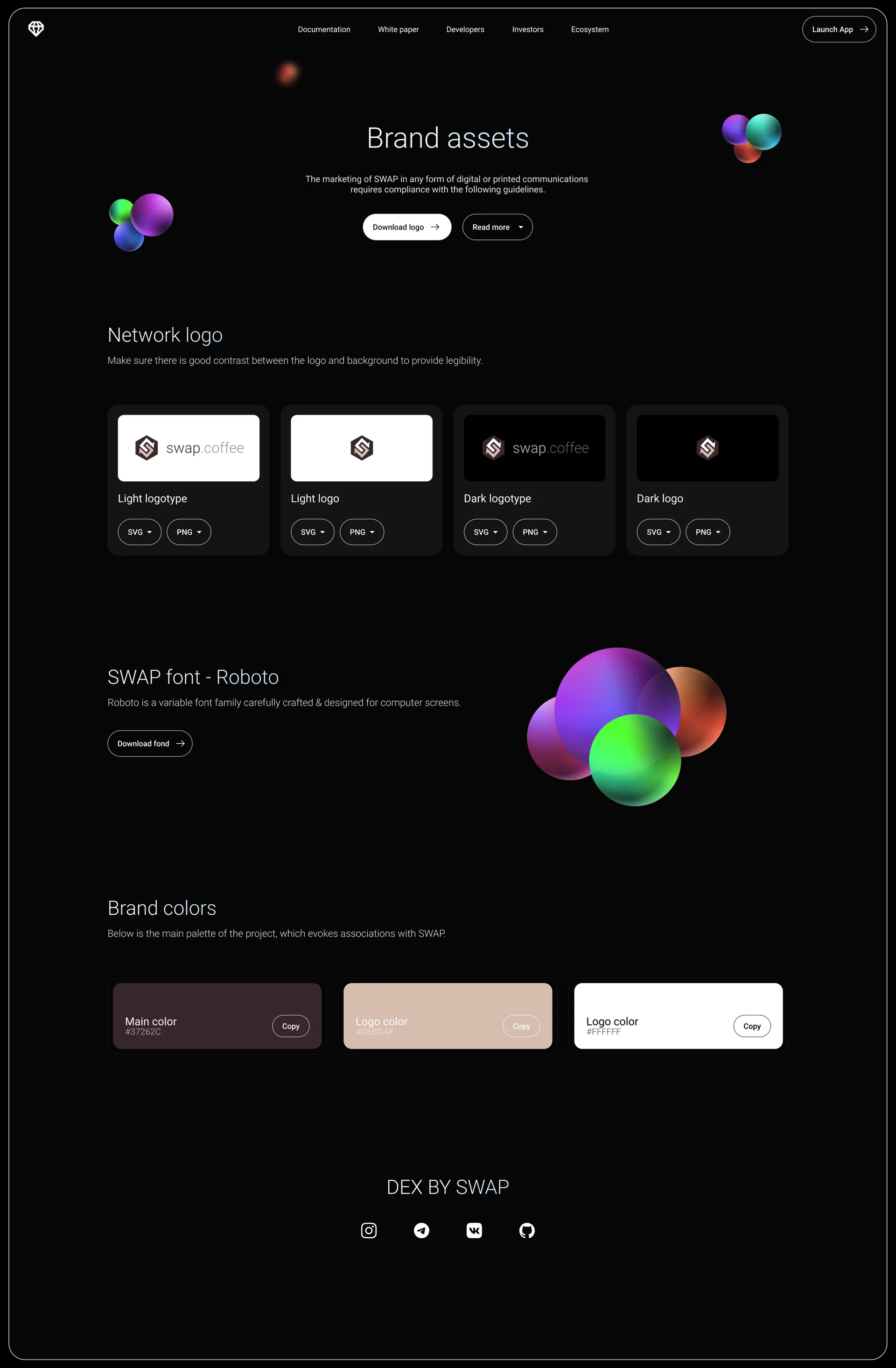
A separate part of the work is the public Brand Assets page, designed as a ready-made tool for everyone who uses the swap.coffee logo in their materials:
Network logo - four options at once: a light logo with text, a light sign separately, a dark logo with text, a dark sign separately - each with download in SVG and PNG.
Font for download - Roboto is available with a direct link so that partner materials are typed in the same way font.
Palette with HEX copying — each color with a card with a Copy button: the partner takes the exact code with one click, without “guessed” shades.
Contrast rule - a direct instruction to monitor the readability of the logo on the background before publishing the material.
Such a page relieves the team of routine: exchanges, aggregators, media and partners download the correct files themselves, and the brand does not spread across dozens of logo versions saved from random screenshots.
What was included in the project
Building sign: arrow-S in hexagon, geometry logic.
Full logo lock-up: sign + word part in two shades.
Palette: main color
#37262C, logo color#D6BDAF, white#FFFFFF.Typography: Roboto for interface and communications.
Light and dark versions of the sign and logo with check for contrast.
Public Brand Assets page with SVG/PNG files and HEX codes.
Decorative gradient element - spheres for promotional surfaces.
Why is this works
Trust through restraint. A coffee-beige palette instead of crypto-neon highlights swap.coffee amidst the visually bustling market of DEX projects and reads like a more serious, grown-up product.
Double meaning in one character. The letter S, exchange arrow and honeycomb shape work simultaneously - a rare economy for monograms.
Readiness for partnerships. The Brand Assets page is not a formality, but a working tool: any partner publishes material with the correct logo in a minute.
A brand that holds its form in the interface. The identity does not conflict with the dense functional UI of the trading platform - this is a rare quality for decorative logos.
Result
swap.coffee received an identity that works on two fronts at once: it sells trust to a new user at the moment of the first touch and remains a working tool for the team and partners. A monogram sign, a discreet coffee palette and an open brand assets page are what distinguishes a product with a systemic brand from a project where the logo is just a picture in the site header.
FAQ: identity for DeFi and Web3 projects
Why was the coffee palette chosen for the DEX aggregator, rather than the typical crypto-neon? The DEX and DeFi market is visually homogeneous: blue and purple gradients are repeated from project to project. Coffee beige palette #37262C / #D6BDAF highlights swap.coffee and at the same time plays on the brand name - a rare hit in both tasks at once.
Why does a crypto project need a public brand assets page? DEX aggregators are mentioned in articles, on data exchanges, in partner integrations and media. Open logo files with accurate HEX codes eliminate distorted versions of the logo that would otherwise spread across the web from screenshots.
Why is the sign both a letter and an arrow? A multi-layered sign saves visual space and gives more reasons for recognition: the user reads the shape at several levels of perception - as a monogram of a name and as a functional symbol of exchange.
How is identity verified in the dark interface of a trading platform? Through real product screens: swap panel, quote chart, navigation with dozens of sections. A brand that only looks good on a presentation slide but gets lost in the production interface is not serving its purpose.
Developing a DEX, DeFi protocol or other Web3 product? Studio vasilyev.design creates logos, corporate styles and brand books for turnkey crypto projects - write to us.