

Logo and brand book for the hike app
Logo, corporate identity, and brand book development for the hike app
Case study from vasilyev.design studio: development of a sign, logo, corporate colors, typography and a complete guide to using the brand for the hike mobile application.
The logo of a mobile application lives under strict conditions: it must be read in a 60x60 pixel icon on a smartphone screen, in a browser favicon, in an App Store card and on a full-screen banner. In this case, we tell you how we designed the hike identity - from the idea of the sign to the brand book, which protects the brand from distortion on any medium.
Challenge: a single visual language for the product
The client needed not just a “beautiful logo”, but a system:
- a memorable sign that works both with the text part and independently - like an application icon;
- corporate palette and font that define the character of the product;
- brand book - a guide to using a corporate logo so that any designer, developer or contractor applies the identity in the same way;
- ready-made adaptations: iOS icon, favicon, versions of the sign for light and dark surfaces.
The name hike - “climbing, rising” - itself suggested a metaphor: upward movement, speed, a confident jerk. For a financial application, this is precise positioning - capital growth and dynamics without aggression.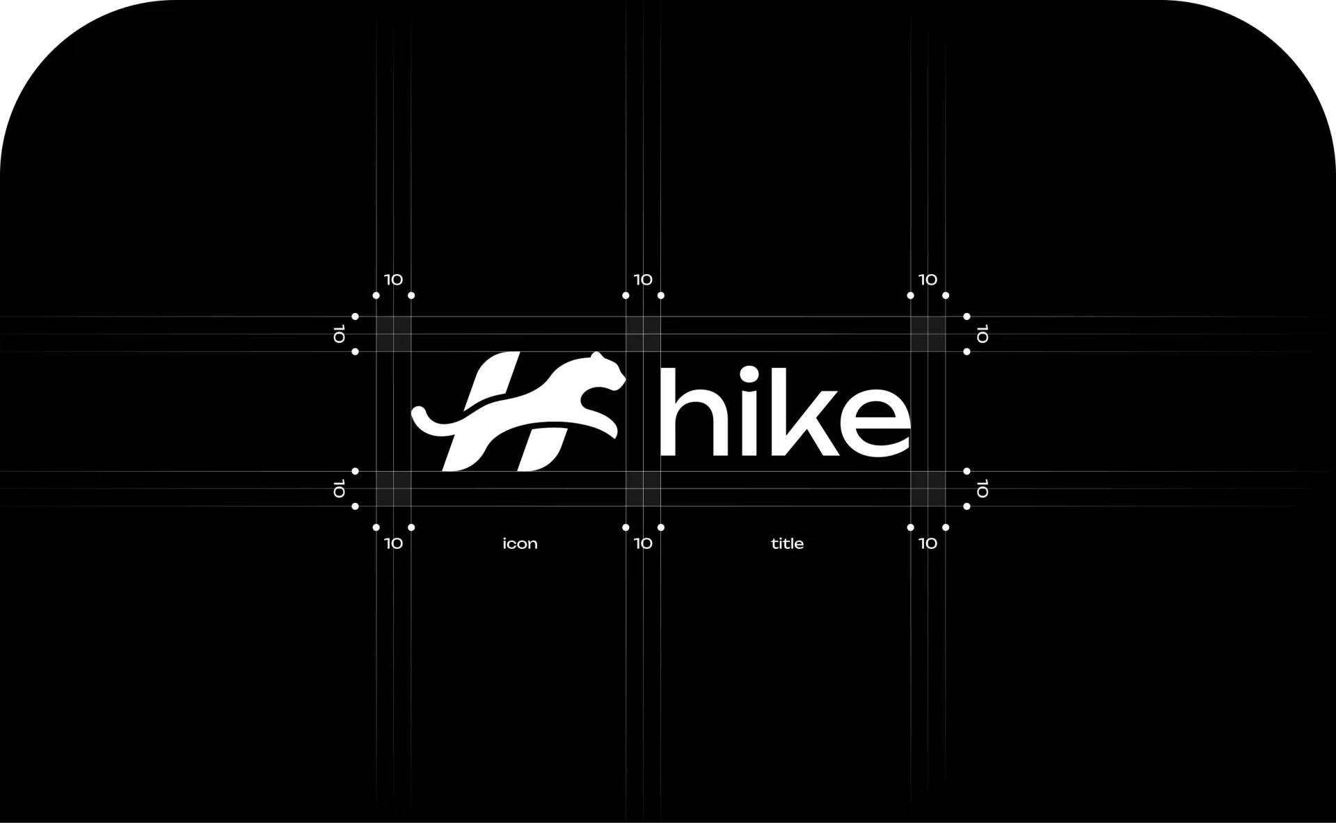
Sign idea: leopard hidden in the letter H
The logo is based on the silhouette of a running snow leopard, inscribed in the first letter of the name. Two inclined ribbons form the letter H, and the body of the animal in a jump becomes its crossbar. The result is a sign with double reading:
- At first sight- a swift wild cat in a jump: speed, strength, grace.
- From the second— monogram H: direct connection with the brand name.
Such “secret signs” are better remembered: the user, having once seen the letter in the silhouette, will no longer be able to “unsee” it. In addition, the zoomorphic sign scales well: the plasticity of the animal can be read even in the size of the favicon.
The leopard is not accidental in its meaning: this animal of the highlands is a direct bridge to the name hike and to the idea of ascent to the goal.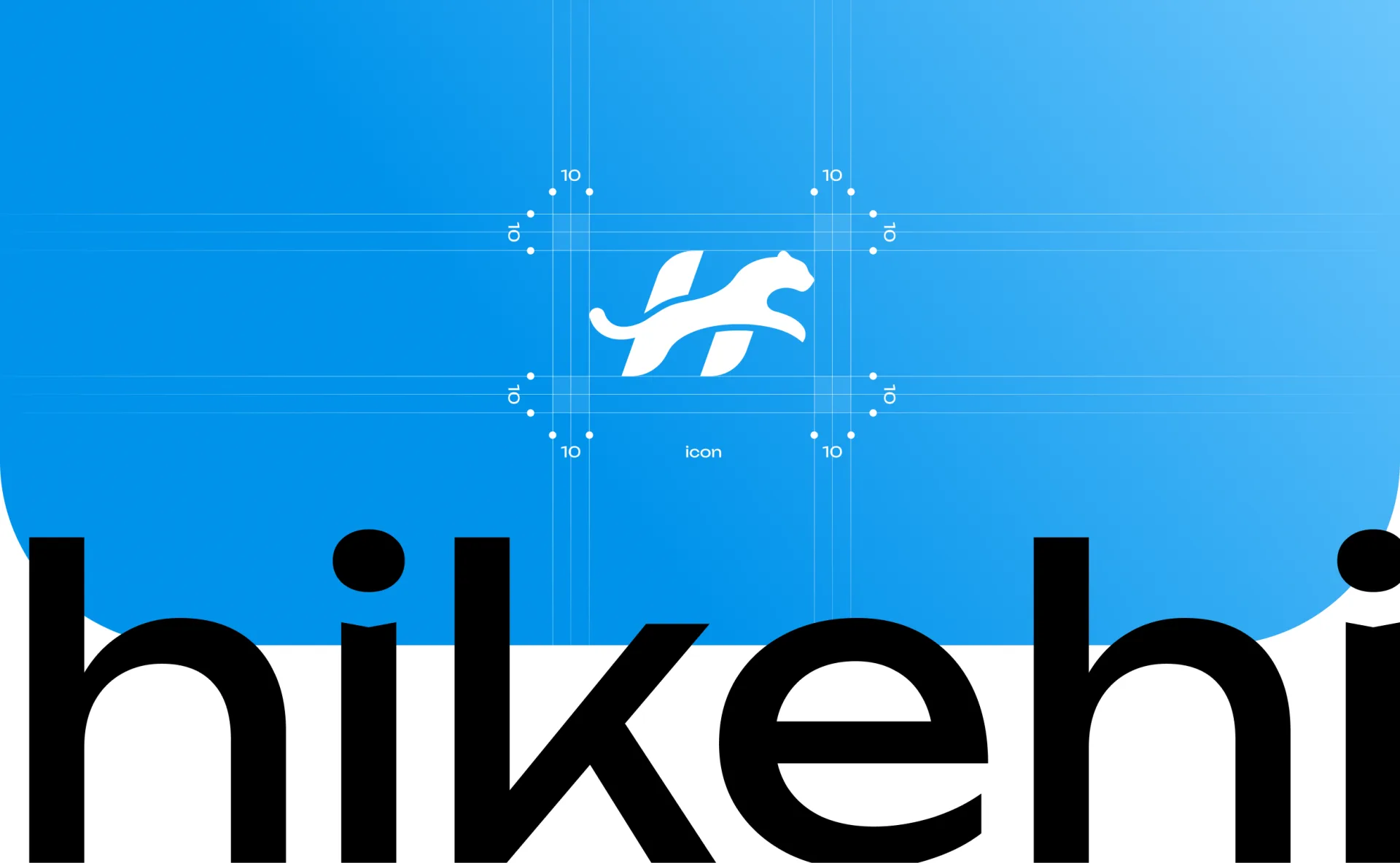
Logo: sign + font part
The full version of the logo is a horizontal lock-up: the sign on the left, the lowercase “hike” on the right. Lowercase letters make the brand feel friendly and modern—the language of digital products, not 90s corporations.
The brand book contains a modular construction grid: the security field around the logo is set by module “10” - a distance that cannot be violated by either text or other graphic elements. The security field for an independent sign-icon is described separately. This simple rule gets rid of a typical brand problem: headings and layout edges that “stick” to the logo.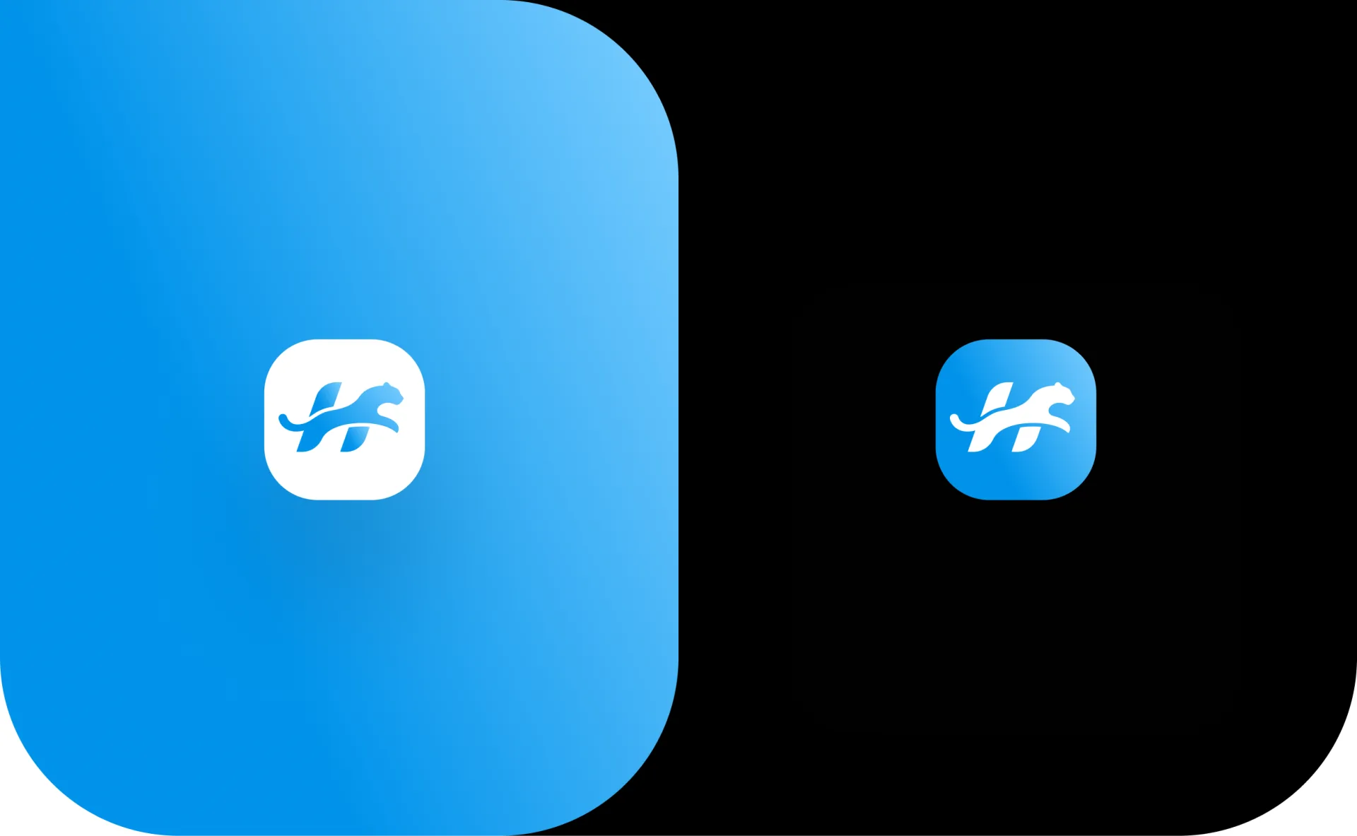
Brand colors: sky gradient
The hike palette is laconic - three colors
The gradient from rich blue to light sky creates a feeling of air, height and lightness - again working on the metaphor of ascension. At the same time, the palette remains strict and “banking”: for a fintech product, trust, not diversity, is important.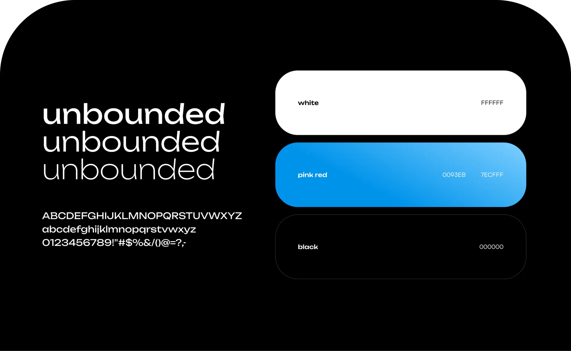
Typography: Unbounded
Corporate font -Unbounded, a modern grotesque with wide proportions and distinctive details. It is used in three styles (from Light to Bold), supports Cyrillic and Latin, and works great in both large headings and interface signatures. The wide plasticity of Unbounded rhymes with the rounded shapes of the sign - the identity feels solid.
Adaptations: from favicon to App Store
A good brand book is tested not on a poster, but in real media. For hike we rendered and tested:
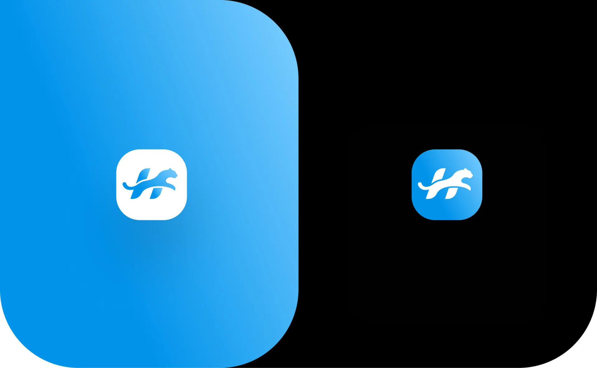
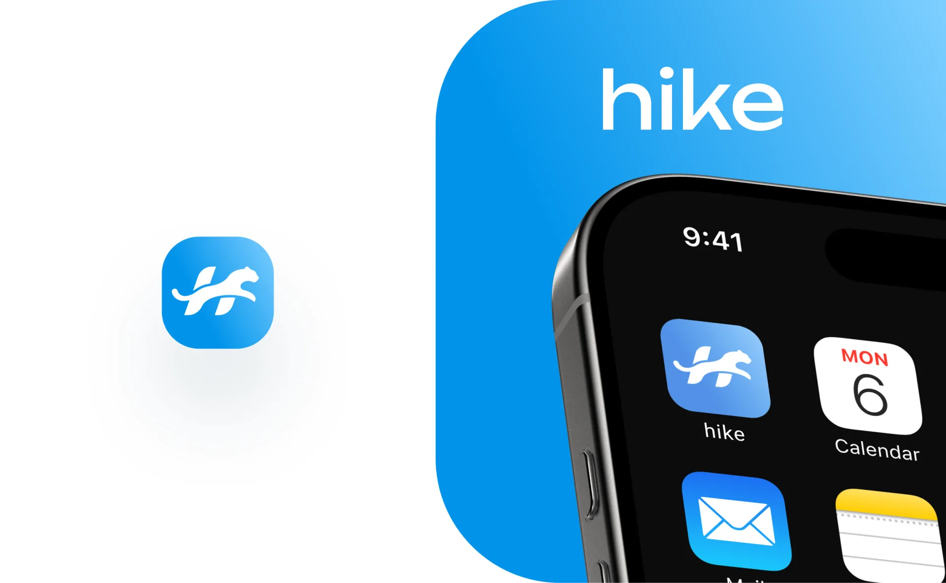
- iOS application icon— a sign on a corporate gradient and an inverse version (a white plate with a gradient sign). The icon is tested in the context of the home screen next to Apple system applications.
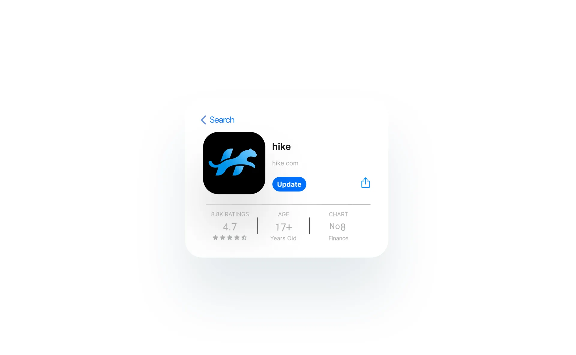
- Card in the App Store— the sign looks confident on a black background, maintaining recognition in the “Finance” category.
- Favicon and browser tab— the minimum size in which the silhouette of a leopard remains readable.
- Corporate pattern and banners— large “hike” typography with trimming to the edge of the layout and a translucent silhouette of a leopard as background graphics.
Rules of use: logo on different backgrounds
A separate spread of the brand book is a matrix of acceptable combinations of sign and background. The principle is simple and unambiguous:
- on light and light blue backgrounds - a gradient or black sign;
- on the rich corporate blue there is a white sign;
- on gray and black surfaces - white version;
- monochrome (black/white) - for documents, engraving, printing in one color.
The rule is formulated in one line:use the correct logo color relative to the background. Such a matrix removes subjectivity - the contractor does not need to “feel”, just check the table.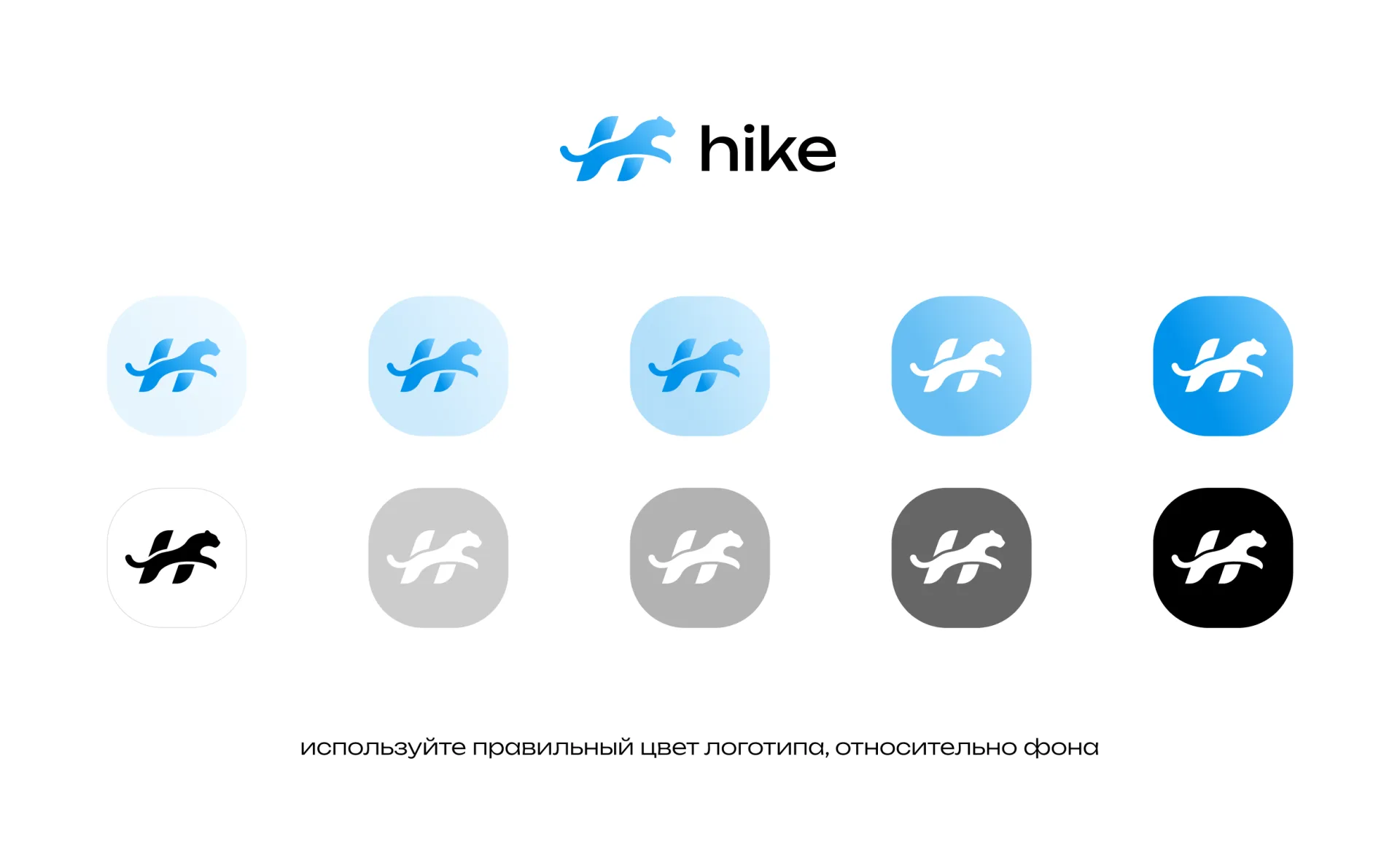
What's included in the brand book
- Philosophy and idea of the sign.
- Logo construction, modular grid, security fields.
- Logo versions: full, sign, inversion.
- Corporate colors with HEX codes and application rules.
- Typography: Unbounded styles and hierarchy.
- Matrix “sign × background”: permissible and prohibited combinations.
- Adaptations: iOS icon, favicon, App Store, banners, pattern.
Result
hike received an identity that scales without loss: the same sign works in 16 pixels of the favicon and on the billboard, and the brand book guarantees that in a year and in five years the brand will look as intended. A zoomorphic monogram gives recognition from the first touch - and in a crowded store this is a competitive advantage.
FAQ: logo and brand book development
How does a brand book differ from a logo book?The logobook describes only the logo and the rules for its use. The brand book is broader: it includes colors, typography, graphic elements, adaptations to media and principles of brand communication.
How long does it take to develop a logo and brand book for an application?On average, from 2 to 6 weeks depending on the volume: number of concepts, media and depth of the guideline.
Why are logo security fields needed?Security margin - minimal space around the sign, free from text and graphics. It maintains the readability and “weight” of the logo in any layout.
Why is a separate icon important for an app rather than a smaller logo?The full logo with text is unreadable in icon size. Therefore, in the hike system, the sign is designed as an independent unit and tested in real iOS sizes.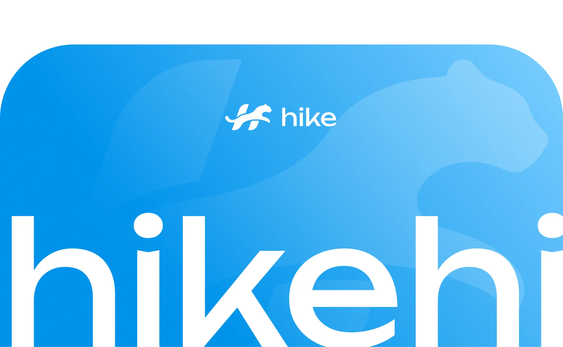
Do you need a logo and brand book for your product? Write to us - vasilyev.design studio develops turnkey identities for applications, services and brands.