Website design for the TabPay payment service
How we made a landing page, a payment page with 12 states, a dark theme and a UI kit for the TabPay payment acceptance service. Solutions, mistakes, what to take into your project.
About the client and task
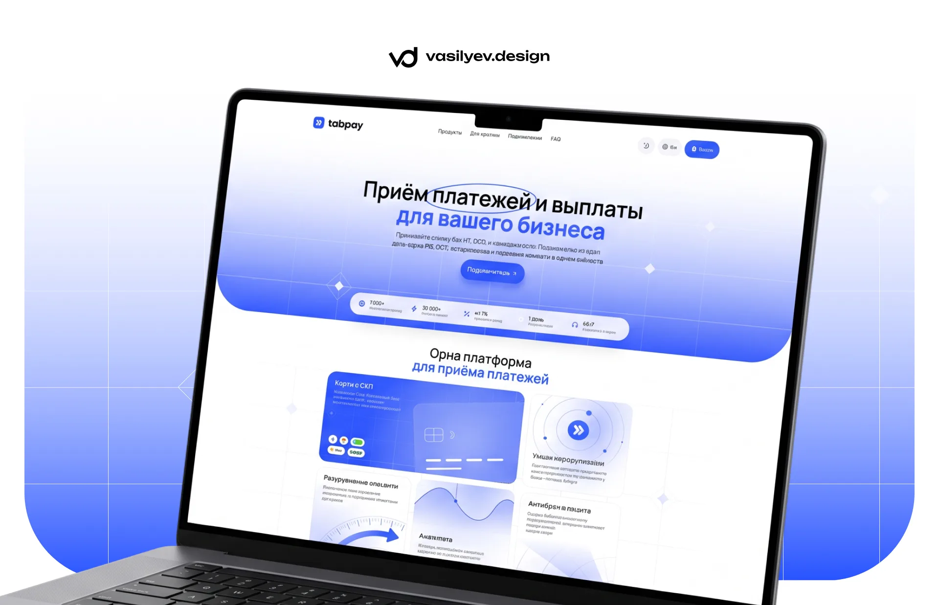
TabPay is a payment service for websites, Telegram bots and applications. The store connects to it and accepts payments by cards of Russian banks and via SBP, and receives the money into its account without individual entrepreneurs and LLCs. The service's clients are small online projects: VPN services, bots with subscriptions, digital goods, courses.
They came to us with a fairly broad request: they needed a logo with a basic identity, a website and a personal account design. The service already had a working product and its own code on Nuxt, but there was no face: the site did not explain what it was and why, and the payment page - the place where the buyer enters the card - looked like a technical form.
We agreed to go in parts. First, the main page and the payment page with all the states, in a light and dark theme, plus a mobile version and a UI kit, on which we will later create a personal account. This article is about the first part.
The problem was formulated in two sentences. For business: in one screen, understand what this service is, who it is suitable for and how to connect. Buyer: pay without thinking about where to click. Everything else - the design system, themes, responsiveness - is only needed so that these two proposals work on any screen and so that the site can be developed without us
First screen: one header, one button
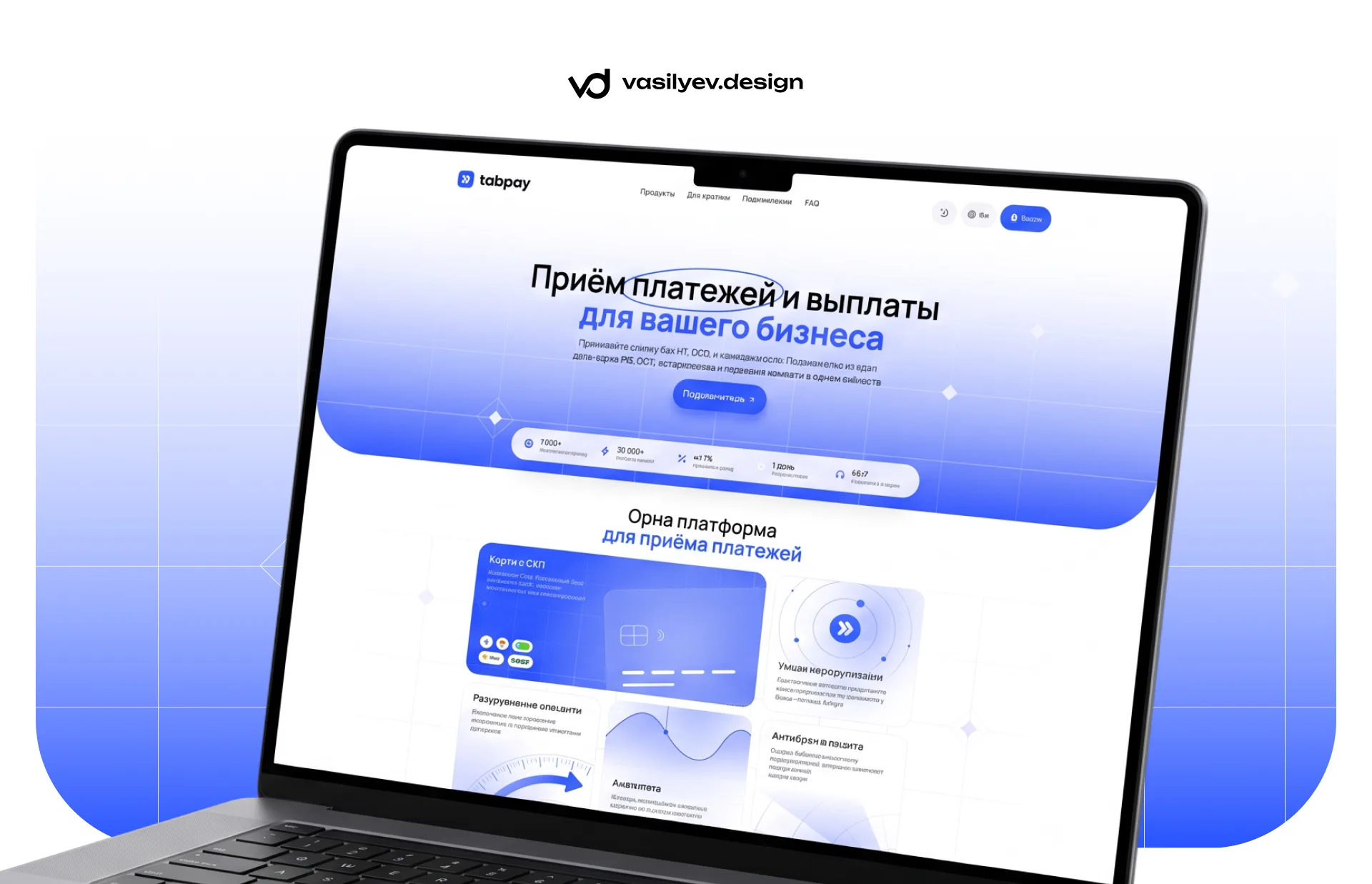
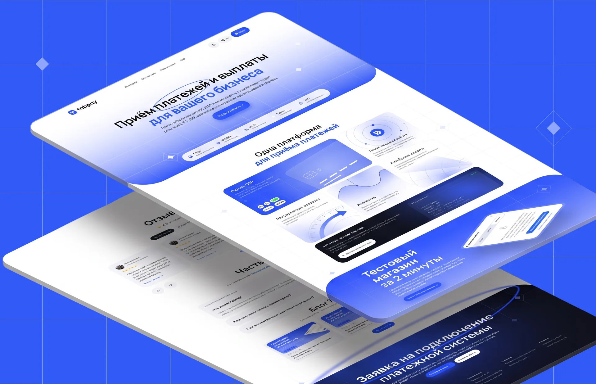
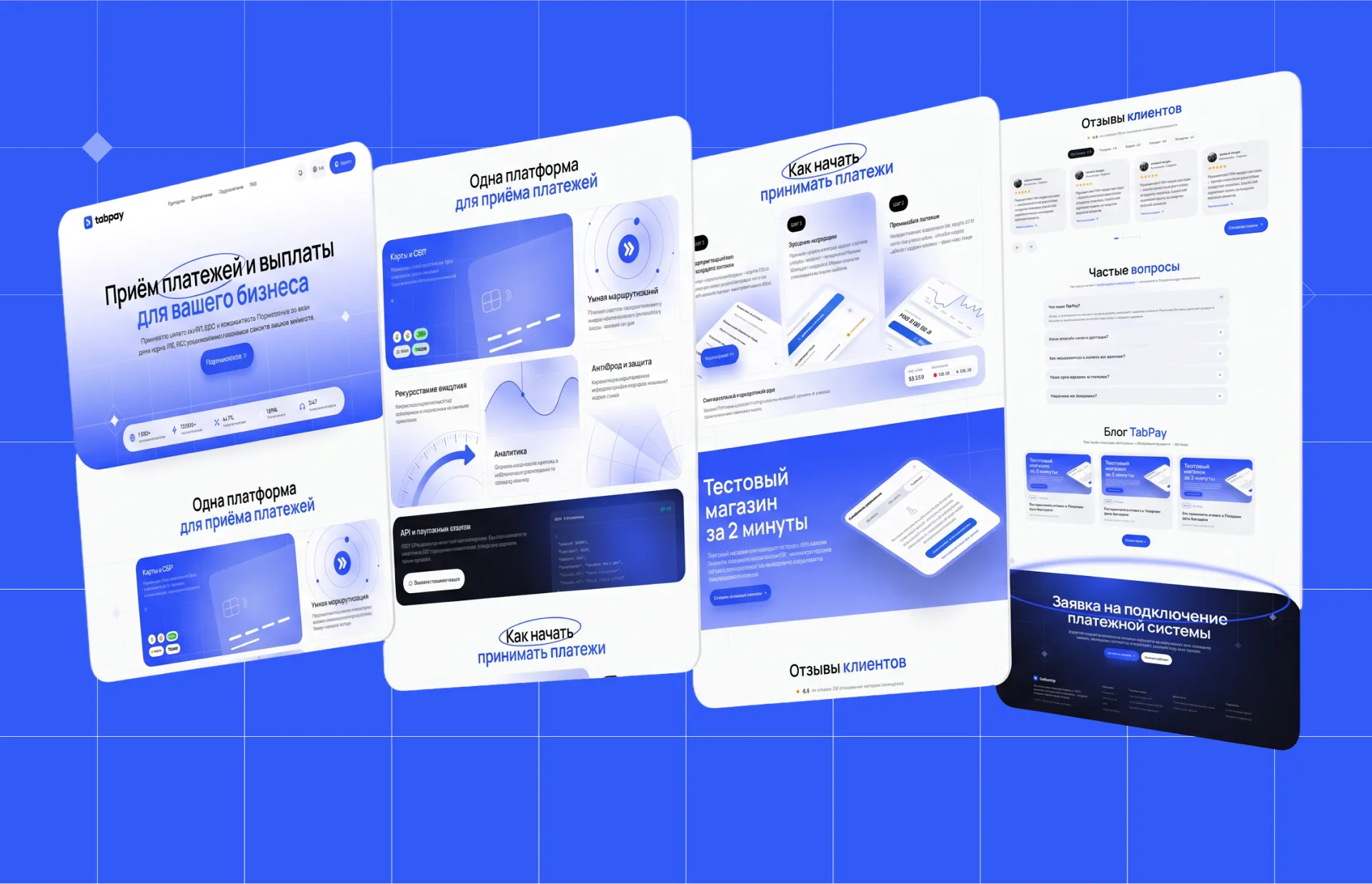
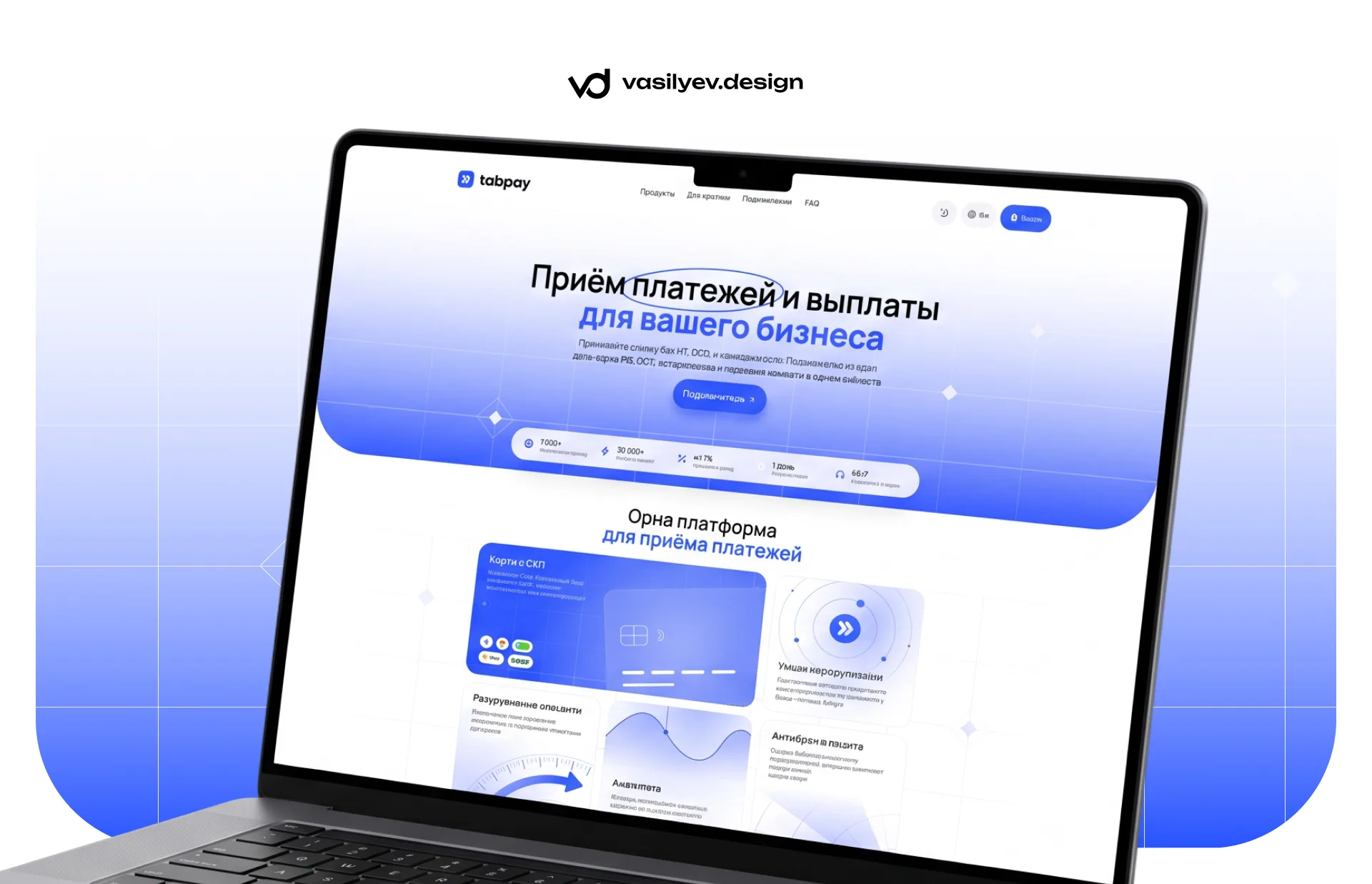
The title is “Accepting payments and payments for your business.” Without “ecosystems” and “new generation solutions”. The word “payments” is outlined with a line, like pen on paper, the only decorative touch on the screen, and it keeps the eye on the main word. The subtitle immediately answers what is asked first: without individual entrepreneurs and LLCs, connection in one day, cards and SBP.
There is only one button on the screen - “Connect”. On landing pages they like to put a second, contour line next to it: “Learn more”, “See tariffs”. It divides attention in half and is almost never needed: those who want to learn more simply scroll further. The dark theme and language switch is in the header next to the login button - so the site immediately feels like a product, and not like a booklet.
Immediately below the first screen is a line of five facts with icons. These are not “they trust us” or “the best service”, but specific numbers that the service updates itself. A number next to a promise works better than any adjective
Visual language: one blue, one font and an arrow
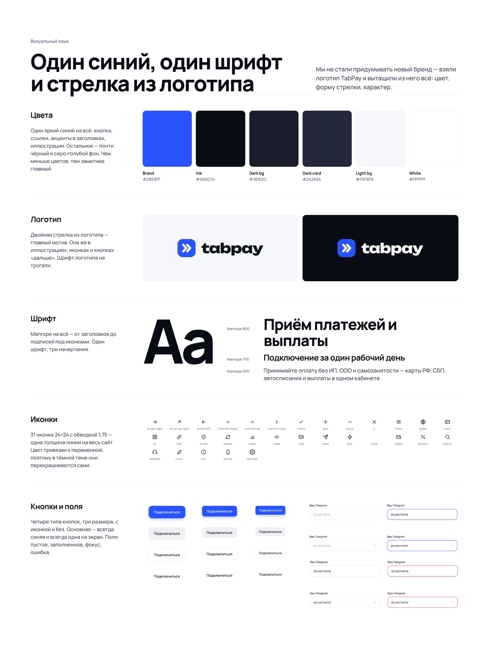
The starting point is the logo: a blue square with rounded corners and a double arrow to the right. The arrow is the payment: the money went and came. The entire site grew from it: the same blue #2853FF on buttons, links and accents in headers, the same arrow in illustrations and “next” buttons. There is no second accent color at all. The rest is almost black text and a blue-gray background. The fewer colors, the more noticeable the main one, and the easier it is to maintain the style later without a designer.
There is only one font - Manrope, in three styles. Bold with close letter spacing for headings, semi-bold for subheadings and buttons, medium for text. It handles the Cyrillic alphabet and numbers well, and there are a lot of numbers on the payment site: amounts, commissions, rates, timers.
They drew their own icons - 31 pieces, 24x24, one line thickness for the entire site. The color of the icon is tied to a variable, so in the dark theme they are recolored themselves. No emoji instead of icons and no random sets from different sites: it is the inconsistency in the little things that makes the site look cheap.
Product block: grid and its own graphics
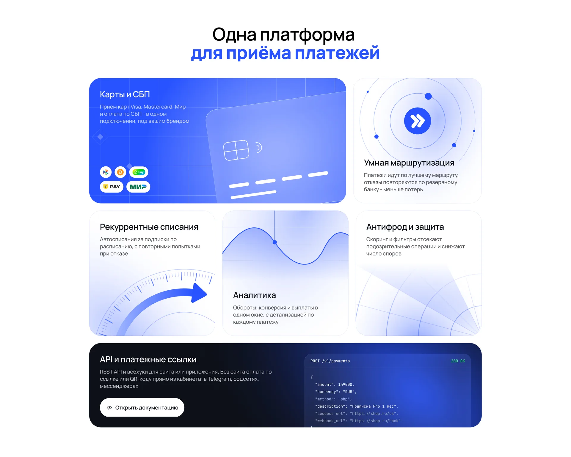
TabPay has six options, and they are not equivalent. The main thing is cards and SBP, for this they are connected. Therefore, instead of six identical cards with icons, we made a grid with different sizes: the “Maps and SBP” card is twice as wide and blue, the rest are more compact and light. The look itself goes from big to small.
Each card has its own illustration: a bank card at an angle, orbits around the logo for routing, a speedometer for subscriptions, a graph for analytics, a grid for protection. Everything is drawn with vectors in the corporate blue, without stock images and without 3D renderings, which are now on every second fintech landing page. Such illustrations can be easily redrawn for a new product, and they do not weigh down the page.
Separate dark card - API and payment links. Instead of the text “we have a convenient API,” it shows a real request to create a payment. The developer sees in three seconds that the integration is simple, and he doesn’t need any words
Payment page: 12 states and nothing extra
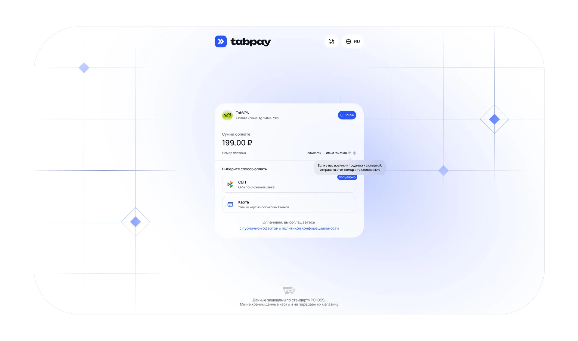
The payment page is the most expensive place in the entire service. Before her, the buyer had already chosen the product and decided to pay; here he either completes the task or closes the tab. Every extra element on this screen is a reason to doubt.
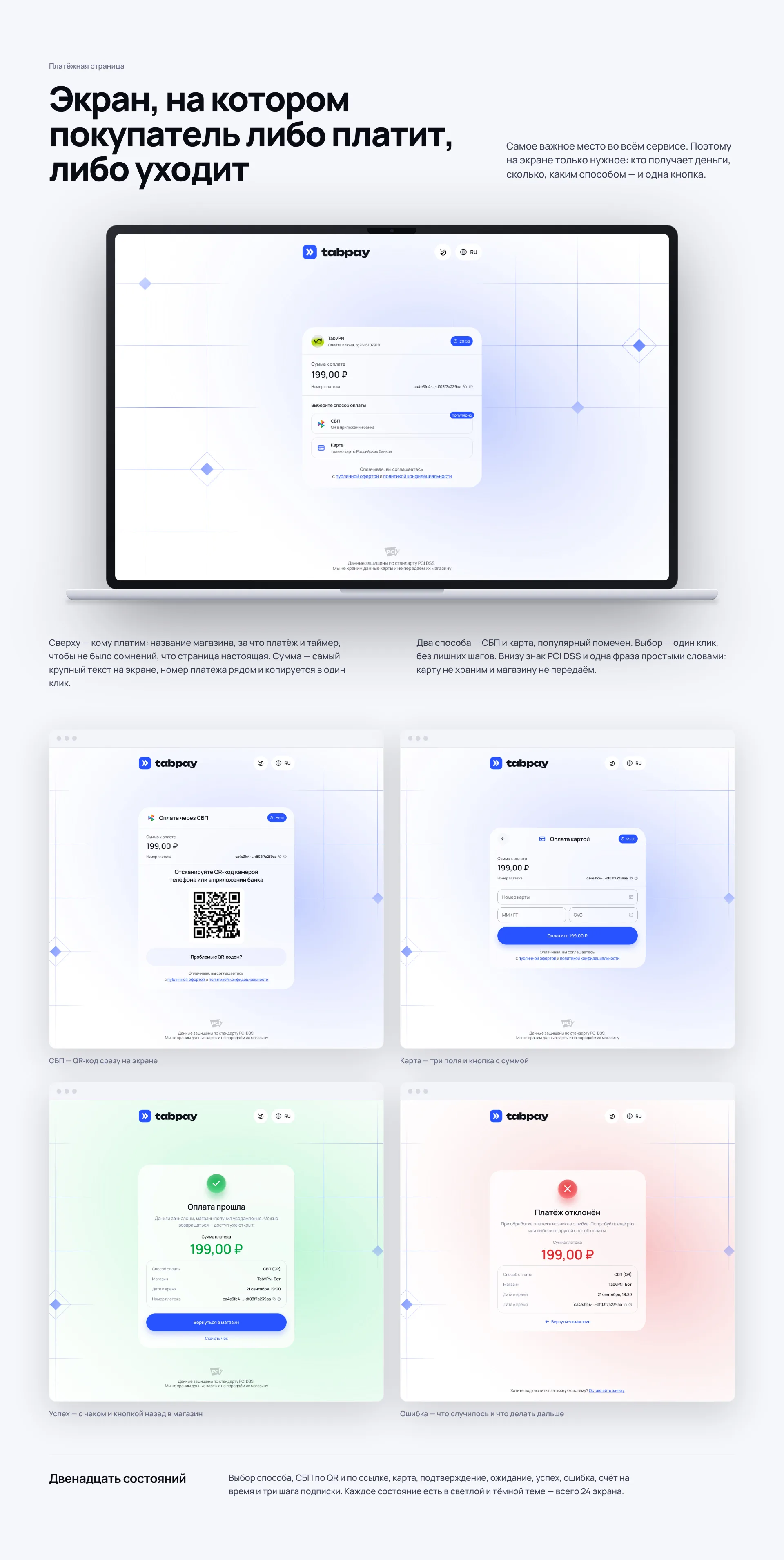
That's why there are only four things on it. Who we pay: the name of the store, what the payment is for and a timer - so that there is no doubt that the page is real. How much: amount is the largest text on the screen, the payment number is nearby and copied in one click. How: SBP or card, the popular method is marked. And below is a PCI DSS sign with one phrase in simple words: we do not store the card and do not transfer it to the store.
The page has twelve states: choice of method, SBP via QR and link, confirmation before SBP, card, waiting, success, error, time count and three subscription steps. Several of them are worth mentioning separately.
The SBP shows the QR code immediately, without an intermediate screen, and the code always lies on a white backing - the bank’s camera reads it the same way in both themes. Before the SBP there is a short confirmation: the method cannot be changed later, and it is better to say this before than to receive a support request after. Card - three fields and a button with the amount right on it: “Pay 199.00 ₽.” The success screen is highlighted in green, with a receipt and a button back to the store. The error screen doesn’t just say “payment declined,” but tells you what to do: try again or choose a different method
Dark theme: a separate palette, not an inversion
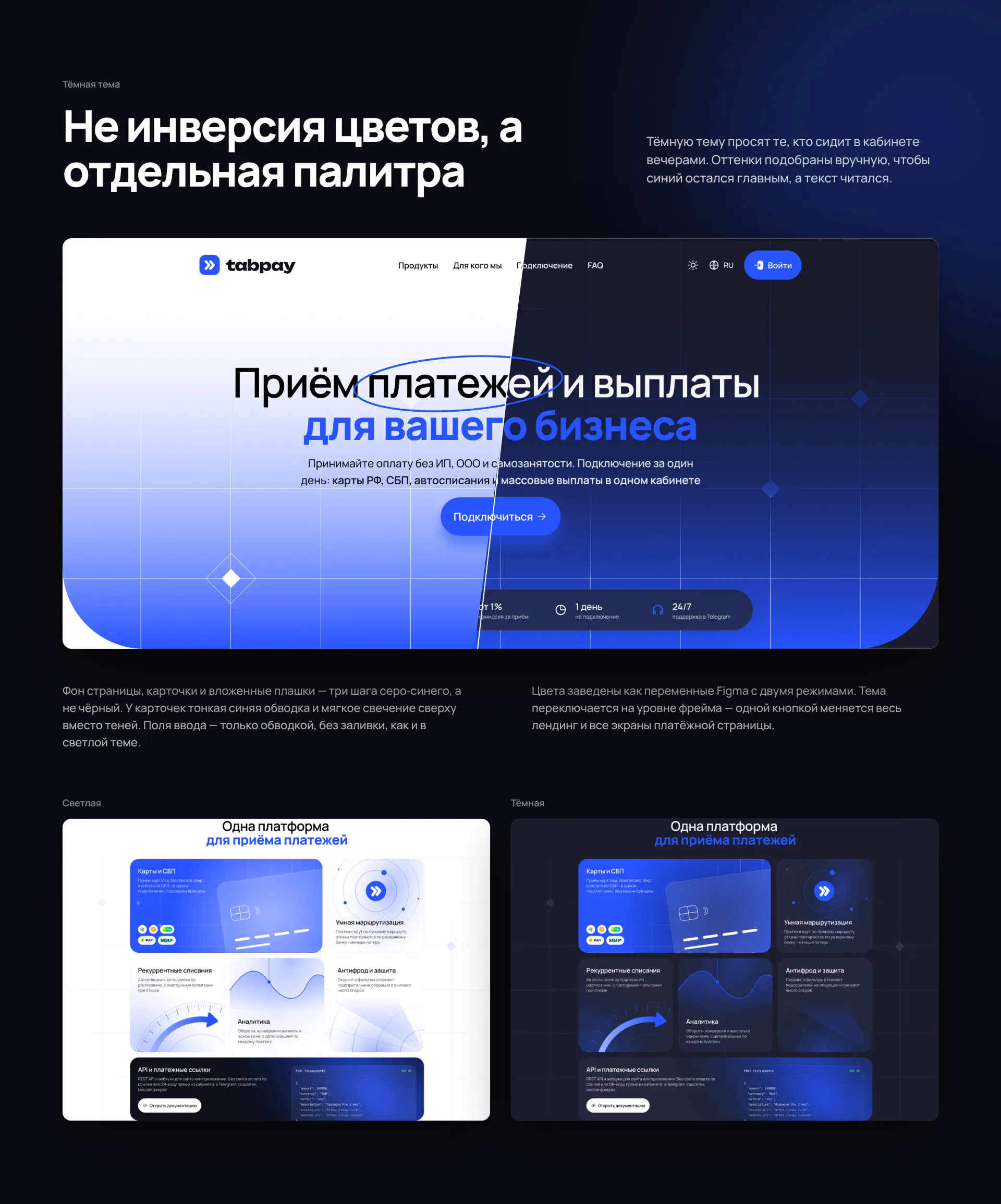
A dark theme for a payment service is not asked for for the sake of fashion. Shop owners sit in their offices in the evenings, and customers open payments from a Telegram bot at night - the white screen at such a moment is annoying. You can't simply invert colors: blue on black loses its brightness, gray cards blend into the background, and shadows disappear completely.
Therefore, the shades are hand-picked. The background is not black, but dark gray-blue; cards are a tone lighter, with a thin blue outline and a soft glow on top instead of shadows; nested dies are the background color again. Three steps deep, and that's enough. Input fields in the dark theme have only an outline, without filling, as in the light theme; payment methods - on the contrary, smooth tiles without frames so that the card does not turn into a grid of strokes.
Technically, the theme is made through Figma variables with two modes. Each color on the layout is not a value, but a reference to a variable that has a light and dark value. I switched the mode on the frame - and the entire landing page with payment pages changes entirely. For the developer, this is a ready-made set of tokens: one names, two sets of values.
Mobile version: a separate assembly, not a reduced desktop
The owner of a small business looks at the payment site from his phone - between tasks, using a link from the chat. Therefore, the mobile version is assembled separately, with a width of 393 px, and is not obtained by compressing the desktop. All nine blocks have been reassembled into one column: product cards are located one below the other, steps are taken in turns, buttons span the entire width of the screen, the text is larger than usual for a desktop.
The header on your phone saves what's important: the logo, theme switcher, language, and menu. The illustrations from the product block were not cut out “to save space” - they remained, they just became smaller. Mobile blocks are assembled from the same components as the desktop, so edits in a button or card arrive in both versions at once.
UI kit and transfer to development
Everything described above lives in one Figma file. On a separate page there is a UI kit: colors as variables with two modes, text styles, 31 icons, buttons of four types and three sizes, input fields with four states, tags, cards and landing blocks as components. The pages are assembled only from them: not a single “unlinked” element with a color set manually.
Why does the client, and not just the designer, need this. TabPay has its own development team using Nuxt and Vue, and the site will grow: new landing pages for niches, documentation pages, personal account. When there is a whale, a new page can be assembled from ready-made parts in an hour, and it will not diverge from the rest of the site. Without the whale, each subsequent page is a new project with new indents and a slightly different blue.
Developers receive from the file ready-made tokens of colors and typography, the states of each component and autolayouts, which show how the block behaves with a different text length. This eliminates most of the layout issues and saves a week or two of correspondence.
What does this give to the service
A beautiful website in itself is worth nothing. Here's what's changing for TabPay in practice.
The visitor understands the service in one screen, which means fewer people leave without understanding it. On the payment page, the buyer sees the amount, method and button - and gets to the end, and the client’s stores receive more payments from the same traffic. Numbers, reviews from sites, the withdrawal rate and the PCI DSS sign are in plain sight - it’s easier for a business to make a decision, and it’s easier for a buyer to pay.
From a phone, the site can be read without zooming, and the buttons can be pressed the first time. The dark theme is not worth double work: a new block is drawn once and immediately lives in both. And the most important thing for a growing product: the team can assemble new pages themselves, from ready-made parts, without waiting for the designer.
There will be no conversion figures here: the site is still being designed, and promising interest before launch is a bad habit. We will update the article when data for the first months appears.
What you can take into your project
These rules are not tied to TabPay. They work for any payment or fintech service site where a person trusts you with money.
The first screen answers three questions - what it is, for whom, how to start - and contains one button. The second button is almost always superfluous.
Objections are removed where they arise. “Without IP” is in the subheading, the withdrawal rate is next to the connection steps, security is under the payment form, and not on a separate page.
On the payment page, the amount is the largest text, and the button says how much will be debited. The error always tells you what to do next.
One accent color, one font, your own icons and illustrations. Stock 3D coins and gradient spots make the site look like hundreds of others.
Dark theme and mobile version are included in the UI kit from day one, and are not added “later”. Then - this is the second project for the price of the first.
Frequently asked questions about website design for a payment service
How long does it take to design a website for a fintech service?
Landing with a mobile version and UI kit - from two weeks. The payment page with all the states and the dark theme add another week or two. Most of the time is spent not on images, but on states and edge cases: errors, waiting, long store names.
Does a payment service need a dark theme?
If customers come from Telegram or pay from their phone in the evening - yes. But only if it is built into the variables from the very beginning. Adding a dark theme to a ready-made website without tokens is almost the same as drawing it anew.
What is more important on a payment page - design or speed?
Speed, and good design helps it: no heavy pictures, one font, a minimum of elements. The TabPay payment page weighs less than one photo from a typical landing page.
Is it possible to order only a payment page, without a website?
Yes. Often this is where you should start: this is the shortest path to money for the service, and the landing page can be assembled later on the same UI kit.
How do you hand over the design to the developers?
In Figma: components with states, color and typography variables, auto layouts. If desired, we also take the layout - then the kit turns into a set of ready-made components in code.
Do you need a similar website?
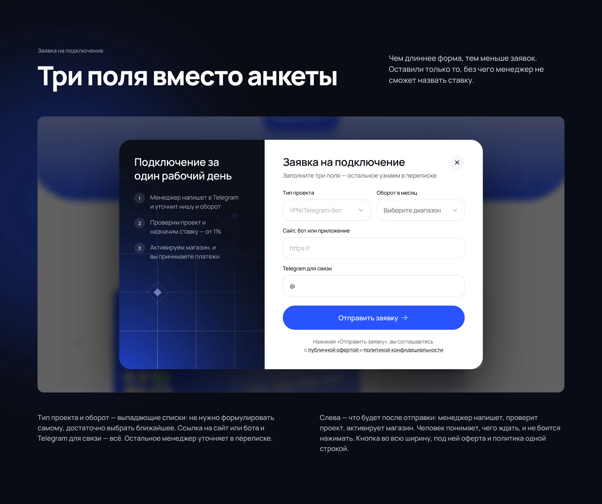
We design websites for payment and fintech services, Telegram bots and online products - from a logo to a personal account, with with or without layout. The work includes a desktop, mobile version and UI kit; dark theme and payment screens - according to the task. Turnkey website - from two weeks, logo and corporate identity - from five days.
Write to us what the service is and what is currently not working on the site - we will respond with an estimate of the time and cost on the same day. Other studio works are in the portfolio.